910
Side-effect of flattening a globe
(startrek.website)
Mercator Projection. So many ways to try to represent a sphere on a flat 2D plane but none are perfect
https://theconversation.com/five-maps-that-will-change-how-you-see-the-world-74967
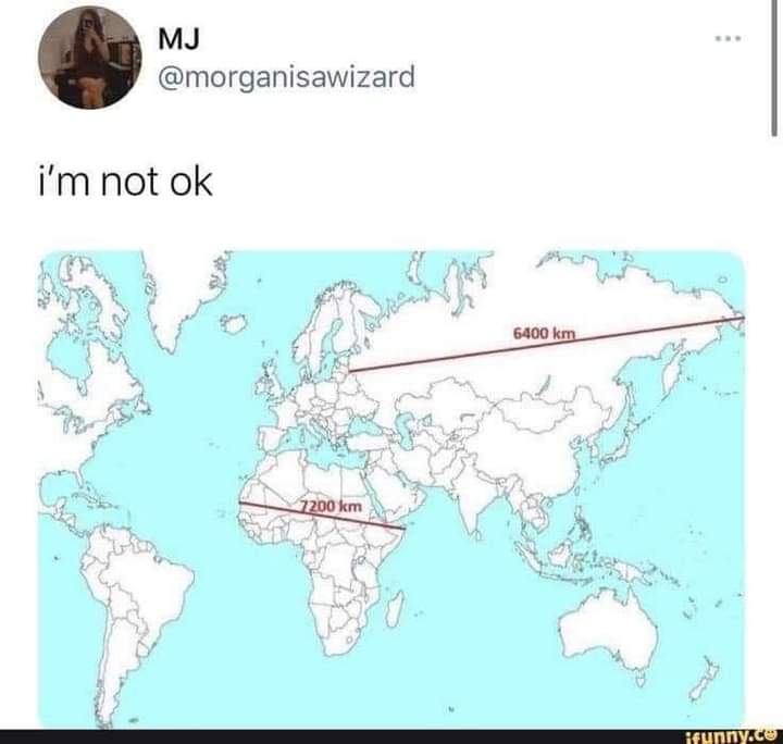
And this “True Size” map is fun to play with.
What Your Favorite Map Projection Says About You
Dymaxian
You like Isaac Asimov, XML, and shoes with toes. You think the Segway got a bad rap. You own 3D goggles, which you use to view rotating models of better 3D goggles. You type in Dvorak.
What Greenland actually looks like is always wild.
It looks like this massive arrow head that stretches so far to the east and west as you go north...
When really it's just like a normal island.
And japans larger than it seems too when compared to the eastern US.
Or the sheer size of the African continent
Still pretty big though, about the same north-south as the u.s.
I mean it is a big island.
But on the standard map it looks like it's as big as Mexico, Canada, and USA combined.
When really it's only about 30% larger than Alaska by square km.
Damn I didn't realise New Zealand is a fair bit larger than the UK, but only has like 7% of the population. Damn, that place must be empty.
Japan is also surprisingly huge. I always assumed Japan and the UK were similar in size, it's like 1.6x the size, jesus.
Maps be crazy.
Another thing we mostly have no clue about thanks to most of our maps is how massively large the Pacific ocean is.
And somehow fellas just sort of wandered to places like pitcairn islands, chance of a million.
Pitcairn islands are a great wikipedia rabbit hole if you're into freaky crazy shit btw.
There's a whole season of the podcast Extremities about Pitcairn. Totally worth it.
Can confirm, I lived in the middle of it (Polynesia), first airports (Auckland and LA) were 6 and 8h flights away.
Maybe the kms in Asia are larger than the ones in Africa. Since the metre is defined as the distance traveled by light in 1/299792458s, one can only conclude that light is slower in Asia. Because it's cold. It makes sense. Light is cold-blooded, maybe? See my next paper in Nature, idk.
this can't be right. i have it on good authority that every 60 seconds in africa, a minute passes. and since time is space...
I think you'll also find that the rains in Africa are blessed, so it's reasonable to assume that these residual divine energies could warp spacetime.
Isn't there a flat map where the actual scale is kept intact? That fucker looks so weird when you've been taught the other one your whole life. It's like planetary dysmorphia.
Fascinating, thanks for sharing!
Australia and China are absolutely massive, wow. They look deceptively small on most maps 🤯
This is what us Aussies have been trying to say! We're not that much smaller than the contiguous USA. Yet so often online people act like we're this tiny island. It's just our population that's tiny by comparison.
Effectively no. Any projection of a spherical surface into 2D will distort it in some way. If I understand correctly, the Mercator projection (which I think is what we're looking at) is a cylindrical projection, which preserves latitude but severely distorts longitude near the poles.
I do know that aeronautical charts are conical projections, which is fairly distortion free for the relatively small area they cover, but you can't lay more than a few of them edge to edge before things stop lining up.
No, it's not possible to take a 3D surface and to transpose it onto a 2D plane without any distortion.
This is true. There are some projections that show area more accurately, or shape of landmasses, etc.
For example:
Many map projections do one thing well at the cost of sacrificing others. For example, the popular Mercator projection (which you'll see in many US schools and textbooks) is well suited for marine navigation but is exceptionally distorted the closer you get to the poles.
You can easily do it without distortion. The issue is continuity. You'd have to make cuts and effectively unwraped the globe like you would a 3D sphere. Some countries might literally be cut in half, but it would at least be accurate
There are many different world maps, and some have an intact scale. But they lack in other ways.
Map Men has a good video about it:
Actually this is a bit misleading. If you check google maps you can see that those straight lines are not the shortest path between those points. Also, that's not the longest distance between 2 points in Russia.
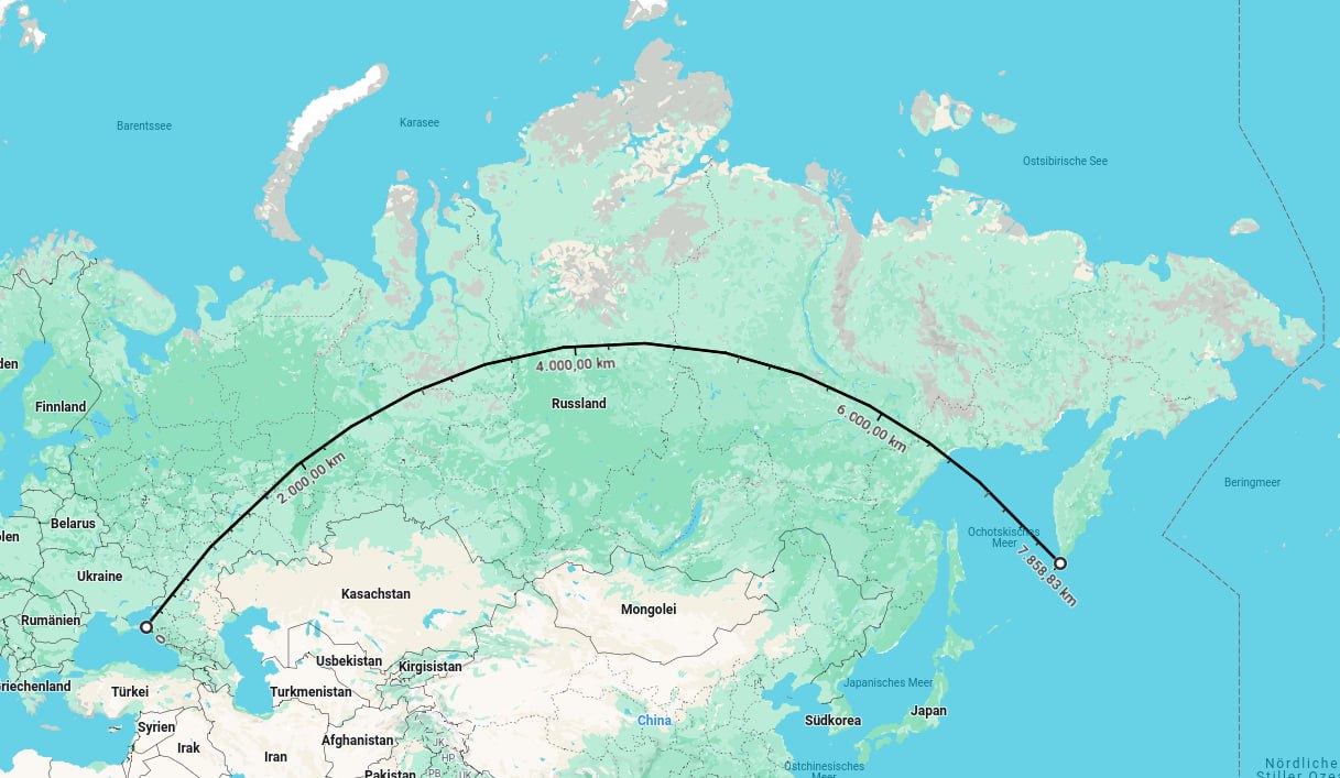
The point still stands that these two distances are practically the same when they appear vastly different in a 2D projectio.
Edit: I might have placed the marker in Crimea. Sorry about that. The point still basically stands.
This may be off topic, but it's sadly not a common occurence to see someone correct something "a bit misleading", while acknowledging that the point is still valid.
You are cool. Keep being you.
You have made a political statement about crimea, watch out for Russia simps
Actually this is a bit misleading.
I think thats the the entire point of this post is how the projection is misleading lol
I'm still annoyed that the default in Google Maps isn't a spherical mapping. You can set it to use a sphere if you're logged in, but that's not the default.
In the past, the only reason for a flat map was paper, but since it's now easy to project a 3d image on a 2d screen, there's no reason that online maps should ever use anything other than a sphere. Yet, Mercator is the default for Google Maps, which just confuses another generation of kids.
So many projections to chose from and none of them are perfect. Except the sphere
I wonder if there would be any way to try to quantify the cost of mistakes made by the simple impossibility of accurately projecting a round image onto a flat surface.
You know, people make dumb mistakes because they just forget a conversion or something. People also probably make dumb mistakes because they forget to mentally correct a Mercator projection.
I feel like there's lots of soft mistakes, for example one might underestimate the size of African countries and therefore underestimate just how atrocious the colonization era was.
People also probably make dumb mistakes because they forget to mentally correct a Mercator projection.
Idk, I think we’ve all seen a 3D model of a globe enough times to not be that surprised by this
Let me just put my two cents in for the Dymaxion Projection. It preserves size and shape, and it also shows how connected the land masses really are.
Greenland may look as big as all of Africa, but it's actually as big as Greenland.
Every time I look at a real globe it always fucks with my head. Especially when I see just how massive Africa is.
Thsi reminds me of this site where you can overlay the borders of any country anywhere on earth and see how it compares. https://www.thetruesize.com/

Yes, we know about Mercator projections. As a kid I was convinced Greenland was huge though. Now it is big but not THAT big.
Also Australia is 4000km across. On these maps it looks about half that.
Welcome to /c/funny, a place for all your humorous and amusing content.
Looking for mods! Send an application to Stamets!
Keep it civil. We're all people here. Be respectful to one another.
No sexism, racism, homophobia, transphobia or any other flavor of bigotry. I should not need to explain this one.
Try not to repost anything posted within the past month. Beyond that, go for it. Not everyone is on every site all the time.
Other Communities:
/c/[email protected] - Star Trek chat, memes and shitposts
/c/[email protected] - General memes