
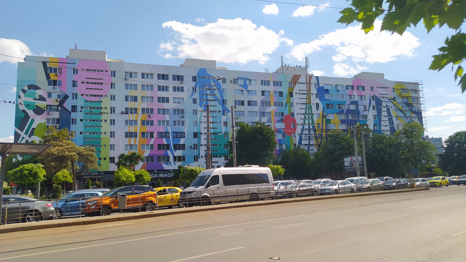
Let me introduce you to Tirana, Albania which has done exactly as you suggest! They elected a former painter as mayor in 2000, and the rest is history. So many of the brutalist buildings in the city are now covered with bright colors, murals, patterns, and more. You can check out some before and after images here: https://blog.ted.com/9-views-of-tirana-albania-with-its-bright-multicolored-building/
this post was submitted on 26 Oct 2023
61 points (90.7% liked)
Ask Lemmy
33002 readers
1663 users here now
A Fediverse community for open-ended, thought provoking questions
Rules: (interactive)
1) Be nice and; have fun
Doxxing, trolling, sealioning, racism, and toxicity are not welcomed in AskLemmy. Remember what your mother said: if you can't say something nice, don't say anything at all. In addition, the site-wide Lemmy.world terms of service also apply here. Please familiarize yourself with them
2) All posts must end with a '?'
This is sort of like Jeopardy. Please phrase all post titles in the form of a proper question ending with ?
3) No spam
Please do not flood the community with nonsense. Actual suspected spammers will be banned on site. No astroturfing.
4) NSFW is okay, within reason
Just remember to tag posts with either a content warning or a [NSFW] tag. Overtly sexual posts are not allowed, please direct them to either [email protected] or [email protected].
NSFW comments should be restricted to posts tagged [NSFW].
5) This is not a support community.
It is not a place for 'how do I?', type questions.
If you have any questions regarding the site itself or would like to report a community, please direct them to Lemmy.world Support or email [email protected]. For other questions check our partnered communities list, or use the search function.
6) No US Politics.
Please don't post about current US Politics. If you need to do this, try [email protected] or [email protected]
Reminder: The terms of service apply here too.
Partnered Communities:
Logo design credit goes to: tubbadu
founded 2 years ago
MODERATORS
He was asked to opt for more neutral colors. “I told them no. Compromise in colors is grey,”
Lol.
Had to look up the tedtalk https://www.youtube.com/watch?v=oDNgnrt_D8w
As an artist myself, I like this guy.
I should have linked that too, but yes, he’s great!!
I really like the solid color, the rainbow, and the checkerboard. The ones with the lines/patterns are somehow significantly worse to me
If you image search it you will find all kinds of cool stuff! Even better if you get a chance to wander around Tirana and find hidden ones!
Brutality architecture, done well, already looks amazing!
That said, yes, their tendency towards large unbroken planes of material make them prime candidates for murals, and you see a lot of that in places like Chicago that had a big Brutalist phase.
I feel like most brutalist buildings are designed by a committee. They want the building to look like it provided maximal value for money, so they try to avoid looking good.
Especially true in America, where "the projects" often used spray-painted signage, even though metal numbers would cost less. The conservative hierarchy fetish couldn't stand poor people having anything too nice.
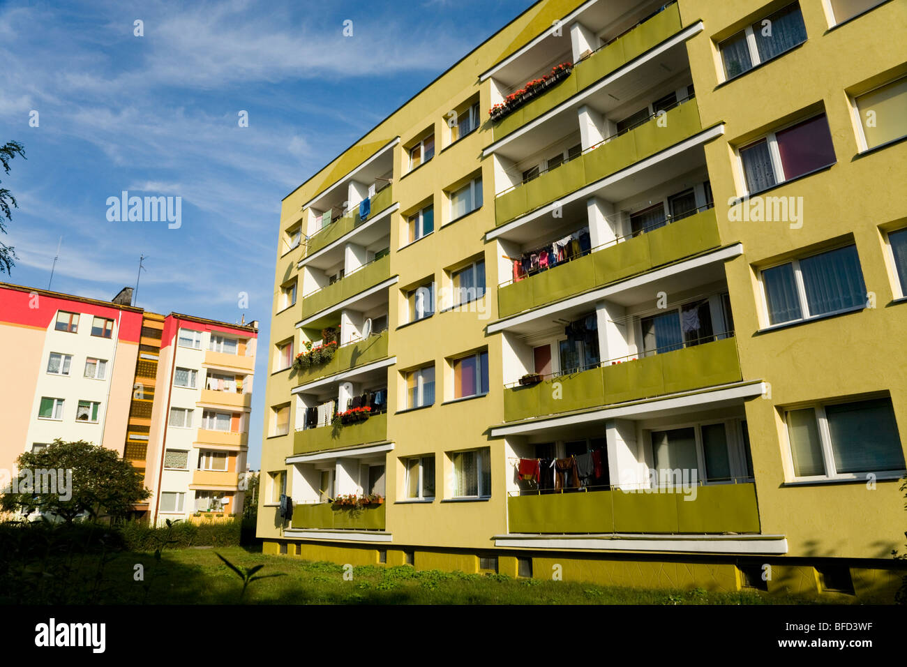
It's been done quite a bit throughout Eastern Europe. Here are some examples from Poland:

Certainly a nicer colour scheme than dirty soul-crushing grey.
Those don't look brutalist to me. I feel like brutalism calls for more than just grey blocks of concrete.
It has to look at least a little bit evil
Not sure if you're making a clever joke, or if you don't know that brutalism is defined by using steel and concrete in large blocks. Might be a mega "woosh" on my part though haha
I wasn't making a joke. It doesn't feel right to call every unpainted concrete box brutalist.
Edit: https://mcmansionhell.com/post/187806092991/the-brutalism-post-part-2-what-brutalism-is-not/amp
Some graffiti is, I think, traditional at this point and a good mural can do wonders to humanize it. I have a feeling that patterns are not actually going to improve it though. The problem is often the form rather than what the material looks like. You could paint it to look like a row of thatched cottages but that would to me be even more depressing.
You are also then committed to repainting it regularly or it's going to quickly look even worse than when you started.
Plants, especially vines, tend to go great with brutalism. The living contrast adds color and life to durable structures.
Vines in my opinion are great dicore maybe that's because I'm a sucker for abandoned building vibes idk what it is that makes me love looking at abandoned buildings it's one of the reasons I love portal 2's abandoned sci Fi look if I wasn't for the high heights and turrets I would love to explore abandoned apeture
Not sure if this counts as brutalist, but the post made me think of this example from Portland

Have a before photo?
There is no before, it was decorated as soon as it was built by the designer-- it was always intentional. (the building is like 8 years old iirc)
Now I just want to see big buildings painted with WWI dazzle camo.
"How far away is that building?"
"I just don't know."
Ooh. I should do dazzle cammo on my house.
But then the mailperson would never be able to guess the speed and heading of my house to deliver packages.
It can't quite get brutalist buildings to look as good as non-brutalist buildings, but yeah painting them is a great move that really improves the vibe.
The Bierpinsel in Berlin has been painted in a few different ways, and looked great in all of them. Do an image search for it, you’ll see what I mean
Run neon tubes along every edge.
Need a before photo too.
Brutalism gets a bad rap because people mimic the naive effect without understanding motive. It's about not disguising how a simple thing was made. The first by-name brutalist structure was a house with one window topped by a solid steel I-beam. What fools saw was raw construction with no ornamentation. But what mattered was function without shame.
There is no reason the concrete walls in a stairwell have to be formed from flat least-effort boxes. You can put pretty patterns in the forms! You can sculpt and mass-produce whole reliefs! What makes it brutalism is not covering up the fact it's a big slab of concrete. Don't even hide the holes where you had to shove the slab out of the form. If you don't like where they sit, in the pattern or the relief - make a better form. You can figure out how to integrate a few little circles and still be pretty.
The best examples in modernity might be "street furniture." Curbs, signposts, telephone poles. Hard-wearing civic necessities that are obviously made of one piece of one material and maybe painted a solid color. But you know there's a difference between ugly streets and pretty streets. It's never because the pretty street covered up how everything was built. There's no wooden slats over the sidewalk, pretending it's a boardwalk. No terra-cotta pots around an in-ground bush. No faux cobblestone paint-job on the asphalt. Signposts are still a steel tube or a punched rail of sheet-metal; they're just treated or painted often enough not to be half rust and all ugly.
So yeah, gaudy up those flat walls. Just not with any nonsense facade that makes them look like five-over-one gentrification rectangles.
I feel like I remember reading about a city that basically encouraged graffiti, and would rotate through local artists every few months or so. Seems like a great way to give the place some character