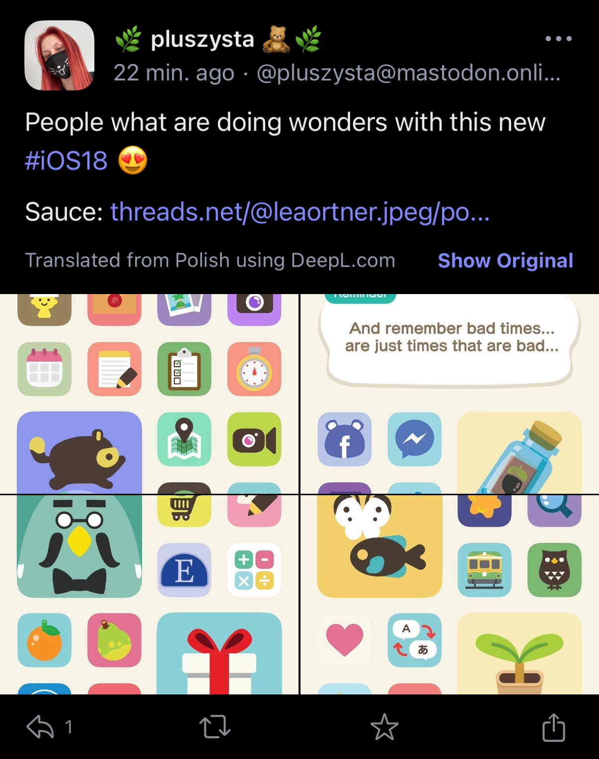
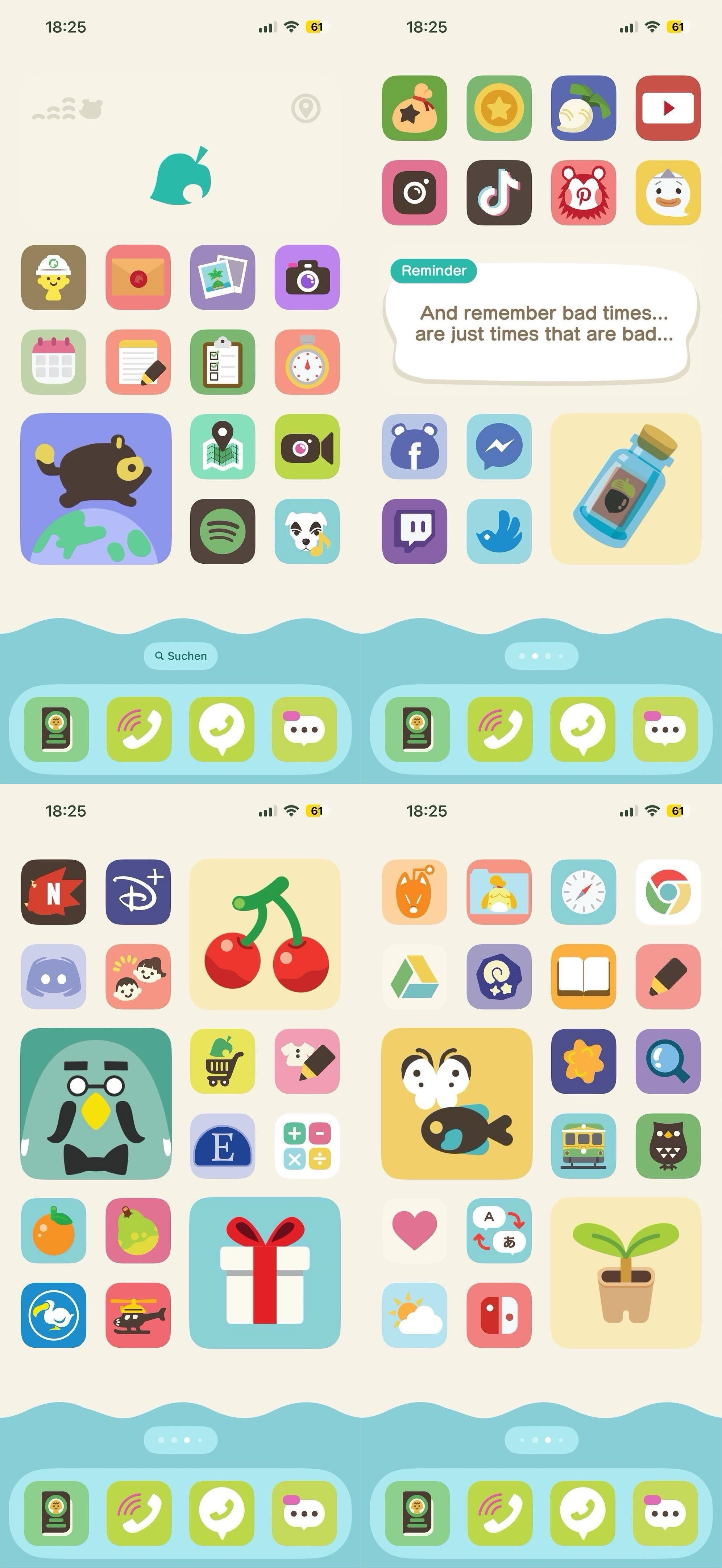
Very cool! So annoying that it takes forever to set something like that up.
Apple
Welcome
to the largest Apple community on Lemmy. This is the place where we talk about everything Apple, from iOS to the exciting upcoming Apple Vision Pro. Feel free to join the discussion!
Rules:
- No NSFW Content
- No Hate Speech or Personal Attacks
- No Ads / Spamming
Self promotion is only allowed in the pinned monthly thread
Communities of Interest:
Apple Hardware
Apple TV
Apple Watch
iPad
iPhone
Mac
Vintage Apple
Apple Software
iOS
iPadOS
macOS
tvOS
watchOS
Shortcuts
Xcode
Community banner courtesy of u/Antsomnia.
This is the kind of thing I could spend hours doing during my college days. I remember the golden days of Android custom ROMs and specifically kept a phone that got a rotating ROM everyday (God bless Titanium Backup).
Is it still one shortcut for every app icon you want to customize? And then you have to deal with a notification every time too?
I think you can use cowabunga lite to theme every app and it won’t have the shortcut notification, but it still wouldn’t have the notification counter on the icon
They either changed how the notification works or made it minimal for models with the Dynamic Island. I just tested a simple shortcut to open an app and besides a little blip on the Island it was no different from opening the app normally.
Well, try a 10% of that in iOS/iPadOS.
This is iOS 18.
A perfect example of “give the people what they think they want, and they’ll make something entirely unusable.”


