
That Firefox logo was simplified, but not oversimplified. Even with a very small icon size you can still tell it's a fox that is (on?) fire. The Firefox Family logo is oversimplified, just being a swoosh, basically.
1. Be civil
No trolling, bigotry or other insulting / annoying behaviour
2. No politics
This is non-politics community. For political memes please go to [email protected]
3. No recent reposts
Check for reposts when posting a meme, you can only repost after 1 month
4. No bots
No bots without the express approval of the mods or the admins
5. No Spam/Ads
No advertisements or spam. This is an instance rule and the only way to live.
That Firefox logo was simplified, but not oversimplified. Even with a very small icon size you can still tell it's a fox that is (on?) fire. The Firefox Family logo is oversimplified, just being a swoosh, basically.
well the family logo is supposed to be as simple as possible
Never forget what they took from us

I still think the 2017 logo was their best, like a nice middle ground between this version and the current one:

I like this one. New ones missing the paw and has an odd tail end to me.
I liked this so much more! It was cute and charming.
The new logo looks so office neutral/corporate friendly.
I seem to be the only one who likes the new Firefox logo. It's way more colorful!
The new logo looks sleek and nice, but I personally just really like more complex logos.
You are not alone, we just don't meme about it.
I like it too, the old one was too detailed which makes it stand out too much. Icons need to work in a lot of contexts so simpler is almost always better.
I think most actually like it more, it's just people are a lot more likely to come online and make posts if they dislike something.
I used to not like the new Firefox logo when it first came out, but by now, I couldn't do with the old one, it looks so much... And I bet if they changed it back, it would take me 2 months max to switch opinions right back.
At some point I have to accept, I'm just an ape of habit.
Honestly, its considered a hot-take but I do like minimalistic logos cause they are easier to recognize. Also they tend to better fit with the rest of the UI and products.
Counterpoint is the bullshit Google did with all their icons. Same exact colors with different shapes makes quick differentiation an actual challenge. 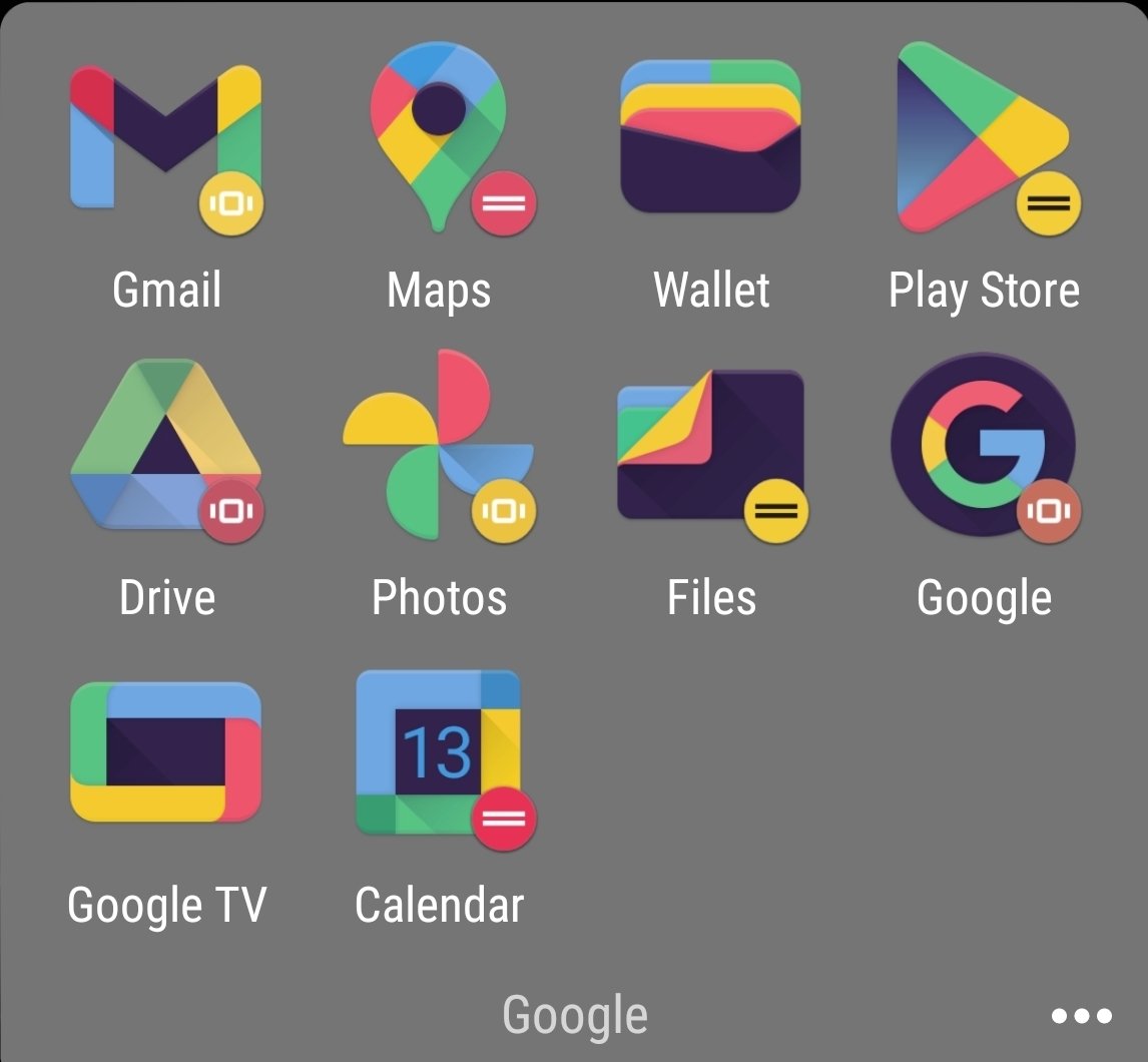
That's gotta be an icon pack, given the black and the weird colors. Am I wrong? Did they change it since I last used the stock icons?
I forgot I had an icon pack on. Original is actually worse. No large silhouettes to work with. 
And then they introduced to android a new option that only showed the shape of the icon in two tones. Now they have no colour and are just odd shapes.
It all depends on context. The Firefox logo is good and fine as a brand logo you can put on the product website, big enough, or the about dialog. But as an application icon I dislike it. I would prefer a simpler, more recognizable, flat-colored version.
The new reddit logo is pretty awful but both Firefox logos are fine IMO. They are both pretty well done, just in different styles.
Yup, the design for Firefox's logo is just a million times better than reddit's, simplification arguments aside. FF just did a much better job.
Are they trying to fool investors that it’s a messaging service? The little tail on the bubble makes it look like a WhatsApp ripoff.
The new reddit one is so fucking weird to look at.
It makes the snoo a little too human, I get uncanny valley vibes from it.
The Firefox logo is great though. It's not over simplification. It's just keeping up with the times and doing a great job of it IMO.
I like both the firefoxes. They're good boys!
I also like the old alien. I'm not someone who generally gets upset when companies introduce a new logo, but the new alien is just nightmare fuel. Get away!!
If they didn't change the firefox logo, it'd definitely look extremely dated today though
I like the new Firefox logo though. Except little foxy needs it's paw back.
The Reddit one looks like if they made a mobile game that's just another Candy Crush clone.
OP: „I don’t like change.“
Let's talk about this stupid "Let's put a useless white background under our icons" trend.
Be honest, which looks better?


Oh hey it's the maps logo, or is that the calendar logo? Nah it's the files logo. I guess it could be the photos logo...
Really great when I'm trying to find something in a hurry.

The right answer.
The new reddit icon looks like when kids draw on teeth for giggles.
We should call them "oversimplication" and "overcomplification". Would convey the meaning better :)
That might make thing overcomplified though
I think the new Reddit logo is hilarious. It looks like Snoo has a stubble. What's up Snoo? drinking much?
Label the whole picture as "Never happy about anything"
Just me, or does anyone else see "zombie eyes" in the new reddit logo?
overcomplification
Often, I associate a logo change with a change in what the brand wants. The older Reddit logo is associated with a time Reddit was good, and the new one is associated with Spez's greed. Same with the Android logo, and many others.
All of these logos look fine.
Hot shit I thought the reddit design was a joke, that's awful.
Just looking at the thumbnail of this post reveals to me that reddit has takgen a bad step. An icon which scales well and is highly recognizable changed to something that looks like a badly generated figure which is way less recognizable. The added colors will make it look worse on different colored backgrounds as well. Not great.