Dark patterns are taking over everywhere
This is a community for designs specifically crafted to make the experience worse for the user. This can be due to greed, apathy, laziness or just downright scumbaggery.
Dark patterns are taking over everywhere
Almost as bad as the "Enable new feature? / Not now" options
No, NOT not now; never. Never.
“Would you like to disable the ‘Not Now’ option?”
[ Not Now ] [ Just Once ]
[ Remind me later ]
“Would you like to disable the ‘Not Now’ option?”
[ Not Now ] [ Just Once ]
angry upvote :|
OMFG, the "not now" option (also disguised as an "ask later" button) makes me want to break things. I'm seeing this happening everywhere!
Load up an app? REVIEW THIS APP! (YES/NOT NOW)
Log into your bank account? SIGN UP FOR E-BILLING! (YES/ASK LATER)
Want to order something online? SIGN UP FOR OUR NEWSLETTER!! (OK/REMIND ME LATER)
Want to pay your utility bill? RATE OUR SERVICE! (OK/REMIND ME LATER)
🤬
Load up an app? REVIEW THIS APP! (YES/NOT NOW)…
Want to pay your utility bill? RATE OUR SERVICE! (OK/REMIND ME LATER)
My policy is: Apps that interrupt me to ask for a review will get a 1 star review. I’ll add comments about wanting to be left the fuck alone and please sthaaap with the thirsty pop ups and emails - if it is convenient to do so. Hulu keeps bugging me on my XBox and I’m not entering an explanation with a fucking remote control (WTF ARE THEY THINKING?) so they just get 1 star with no explanation. Fuck’em. They asked for my opinion so they’re getting it.
This is the way!
Not even dark patterns, dark labyrinth.
There are always alternatives.
Would anyone ever actually fall for this?
"Well I've clicked the button now, might as well put my card info in I guess!"
Exactly! It's a lose-lose situation. Even if you misclick, then you'll realize you've been conned.
happened to me once on some website, "one click buy," I learned the hard way how serious they were about that. Don't need to enter your card information when you've already set your phone up with permissions to access your bank account in one click. DANGER!
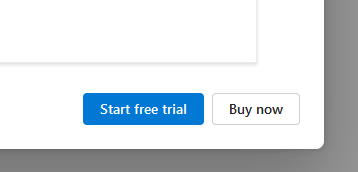
To me, sans any context, the asshole aspect of the design is that there's no explicit button and comparable button to decline the offer / close the window/pop-up/whatever. Though it's also very possible that this was specifically cropped so as to exclude context such as the existence of a close button or other clues that might offer some rationale for this design.
I don't see the Buy now button as being disguised as anything, personally. This just looks like there's standard theming in place where one button is classed as a primary button and the other as a secondary or perhaps default button. Pretty vanilla stuff and a common approach when there are choices like this.
Yes the cropping is suspicious but still it's asshole design because two buttons next to each other should offer two opposite choices. These two buttons just force the user to get the product.
I may be misunderstanding what you're saying, but taken at face value, I do not agree that two buttons always have to offer opposite choices. But, that also didn't seem to be the point that OP is making, which was that the button is somehow disguised.
Yeah, usually the button they want you to press is the one that's colored.
If they want you to buy something, why make that the colorless one?
usually the button they want you to press is the one that's colored
That’s the point. They’re abusing that common knowledge. They know that you’ll glance at the buttons and in that split second, assume the white button is “cancel”, and click that. They’re hoping some of those errant clicks turn into sales
So their isn’t even a “no” option? I’m assuming theirs an X at the top of the window but that’s still scummy either way.
The 'no' option is rebooting into a live USB drive, mounting the windows drive, and laughing manically as you remove this shit by force. Then reboot and be happy with your murder.
'motherfucker I own you!'
Or just run Linux.
Many if the games I play are only marginally compatable, so here I stay
If you own it why do you need to boot around it to fix it?
You don't own shit but yourself installing Windows.
*there, there's
well if there is no free tier it doesn't make sense to add a button like that, that is I assume this is merely an optional thing,if you want one drive storage,pay for it,free trial or exit.
There is an X, but it's effective enough for me to almost click, make this post, then immediately, while knowing the button was there, actually click.
Software Engineers and UX/UI Designers need a code of ethics, like yesterday.
Yes, business is ultimately to blame, but those folks are beyond saving - they will never ever ever put the brakes on an initiative that could make more money legally. Unless there's blowback from an ethics board / professionals in charge of implementing their dark patterns.
Software Engineers and UX/UI Designers had a code of ethics. Digital Research specifically created a code of ethics. (I think it was Gary Kildall who did it.) The code of ethics recommended companies that make OSes should stay separate from companies that make applications. It was Bill fuck-the-community-I-want-money Gates that ignored all that stuff in order to seek market domination (and monopoly power).
A combination of regulatory pressure, hackers, and enshittification from within has done a lot to keep Big Mike from seizing the whole market, but it's gotten pretty brutal multiple times in the last two-plus decades.
Why include software engineers in this? In the large companies I've worked for, the people with the title "software engineer" have absolutely nothing to do with the actual design of something like this; we just get handed a spec and are expected to implement it as is. In smaller companies I always did one-person projects where I handled every aspect of the development process including UX and UI, but my title was not "software engineer". Are you expecting the engineers to refuse to implement a "feature" like this on principle or something?
The title's meaning and weight can vary. So can the responsibilities and impact of an individual engineer's decisions. But there is a longstanding tradition of engineers as gatekeepers for quality and the ethical application of their skills.
For instance, licensed engineers in Canada have a duty to the following code of ethics. To quote the header:
Registrants shall conduct themselves with integrity, in an honourable and ethical manner. Registrants shall uphold the values of truth, honesty and trustworthiness and safeguard human life and welfare and the environment. In keeping with these basic tenets, registrants shall: [...]
That's why in Canada virtually everyone is a "Software Developer". Same job across in the state you'll be called an "engineer".
Are you expecting the engineers to refuse to implement a "feature" like this on principle or something?
Yes. Or at least question it.
Just like I'd expect a civil engineer to question the plans for that bridge they're building if it seems like it's not up to spec.
Or like I'd expect an electrical engineer to revise the plans for a circuit that poses an electrocution risk.
Why would software engineers be held to a different standard?
We do, and it really depends on the entire team being ethical to make it effective. If you have an unethical boss, they'll just go find someone else to implement their ideas.
Wait. this is Microsoft.
I have a long relationship with Microsoft and its marketing shenanigans.
In fact, they've specifically done shit like this before.
Spooky that it still didn't get the memo (the power-users always report and circumvent their antics, and they lose sales).
It’s called “secondary” in Bootstrap, and “Buy Now” is legitimately the secondary option here.
It’s relatively rare a person would rather just buy without trying first.
Cancel would be the “danger” class in Bootstrap, and I would bet it’s the color of the actual “Never Mind” option somewhere in the larger version of this screenshot. My hunch is there’s an X where you can simply close this window. Unless it’s an app that requires a subscription to use in which case the close option is to close the app.