111
Are you guys tired of "Material You" design?
(lemmy.world)
As a UI/UX designer myself (hobbyist, to be clear), I really like it.
There seems to be this notion in the homebrew/FOSS/Linux community that "wasted space" is always non-preferable. I can see this being true for some people, but I feel like a lot of people are band wagoning this opinion.
It's pretty universally known and accepted in the design community that padding is extremely important when it comes to helping your brain read and separate content. And to be fair, most non-tech people prefer space and padding in their applications to make things easier to understand.
I can be entirely off base here, but TLDR: I like padding and it's literally beneficial to helping your brain understand the layout of what you're looking at better.
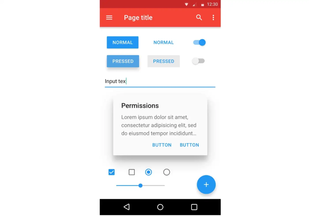
personal opinion, i think padding is worse for delineating objects than a bit of colour; or just, like, a line. look at this example - there are four distinct segments on the left, whereas on the right they all merge into one and a half
padding is really useful, yes, but if you put padding on everything then what's there to be separated?
The one on the right looks like different buttons and that everything is clickable. A quick glance shows you different elements and you can easily find what you're looking for. An example of form and function working together.
The one on the left looks like a text area showing different symbols. A quick glance shows you a blue area and a white area. Seems like you need that extra moment to find what you want because everything looks the same. An example of function over form.
Cramming a lot of things together isn't always good (probably it's just bad in general) because it just makes things confusing and ends up wasting time more than having bigger things but less of them.
It's nice to see your perspective on it, you make some great points.
Its funny how the places that I dislike the most (status bar toggles and recently google search) are used often and thus do not need the benefits of reading and content separation. You already know by heart what it says and where they are.
Maybe I would like it more if the big padding would only be used in places where I do not interact often with. This would make consistency difficult though.
Good point but just because you know where certain things are on screen, that doesn't mean everybody knows. So you have to account for that too. Like design considering that that's the first time someone's looking at that screen.
UI dev here. To add to this, good use of “negative space / white apace” is also beneficial in signalling abundance. The more negative space you can afford to “waste”, the more resources you signal to have.
Luxury brand ads are good examples. Compare this Citizen Watch ad (https://images.app.goo.gl/mALYonDz6qzKJjuJ6) to this (https://images.app.goo.gl/sTXzyrFXNDUxR8AR9)
While you're here, I'm curious about your opinion on the latest Spotify client design. It feels like they want to bring the desktop design closer to the touch screen client (maybe to reduce the codebase not shared by the projects). Personally, having grown up with Winamp, I find it very uncomfortable how images are dominant in both list and grid views, and how much space is left (really wasted) around texts. I think it's just a very inefficient interface with way too much useless visual fluff.
spoiler
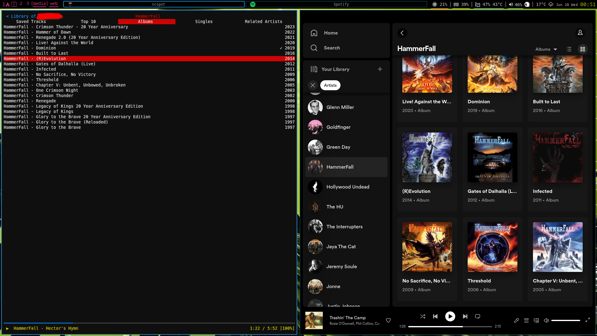
(the application on the left is a terminal-based client that really only needs a tiny corner on the screen)
There’s a fine line between desirable ‘white space’ and too much padding, which Google should probably do a better job at finding.
As a UI/UX designer myself (non-hobbyist), there's UI and there's UX. What differentiates a good-looking design from a crappy-looking design, most of all, is space (or padding). There are many other factors, of course, contrast being also very important for example, but space is number one. But that doesn't make a design good, just good-looking, which is a very different thing.
Adding steps to take a common action (turn off wifi or whatever) because you used to have a certain number of buttons and now you have to hide some to add space... That's bad design. Good looking, good UI. Shit UX.
Space should be added when needed. And you need it, when you do, to make thinks clearer. You shouldn't add space to make it look better if that's gonna make the experience worse.
The number one rule of design is that form follows function. You should make things as pretty as possible until you find the wall of functionality, and then you stop. Going from six quick access buttons to four was breaking that wall. You wanna be just on top of the wall. Go to one side, you get a great looking interface people hate to use. Go the other side, you get an interface that's dense and full of things you want, but looks like a piece of nerd shit.
I'm also tired of people repeating the same copypasted ideas about any new design system out there (as I'm sure most people are when hearing people talk about their area of expertise), but they are not wrong on that regard when it comes to material you. Shit name by the way.
The dynamic colors are a fucking nightmare. No, I don't want all my ui elements to be the same color as my girlfriend's skin tone. And the worst is even if I change it, it resets every update. I also don't like the new quick access controls in the pull down. This is really the first Android update that's felt like a flat downgrade for me.
As a professional UX designer, the padding is the least of the issues.
I'm hoping I get used to it, but I miss more skeuomorphic design. It's like a designer wanted to push it to be edgy and forgot about real people using it.... which describes the bulk of Apple design, too, for that matter. I think we overshot the balance point.
Edit: forgot my real point halfway through commenting: I will say even that isn't the worst of it, though. The dynamic theming is a bit of a branding nightmare.
The dynamic theming is a bit of a branding nightmare.
Probably one of the reasons I like it. Big red company icon next to the big black company icon, next to the big pink company icon. Nah, I'll take the uniform design, please.
I'm over pastel colors, honestly. I want bold, vibrant colors. At least the option. It feels like Google is stripping more and more customizability with every update.
I'm not upset by it because, like all Google design eras, nearly no one uses it uniformly.
yeah, i hated material ew as soon as it was announced. so much padding everywhere, and so little contrast - to paraphrase the incredibles: if everything's orange^[1]^, nothing is. your eyes will adjust to it. i want actionable items to stand out, not be a slightly lighter shade of the same colour. it also looks rather like a fischer-price my first phone interface
i must say, if an app (for example, jerboa) uses material 3, i usually try to look for an alternative
[1] other colours are available, i just like orange
edit: some examples:
with material design, it's clear what's a header, what's a footer,^[2]^ and what each button's state is.
with all the padding, there's also less space; leading to less functionality
with material ew, it's much harder to tell at a glance what each app is, one has to scrutinise the icon rather than just tell at a glance by colour
i also really dislike monet; the way it pulls this horrible washed out sickly pastel colour from a wallpaper and washes it over the entire app. if i just pulled one accent colour, and applied that to, say, the header and main action button, i'd like it a lot more
[2] look at the lack of contrast on that "new post" button
Big fan of material you.
I like it fine, I just wish Google (and Microsoft, Apple, etc) would decide on a consistent UI theme instead of completely changing it every few years. They don't even have time get all their first party apps up to date with the latest design trend before they move on to a new one, and third party apps are even worse. I have apps on my phone in like 4 different UI styles now.
Design preferences has a tendency to be "cyclical" appearing to be tiresome. That's fine and an encouraged strength of customisablility.
The issue is unified design language across android devices. Material You attempts to solve this to limited success. But it's better than the alternatives I've seen in the past.
The over-padding (especially default widgets) is something I take issue with but it's a preference and can easily be adjusted.
I find it and other modern designs to be boring, but I don't hate it.
I'm personally not that fond of it, and kind of want it to blow over in favour of a new trend.
It lacks the charm, and neat little 3D effects that skeumorphism had, but that's also not helped by it being implemented poorly.
I'm just kind of sick of Android in general, tbh. Google has killed off almost everything that made it fun to play with new Android versions, and somehow made it less intuitive/easy to use for advanced/experienced users in the constant pursuit of - ironically - ease of use. For example: why is it now a swipe and three taps to disable wifi in the Quick Settings panel, when previously it was a swipe and one tap?
Android 11 was the last best Android version in terms of UI. I went back from Android 12 to 11
Came here to make this same comment. Android 11 was peak.
My main complaint is the amount of padding everything has, it makes things feel so cramped, even on a big screen. Increasing the information density would really improve the design, imo. Making colors more saturated would be cool too.
But other than that, the design is growing on me.
No, not at all. I am really fond of Material You. I think it is a nice mix of modern and playful. The colors are great too. I seek out applications that adhere to the material you standards and allow for using system colors. I have a Pixel 7 and a Pixel Watch. I'm excited to see what Material You looks like on the watch when the Wear OS 4 update comes.
HOLO YOLO
I hate it. Any wallpaper with a grain of red or yellow and everything becomes brown/beige and awful. I'm on Oneplus so i can't pick any colors, it's all automatic.
I don't particularly like it or hate it; I see it as the perceivably necessary new thing that's introduced each year to keep people interested.
Absolutely not.
I'm way more tired of the designs before it, or the apps halfway into the design language but not really. Especially if it is to the point where just using the material you colours you have seperates it, signal comes to mind there for example.
Some apps can keep their design layout but please let me use my material you colours anyways
I like MY — I just wish I could design more of it on the user side.
Auto generated colorschemes are great and give Android a level of class it has been missing for a while. But I wish I didn't have to rely on a third party app like Repainter to finely choose my palette rather than hope the theme engine makes a good one. I also resent my icon shape, font, and icon options being ripped away from me.
There was a section on the original MY Google IO announcement that implies that the padding and roundness could be freely adjusted throughout the system. I wish that materialized (rimshot) into the final product.
The only objective regression I can think of with MY, rather than just an annoyance, is the Quick Settings. A merged internet toggle that no one asked for, a further reduction in a available toggles from Android 11, and not even bothering to make the Bluetooth toggle one of the fancy expanding ones instead of sending you to settings or surfacing the audio playback toggle (why can't I change the output before I play media, Google?). Ugh.
Definitely not, first of all I love pastel colors and, on the more practical side of things, at least for touch interfaces I do prefer to have some padding: even on larger screens (my current phone is 6.7") I tend to prefer larger and more padded interfaces to avoid hitting the wrong one (and that's the main reason why I don't like to type on a phone that much).
So I might even be in the minority but having a control center with larger but less buttons on each page is exactly what I prefer, I don't mind having to scroll if it's easier to toggle what I need to.
Not "tired" of it, but I'm looking forward to more colour options rather than just pastel colours that sorta work half the time. I hope I can customize it a bit more in the next release.
I can't stand it, honestly. I recently moved from a samsung phone after like a decade of using nothing but samsung to a pixel phone and I really dislike how fat random ui elements are. The volume control is confusing to look at because it's gigantic, there's less quick settings tiles because the ones you do get are giant, and I dont really like the colour tint across the entire OS. Just because my wallpaper has grass in it, my whole phone shouldn't be baby shit green.
It definitely grew on me over time, and as more apps began to embrace it. Really well-detailed apps, like Sync, showed the true potential of what Material You can be like. It's also a little easier to distinguish the pastel and tint in sunlight (at least with sunglasses on), so that's a major plus.
I like the integration of adaptive icons for Android. I'm really keen on selecting a theme based on my current wallpaper and that color being used for all apps.
Not many apps are currently supporting it, even Facebook and other players you'd assume could do it in a seconds aren't.
Implementing it looks fairly straight forward, you provide a transparent image of your logo and it adaptive naturally to suit your theme. I assume apps are intentionally being difficult because that visually changes their logo / branding.
It's great when it works tho!
i don't completely hate it, but seeing the same same UI in every app doesn't feel good.
I'm still liking it a lot.
I was tired of it before they launched it.
I'm a fan - also I think material you allows for good interpretation/flexibility in terms of branding so that not all apps look exactly the same cookie cutter style.
Absolutely like it. This design is very cool and has huge potential
My main issue is the lack of good contrast, it really hurts.
I still want Material back.
I hate it. I wish it and similar flat, ugly UIs weren't everywhere. I get that some people like them, but I wish I could have all my devices' UIs look they way I want them to. Give me skeumorphic, glassy UIs any day.
Welcome to the droidymcdroidface-iest, Lemmyest (Lemmiest), test, bestest, phoniest, pluckiest, snarkiest, and spiciest Android community on Lemmy (Do not respond)! Here you can participate in amazing discussions and events relating to all things Android.
The rules for posting and commenting, besides the rules defined here for lemmy.world, are as follows:
1. All posts must be relevant to Android devices/operating system.
2. Posts cannot be illegal or NSFW material.
3. No spam, self promotion, or upvote farming. Sources engaging in these behavior will be added to the Blacklist.
4. Non-whitelisted bots will be banned.
5. Engage respectfully: Harassment, flamebaiting, bad faith engagement, or agenda posting will result in your posts being removed. Excessive violations will result in temporary or permanent ban, depending on severity.
6. Memes are not allowed to be posts, but are allowed in the comments.
7. Posts from clickbait sources are heavily discouraged. Please de-clickbait titles if it needs to be submitted.
8. Submission statements of any length composed of your own thoughts inside the post text field are mandatory for any microblog posts, and are optional but recommended for article/image/video posts.
Community Resources:
We are Android girls*,
In our Lemmy.world.
The back is plastic,
It's fantastic.
*Well, not just girls: people of all gender identities are welcomed here.
Our Partner Communities: