3
How to Create a Mode Shift in New Big Picture
(lemmy.world)

another, for those who use 88x31 buttons

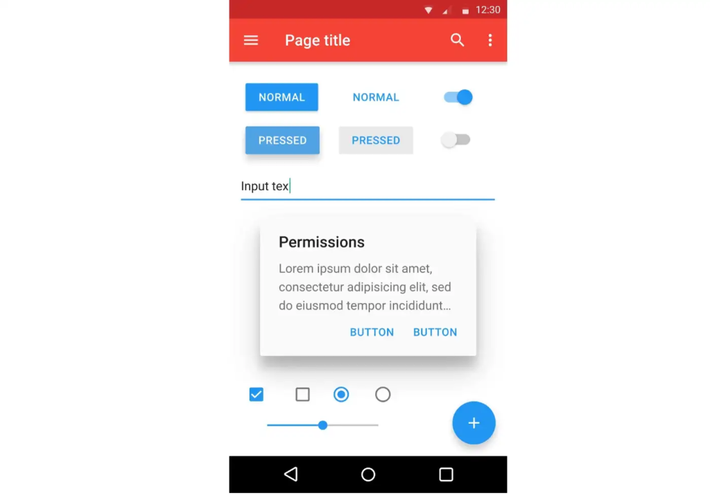
personal opinion, i think padding is worse for delineating objects than a bit of colour; or just, like, a line. look at this example - there are four distinct segments on the left, whereas on the right they all merge into one and a half
padding is really useful, yes, but if you put padding on everything then what's there to be separated?
yeah, i hated material ew as soon as it was announced. so much padding everywhere, and so little contrast - to paraphrase the incredibles: if everything's orange^[1]^, nothing is. your eyes will adjust to it. i want actionable items to stand out, not be a slightly lighter shade of the same colour. it also looks rather like a fischer-price my first phone interface
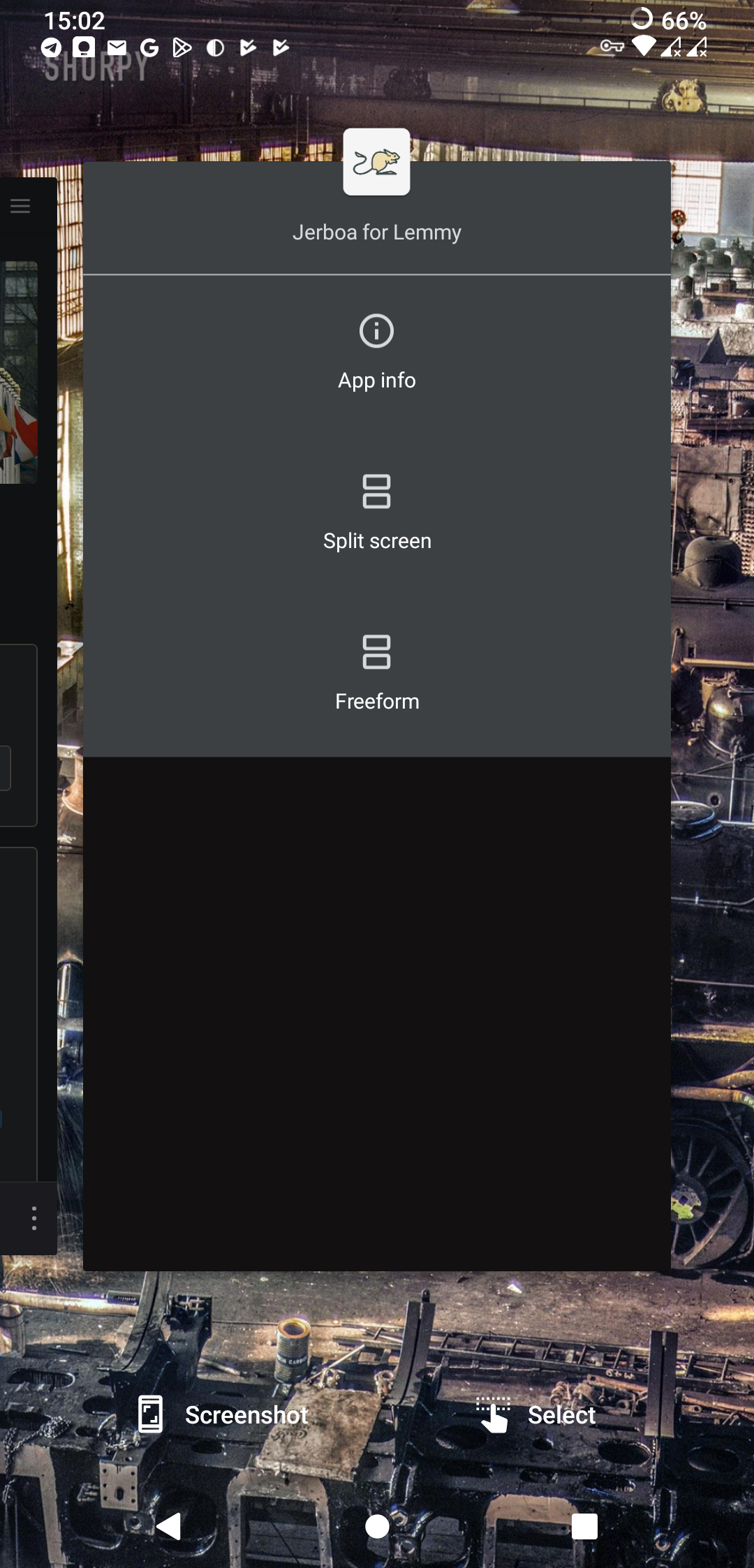
i must say, if an app (for example, jerboa) uses material 3, i usually try to look for an alternative
[1] other colours are available, i just like orange
edit: some examples:
with material design, it's clear what's a header, what's a footer,^[2]^ and what each button's state is.
with all the padding, there's also less space; leading to less functionality
with material ew, it's much harder to tell at a glance what each app is, one has to scrutinise the icon rather than just tell at a glance by colour
i also really dislike monet; the way it pulls this horrible washed out sickly pastel colour from a wallpaper and washes it over the entire app. if i just pulled one accent colour, and applied that to, say, the header and main action button, i'd like it a lot more
[2] look at the lack of contrast on that "new post" button
because fdroid build all of their apps themselves, so every app on the fdroid repo uses the fdroid signing key
instances aren't like subreddits in this example though. if i don't care about drama, i can subscribe to both r/tumblr and r/curatedtumblr and have them both appear in my feed. i can't do that with instances without creating two accounts, and browsing both separately
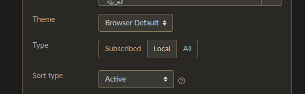
have you tried changing the "type" option in lemmy.world/settings/ (or [yourinstance]/settings)?
nooo, the icon was one of the things that drew me to .world
i don't know whether it's original or taken from somewhere, but it's so glossy and nice
flat design has always been boring, but it's starting to become unfashionable as well
somebody else pointed this out, but it's honestly bizarre he's going in on the "we aren't making any money" ploy in preparation for the ipo
what's the pitch to the investors? "please by shares in this unprofitable company, in the hope that we can become profitable by pissing off our userbase"?
nice, we had the same idea within about 10 minutes...
edit: uh, it seems to have gone; so i've tried reposting it
the "risk" of false positives comes down to the consequence. if the consequence is being stuck in the slammer, don't use ai. if the consequence is you can't upload the image unless you manually appeal, or even maybe have to use an external image host; i think ai is fine
edit: ah bugger, wrong acct. ah well
(please tag @[email protected] if you want me to see your response)