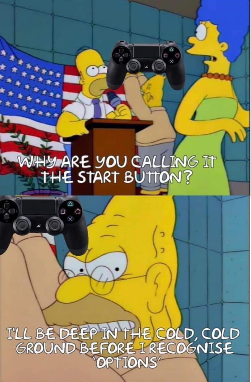
It's select and start.
What's it supposed to be, windows and hamburgers?
It's select and start.
What's it supposed to be, windows and hamburgers?
I won't give it up. Select and Start.
My wife makes fun of me for it whenever we play couch co-op games. "What do you mean press start? My controller doesn't have a Start"
"Press the button formerly known as Start"
⬆️⬆️⬇️⬇️⬅️➡️⬅️➡️🅱️🅰️🅱️🅰️[select][start]
REST 30 REST 30
🏅🏅🏅🏅 🎖️🎖️🎖️🎖️
WTF was the select button actually for? I get start because it was often the button on arcades or gamepads that allowed you to choose menu options (which still works but has mostly been replaced by A).
What were we supposed to be "selecting"?
On the title screen of older NES games, the select button changed what mode you played in, then you hit start to start that mode/variation.
Ahh this makes sense. I played a lot of NES as a kid but must have just never encountered it
Select and Start was how the Atari 2600 did things. At the time, everybody was designing in terms of having one set of controls for when you're in the game, and a set of meta-controls for adjusting stuff outside the game. The 2600 configuration GUI was the dumbest thing in the world. You look at a grid chart of game options in the manual, and you press the Select button 35 times to get to the version that you want.
The Famicom was much more able to draw and interact with a real configuration GUI. But Nintendo's own experience was mostly in making the arcade game "Donkey Kong", where you pick how many players by "pressing" the insert coin button and then Start. Nintendo was selling to a market that mostly knows home games from picking up a 2600 at a bankruptcy sale. So, keeping the separate meta-game buttons and game buttons was natural at the time. Later games developed a better design language for the meta-game UI, so most game studios left the Select/Start interface behind.
(Lol now I see that TubbyCustard said it all, but better)
It was originally for selecting different options.
You're on the start screen and it says:
1 Player.
2 Players.
You press select to choose which one. That's just an example, lots of NES games were like that.
Did the buttons really need renaming? It's not like options and share or + and - make any more sense
I get being nostalgic for Start/Select but how does Options/Share not make more sense? The options button brings up a menu of options for most games and share allows you to share screenshots or video from the game. Whereas start did the same thing options does now which has nothing to do with the word Start and Select was sorta a catch all button for an action you only used occasionally, but was never used for selecting which was usually X but sometimes one of the other shapes.
Options I kinda get but it sounds dumb to me, would've been better as "menu" because it's not exclusively for options, also for pausing and other menus.
Share isn't what that button normally does at all in my mind, sure maybe PlayStation have it bound to that but normally it brings up an alternate menu to start that isn't the pause menu (like in Minecraft and overwatch it brings up player list/scoreboard as an example
A lot of games I believe use it for the map too
Start and Select for life. SNES was my first gamepad.
Brother
My nephew was so confused when I kept telling him to press "Select" when we played on a PS5.
You must teach the boy the old ways.
Everytime I start up Burnout: Paradise Remastered it tells me to hit Options to start the game. No! It's Start to start!
Yeah, same. I actually forget the name of the button, too, so when I give someone the controller so they can play and they ask “how do I open the menu?” I’ll say “oh press start. It’s not called start actually but you know press the button that looks like it should be called start.”
The touchpad is just "big select".
I'm not sure who in the name of all fuck decided that controllers should have a dedicated Tweeting button, but I suspect this gen will be the last of that.
Could we take the guy who put a dedicated screenshot button on the controller instead of another options button and drown him in the nearest septic tank?
Same. My older SO corrects me. I won't have any of it.
So... I believe I'm old now...
*insert "I'm in this meme and I don't like it" picture.
But....we have two buttons right? The right one was always start and the left one was options ig? I'm an Xbox 360 player
start and select
Hello my name MonsiuerPatEBrown, and I use two spaces after a period.
I like to think that you did it here too, even without a 2nd sentence.
I'm the same with Nintendos new controllers.
➕ and ➖ are Start and Select to me.
Curiously enough, the "start" button is now more of a "pause" button. Sometimes also a "skip cutscene" and "open menu" button. Microsoft was into something by actually renaming it to "menu" in the Xbox, since that's what it's used for nowadays. Sony probably chose to call it "options" on the PS4 onwards solely to avoid being sued for plagiarism.
My main controller is the 8bitdo sf30 pro, which as basically the Super Famicom controller but with sticks and extra buttons for modern functionality labels them Start and Select, as ordained by heaven.
Should've gone the Nintendo route and used symbols. "+" and "-"
What are you talking about? The NES was what solidified the select/start names for me. No matter what any manufacturers call the two bottoms in the center of their controller, they will always be select and start.
the worst is when they change the shapes to make them smaller (switch & ps5), gotta save pennies on manufacturing costs i guess
Sure, over the course of making 253489291647802 controllers with that savings we can use the excess profit to throw a pizza party instead of paying you a living wage!
The zoomers of today are the the boomers of tomorrow.
I didn't even realize till like last year that the big square button in the middle was also a touchpad. I kept going into the map in farcry and it would keep wiggling around. Didn't realize till later that you can use that pad as a cursor