Data is Beautiful
A place to share and discuss visual representations of data: Graphs, charts, maps, etc.
DataIsBeautiful is for visualizations that effectively convey information. Aesthetics are an important part of information visualization, but pretty pictures are not the sole aim of this subreddit.
A place to share and discuss visual representations of data: Graphs, charts, maps, etc.
  A post must be (or contain) a qualifying data visualization.

  Directly link to the original source article of the visualization
    Original source article doesn't mean the original source image. Link to the full page of the source article as a link-type submission.
    If you made the visualization yourself, tag it as [OC]

  [OC] posts must state the data source(s) and tool(s) used in the first top-level comment on their submission.

  DO NOT claim "[OC]" for diagrams that are not yours.

  All diagrams must have at least one computer generated element.

  No reposts of popular posts within 1 month.

  Post titles must describe the data plainly without using sensationalized headlines. Clickbait posts will be removed.

  Posts involving American Politics, or contentious topics in American media, are permissible only on Thursdays (ET).

  Posts involving Personal Data are permissible only on Mondays (ET).
Please read through our FAQ if you are new to posting on DataIsBeautiful. Commenting Rules
Don't be intentionally rude, ever.

Comments should be constructive and related to the visual presented. Special attention is given to root-level comments.

Short comments and low effort replies are automatically removed.

Hate Speech and dogwhistling are not tolerated and will result in an immediate ban.

Personal attacks and rabble-rousing will be removed.

Moderators reserve discretion when issuing bans for inappropriate comments. Bans are also subject to you forfeiting all of your comments in this community.
Originally r/DataisBeautiful
"We've tried nothing and we're all out of ideas!"
Imagine how bad it would be if Americans didn't have guns to defend themselves.
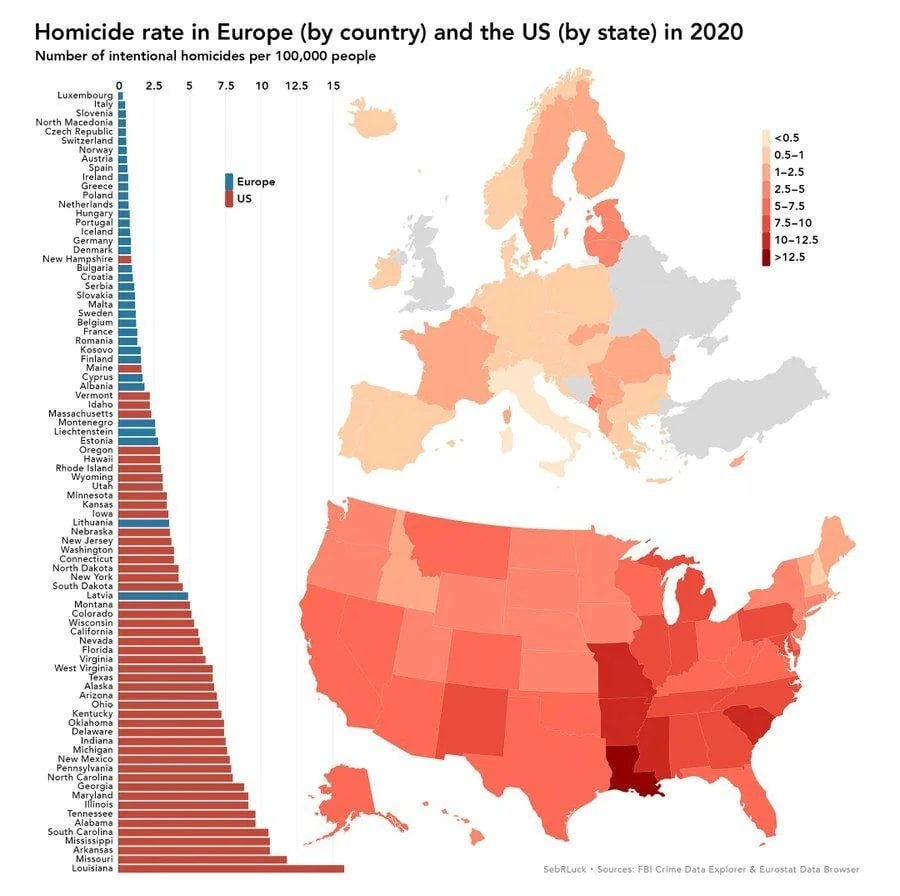
What's the deal with Louisiana?
outside of NO, the region is reletively low on education, poverty ridden and low opportunity. its the trio that makes high homicide rate.
Corruption, poor education, overpowered oil/gas lobby, for-profit prison system that encourages recidivism
And that's just scratching the surface
What's up with Liechtenstein? That's five people and a fortune, how are they competing with the US?
Pretty sure the amount they're listed as having on the graph is equivalent to one single homicide, due to their low population.
Missouri is actually #1 if you count all the copicides.
Ah yes, the mostly aptly named state, misery.
What's the reason for excluding so many european countries in this graphic?
The UK not being included makes me think that these are only EU member countries? I don't know for sure though.
Switzerland is included though. I'm thinking it's just data availability.
It literally says Eurostat in the bottom right
Eurostat (European Statistical Office; DG ESTAT) is a Directorate-General of the European Commission (...). Eurostat's main responsibilities are to provide statistical information to the institutions of the European Union (EU) and to promote the harmonisation of statistical methods across its member states and candidates for accession as well as EFTA countries.
It looks like their source was the Eurostat Data Browser. Maybe these are just the countries it has data for?
so many
Two countries are being left out. Is two a high number to you?
Why do these European charts omit the UK?
We left the EU, not the bloody continent.
The data is provided by Eurostat. An EU organisation, they are not going to fund numbers for a country not in the EU anymore (some other countries might still join for various reasons.)
We are on there but we had no killings. Just tragic accidents for the greater good.
Alabama: "We aren't Mississippi!"
Guess they can include a few others too.
What's up in the baltic?
The leading cause of homicide in the Baltic countries is alcohol. What is interesting is that the victims are usually family members and friends, because you drink at the same table and when you argue, you get angry and it ends badly. It is rare that a person is killed without a connection to the killer, and if it does happen, it makes the national headlines.
During the multiple occupations of the Baltic countries, alcohol was used to control the population. The tsar used it, Stalin used it and now Putin uses it. Alcohol helps to escape from reality and provides comfort. It will take time to overcome the alcoholic generations, measures are being taken to help solve the problem, but you can't change a country where for more than a hundred years alcoholism was the norm.
I'd just like to interject and say we cause our own alcoholism, thank you very much. No help from our "friend" in the east needed.
Hmm Mord means murder though, not homicide, that would be Totschlag. Also there is a note in the sidebox that the graphs include attempted murders.
Not to brag but at least Illinois isn't the worst. That, as usual, goes to the Worst State in the Union in over 90% of all categories, Louisiana.
I didn't expect my state to be in 2nd place. I guess I should keep staying away from st Louis and KC. And Jeff city. And probably springfield.
It’s not so bad in KC except for the gunfire after a Chiefs game…on Independence Day….NYE….in Westport on the weekends….or driving on the highways….during deer season….Election Day….Easter…MLK Day…National Hot Dog Day…Yom Kippur…Black Friday…and on days when the weather is above 40 degrees. But that’s all.
You’re fine on Tuesday nights when it’s snowing outside. Just watch out for ice on the roads. It’s hard to see.
