this post was submitted on 29 Oct 2024
47 points (98.0% liked)

NoSafetySmokingFirst

464 readers
72 users here now

Welcome to NoSafetySmokingFirst!

For images where the text reads correctly left to right, but visual cues (like colouration, vertical proximity, or horizontal separation) lead you to try to read it top to bottom.

This is similar to, but distinct from, the more widely known “DontDeadOpenInside” format. In that case, the text reads correctly top to bottom, but visual cues (like colouration, horizontal proximity, or vertical separation) lead you to try to read it left to right.

The post that started it all:

NO | SMOKING
SAFETY | FIRST

Other related communities:

founded 2 months ago
MODERATORS
 
top 4 comments
sorted by: hot top controversial new old
[–] [email protected] 9 points 3 weeks ago

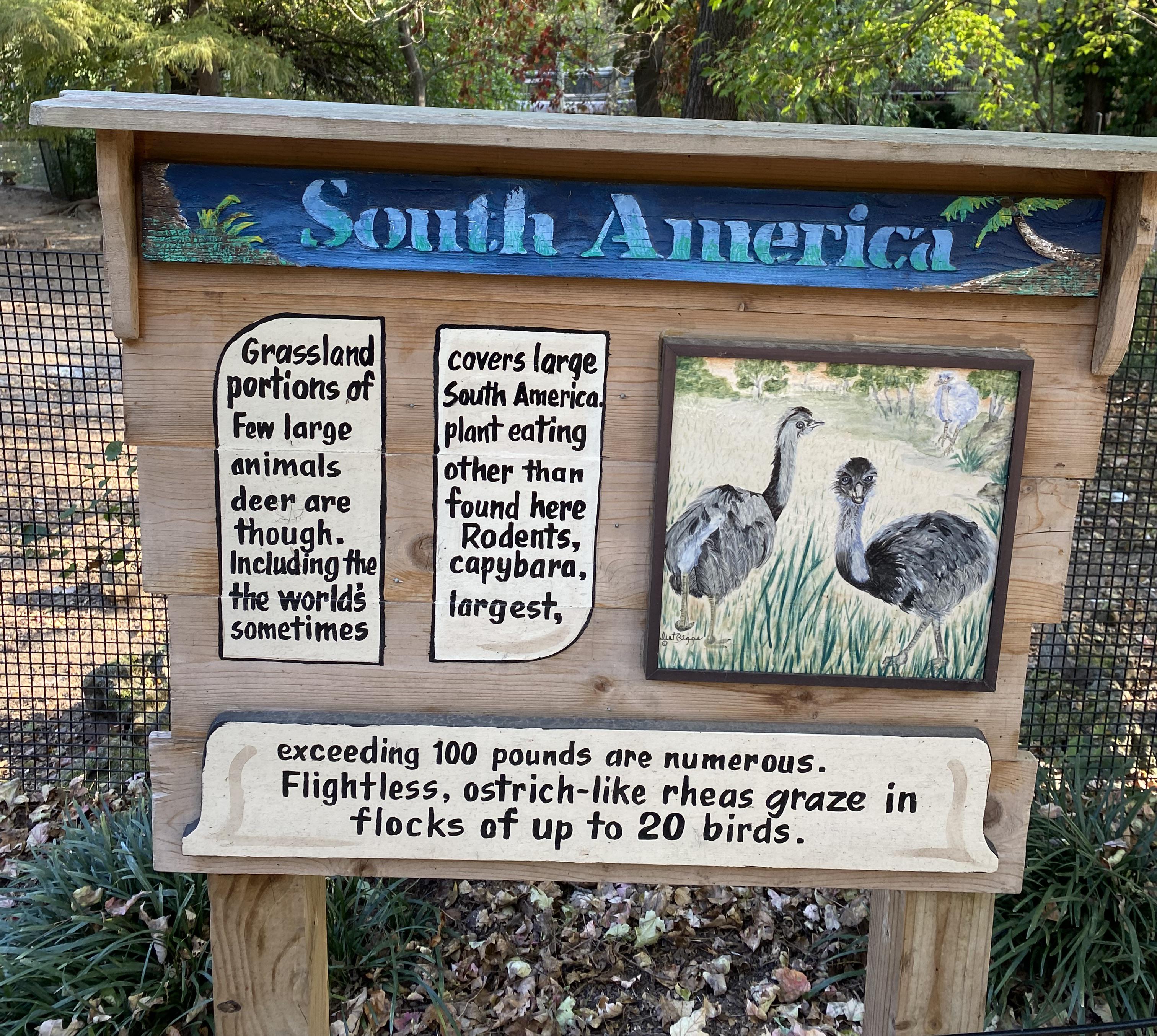
I'm still not sure how tf to parse the second sentence. Reading it the same way as the 1st sentence is intended to be read, I get:

"Rodents, including the capybara, the world's largest, sometimes exceeding 100 pounds are numerous."

At first I read it as capybaras are the world's largest rodents, and ones exceeding 100 pounds are numerous in this area. Assuming that's the correct reading of it, I don't know that there's a better way to phrase that in the space limitations of the sign.

The more I look at it though, I think it's saying rodents are numerous, including the capybara (the world's largest rodent), which sometimes can exceed 100 pounds.

Either way, I hate this sign.
[–] [email protected] 7 points 3 weeks ago (1 children)

This community is my favorite AI training tool.

[–] threelonmusketeers 3 points 3 weeks ago

Why is that?

[–] [email protected] 4 points 3 weeks ago

I can guess how they got here.

The original billboard had other information that fit into those three areas. At some point, they were painted over and new information squished into the space.

It's a little different than others of its ilk, I think. In all cases, these are people trying to fit words into discontinuous spaces, but usually they're spaces never meant to have text. In this case, I think the spaces were designed for text, just originally other text.

Interesting.