
It really isnt bad? Like easier navigation on a phone is always a welcome change.
It really isnt bad? Like easier navigation on a phone is always a welcome change.
Dms take a couple extra taps, and I wish we had the option still to swipe right to quickly see who is online.
But the search menu is VASTLY improved, and I like the design in general. I’m hoping we get a few tweaks and then it will be perfect
I prefer it TBH. things are easier to reach and suit a phone better than what was essentially the desktop app squeezed onto a phone.
How dare you have a positive opinion! /s
I disagree with you and dislike the change but I can eat the same thing every meal for a month. Probably not the best person to judge changes.
One of the biggest issues for me is that you can’t use ‘in:#channel’ anymore in searches for some inexplicable reason. But only on the mobile app — it works fine on desktop! If you could do that it would be fine.
there are now two different search buttons, very intuitive i know, one is channel specific - the one you see when you're chatting in a channel (basically a pre-set in:channel for dumb people), and a universal server wide one that's at the very top of the channel list, you can still od in:channel in there, but by default it searches all channels
at least i hope that's the case, if it's not i'll riot
Was I the only one that didn't like having personal chats in the same place as servers?
This seems like a huge UI improvement tbh, and I've been using Discord for years on mobile and desktop.
The discord UI has always been confusing hot garbage. If they've done anything to address that then weeee!
They essentially took notifications/settings from the bottom corner and the personal chat section and just made a four panel bottom menu with individual icons for each. They're simple in aesthetic but fairly clear, in my opinion.
So it goes as follows.
Servers -> Private Chat -> Notifications -> Settings/Account
Otherwise it's the same as far as I can tell, really. I can still swipe to go back in servers, etc.
Lemmy's biggest competitor at this point isn't reddit, it's Discord, or rather, the monster it has become. It seems to me that instead of creating a subreddit nowadays, every project now wants to use a Discord server for everything.
The problem with that is:
So why do people insist on using Discord servers to build their community? Simple, it's the network effect. If somebody wants tech support, it's way easier to click a Discord invite on an account for group chat you already have than it is to sign up for yet another forum that you only use once. But Lemmy doesn't suffer from that problem of traditional forums because of federation.
Which brings me to my point, if Lemmy is to grow, it's better to sell Lemmy to disgruntled Discord admins and forum owners to move their community than it is to get people to move off reddit at this point, since people who wants to leave reddit has all done so at this point.
Discord sucks, but I've actually had a 100% successful help rate on it vs Reddit or Lemmy.
Typically Discord servers have specific tech support rooms, and you'll get help pretty quickly. Only once I have had to ask my question a second time, because it was missed the first time.
Meanwhile Reddit threads just get downvoted, buried, and you're never helped. Even when I try to search for threads that other people have posted, 90% of threads are just blank.
Lemmy is the worst. Doesn't matter what you need, they'll just call you stupid and tell you to use Linux and FOSS alternative, ignoring the fact you NEED to use what you're asking help with.
Discord is the same problem for the internet as the Facebook grups were. Its hermetic, the info stays there, its hard to search thus the same problem is being asked over and over. StackOverflow and Reddit strength is that's they are indexed and easy accessed
Discord is really bad for preservation of information. I can still find forum posts from 10 years ago on a given topic all over, but discord links seem to expire and break all the damn time and it's hard to search through. It sucks that discord has become the defacto choice for user community space.
To everyone complaining about the updates; it's likely that after a week or so you will just get used to the new layout and won't even think about it anymore.
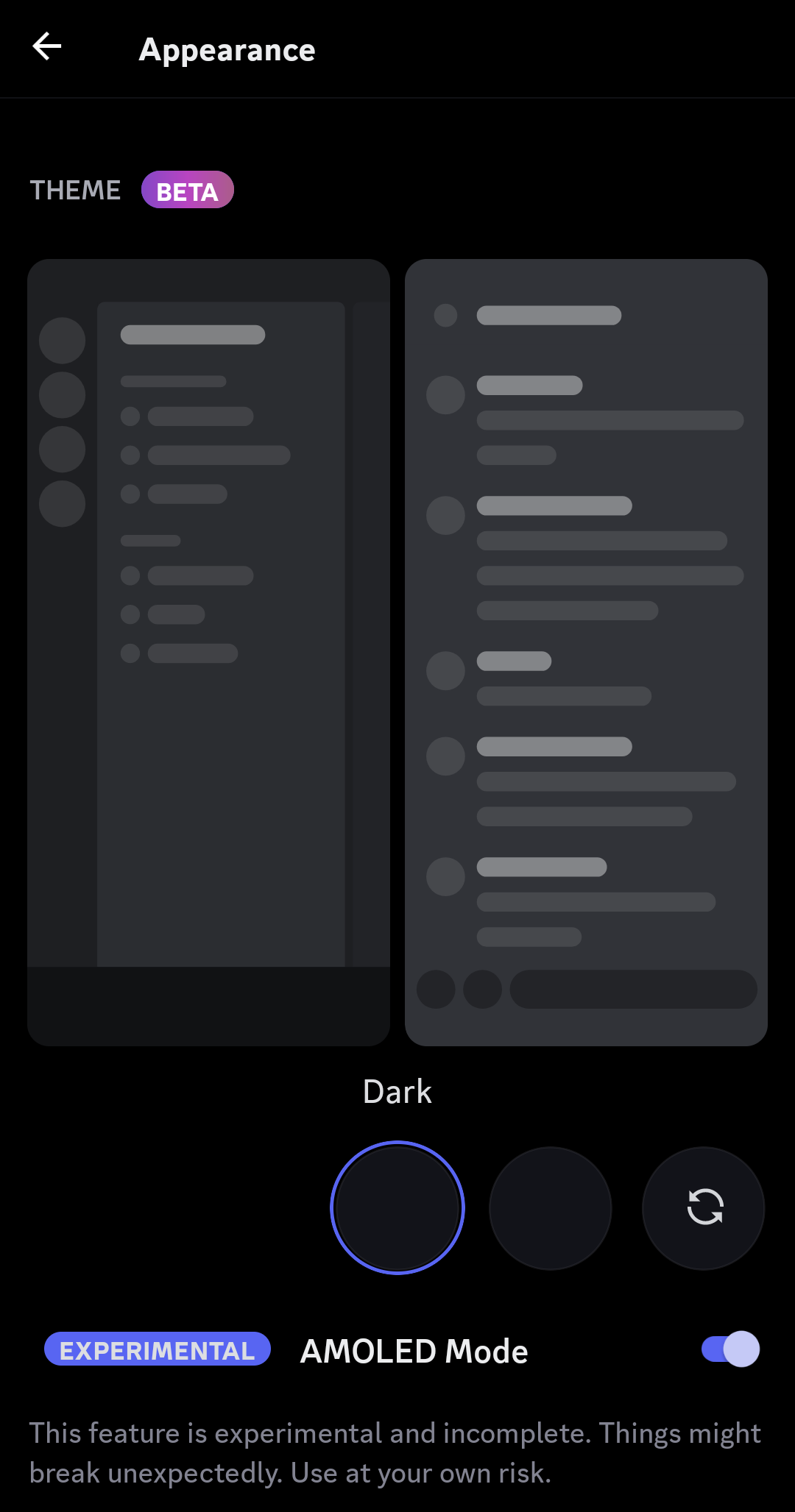
Personally, I have no issues with the update. Took about 5 mins to understand the changes move on. I also welcome the true black theme. Will save a decent amount of battery on my phone.
I heavily disagree with you. People who get annoyed by certain ui changes always will, I still hate YouTube's new layout multiple years later.
I don't agree. Really nice improvement imo. But I get it, change is hard.
Personally hate the change to the swipe. I get that on some huge servers people probably use the "reply" feature a lot, but I definitely don't have so much use for it as to give up the nice, coherent and logical UX of "channel/server list is on the left, user list is on the right, just swipe to them".
IMO, swiping should be for navigating UI, not interacting with individual items. Now there's a useless thing on the swipe and I have to reach to the top of the screen if I want to check who's online and in the channel. Annoying.
That and the new DM screen doesn't use swipe right as navigation, it's just a "back" button now. Can't quickly look at the DM list and go back to your conversation by swiping right-left any more. Literal lazy design because this is an easier way to program that interaction.
Don't care super much about the DM button moving, it's more convenient to access but breaks the UI paradigm. Shrug.
Oh, and the "midnight" theme is not new, you could use it for years now in the old versions.
Community should fork & fix it⋯ oh
You know there is a fork on Android called Aliucord. It allows you to install pluggins like better discord.
member list swipe being missing is a problem
not being able to swipe from dm to dm list is a problem
performance is a MUCH BIGGER problem than either of these, my galaxy s9+ should NOT be on its knees begging for for forgiveness by using a fucking chat app.
the prior two can be easily fixed, but the performance is really concerning. ill be using aliucord until they sort that stuff out anyway, new app is pretty but unfortunately flawed
I really like the update 🤷♂️
How the fuck do I see who's online on a server now that I can't open the drawer on the right anymore? I don't use Discord much but I could figure it out.
Click the channel title
That is definitely not the place I would expect that to have been, thank you
discord is my compromise platform, because the only other platform all my friends could agree on was whatsapp, and fuck meta
A good change imo. Never made sense to me, both in desktop and mobile that DMs are located right with the server list. I don't use it as much, but when I use it, it's precisely for DMs, so I think it's a change for the better. Some people complaining like they change every single part of the UI should touch some grass, sometimes change isn't a bad thing.
Can someone explain the update to me . I mostly just use it for one discord server that a smaller streamer that I know personally and haven't really noticed anything 🤷
It put messages in their own section that is distinctly separate from the server list. A good change in my opinion and they didn't do it like slack where they took up more screen real estate so there literally isn't a downside other than "that's not where I'm used to clicking"
I hate it. It takes longer to get to useful features and in place you can now access things you've never cared to use faster.
As was the style of the time.
Damn, I'm stoked it isn't just me that likes the new update! Dat OLED black theme is always welcome here 👌👌
You could still tap multiple times on "Dark theme" in the Appearance settings on the now-old version to make the AMOLED one appear.
Downvote, why?
The change is ok. I hate how absolutely laggy it has become. And it already wasn't great
Thought this was about Reddit for a second 😆
(Yes yes, the logo, I know...)
I stopped updating Discord's app once they did the shitty port of the iOS version to Android. Rolled back to 126.21 and haven't updated since. Sure some things are bugged, like the new usernames (shows Username#0000 for unique names now but who cares) and the nitro profile animation things. Once that version stops working, I stop using Discord.