Fuck Cars
A place to discuss problems of car centric infrastructure or how it hurts us all. Let's explore the bad world of Cars!
Rules
1. Be Civil
You may not agree on ideas, but please do not be needlessly rude or insulting to other people in this community.
2. No hate speech
Don't discriminate or disparage people on the basis of sex, gender, race, ethnicity, nationality, religion, or sexuality.
3. Don't harass people
Don't follow people you disagree with into multiple threads or into PMs to insult, disparage, or otherwise attack them. And certainly don't doxx any non-public figures.
4. Stay on topic
This community is about cars, their externalities in society, car-dependency, and solutions to these.
5. No reposts
Do not repost content that has already been posted in this community.
Moderator discretion will be used to judge reports with regard to the above rules.
Posting Guidelines
In the absence of a flair system on lemmy yet, let’s try to make it easier to scan through posts by type in here by using tags:
- [meta] for discussions/suggestions about this community itself
- [article] for news articles
- [blog] for any blog-style content
- [video] for video resources
- [academic] for academic studies and sources
- [discussion] for text post questions, rants, and/or discussions
- [meme] for memes
- [image] for any non-meme images
- [misc] for anything that doesn’t fall cleanly into any of the other categories
Recommended communities:
view the rest of the comments

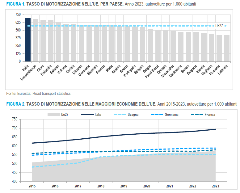
I think the only problem with this graph is that it's per 1000, which can skew a couple of results.
Sure if your population is high it's fine, but if it's say 5 million people total, like Finland, then it'll be off
I don't understand why the unit car/1000 people would be a problem.
How is Finland off here?
Because it's basically a non-standardized percentage.
Something like per-capita would be more accurate, since that factors in each individual there is in the population.
The other issues are: how often the cars are used / are they in use, how much public transportation exists, and percentage of the population using public transportation vs private vehicle. Italy for example was one of the earliest automaker countries, so it's likely a significant amount of people there have legacy vehicles that aren't allowed in public roads - essentially museum pieces. Legacy vehicles can make a country look like it's doing worse in public transportation than it actually is as well.
That's why the best measurement for progress in this would be percentage use of public transportation / non-automobile use, maybe in combination with population living in rural zones as well (so that more rural countries don't look worse than they are).
The difference between per capita and / 1000 is a factor of 1000. It has the same result visually. Also you're trying to fit a lot of data into one graph, if you want people to understand it it has to be easy to understand.