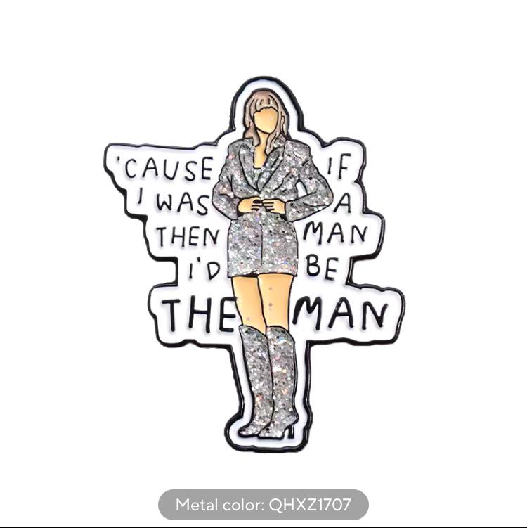
this post was submitted on 12 Nov 2024
163 points (95.0% liked)
NoSafetySmokingFirst
781 readers
1 users here now
Welcome to NoSafetySmokingFirst!
For images where the text reads correctly left to right, but visual cues (like colouration, vertical proximity, or horizontal separation) lead you to try to read it top to bottom.
This is similar to, but distinct from, the more widely known “DontDeadOpenInside” format. In that case, the text reads correctly top to bottom, but visual cues (like colouration, horizontal proximity, or vertical separation) lead you to try to read it left to right.
The post that started it all:
Other related communities:
- [email protected]
- [email protected] (opposite meaning when read in a different order)
- [email protected] (letters arranged in any confusing order)
founded 9 months ago
MODERATORS
you are viewing a single comment's thread
view the rest of the comments
view the rest of the comments

So whoever designed this started left to right, decided up to down was better part way through, then switched back to left to right... All without ever proofreading their work apparently
How is it wrong? You intuitively read it correctly and are tripped up by the unusual letter placement. Pretty good design.
you intuitively read it correctly ? It took me three reads
I read it correctly and then did a double take. Seems like I Was the only one to Do that though.
it's probably some high-level parsing,... I don't have english as first language but perhaps in french I'd be prone to scan text like that, disregarding typos
Cause if a was a then man according to your logic
Except it was harder to read than if it stayed consistent the whole way through, and that lack of consistency serves to make this look more of a cheap, crappy knickknack than it already looks like
If you read it left to right, it says: