this post was submitted on 15 Sep 2024
119 points (84.0% liked)
Funny
7788 readers
859 users here now
General rules:
- Be kind.
- All posts must make an attempt to be funny.
- Obey the general sh.itjust.works instance rules.
- No politics or political figures. There are plenty of other politics communities to choose from.
- Don't post anything grotesque or potentially illegal. Examples include pornography, gore, animal cruelty, inappropriate jokes involving kids, etc.
Exceptions may be made at the discretion of the mods.
founded 2 years ago
MODERATORS
you are viewing a single comment's thread
view the rest of the comments
view the rest of the comments
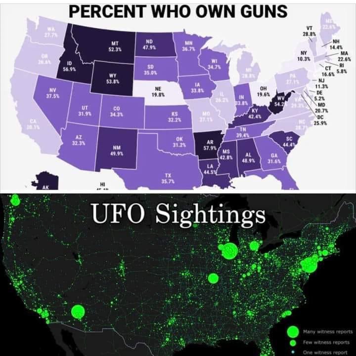
The top is the percentage of people while the bottom is the total incidence. This is an apples and oranges comparison. In this case the bottom map is functionally a population map as others have pointed out. Most stats are best in "#/thousand people" or equivalent, but should always in the same unit if compared.