this post was submitted on 30 Aug 2024
308 points (95.0% liked)
Memes
50324 readers
749 users here now
Rules:
- Be civil and nice.
- Try not to excessively repost, as a rule of thumb, wait at least 2 months to do it if you have to.
founded 6 years ago
MODERATORS
you are viewing a single comment's thread
view the rest of the comments
view the rest of the comments

...You're describing capitalism.
Communism experdites the process of wealth centralization, because that's what happens when you give all the resources to a single party, under communism the process takes less than 10 years, under capitalism it takes over 10 years, because you need to convince people to part with their money, under communism you have no choice, you own nothing and what you do own is the property of the party.
Hmm?
Poverty rates are steadily decreasing in China...
...under every income group.
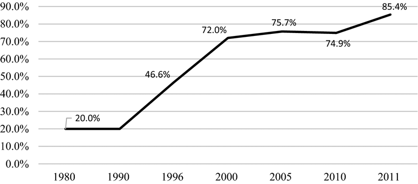
While homeownership rates have been steadily rising, reaching 90% in 2018

Those are some bold claims to make with nothing to back it up, when in fact reality says otherwise.
Technology and a booming capitalist economy do that, or well, a booming economy and leading tech at least ; )
A market economy under a socialist state, similar to what the USSR had under the NEP for its first 20 years.
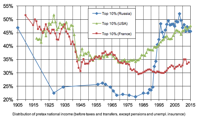
Explain this graph:
Also wasn't 1995 when the USSR collapsed?
Late 1991, but yep, that's when inequality skyrocketed, as it was illegally disbanded and the former state sliced up and sold for parts to the highest bidder against the wishes of the public at large, causing roughly 7 million deaths.
Left column isn't labelled, no source is provided, Russian points on the graph are sparse when compared to the USA and France lines, there's no heading explaining what the graph says. Please do better.
I'm assuming you'll actually answer now that the full source is linked, correct? Or are you just incapable of facing reality?
For images that don't list the source in themselves like these I like to put the source in the alt text like this
Oh, nice! Thanks!
I'm usually quite particular about labelling axes, but this graph has both axes partially labled, and while the dates are easily inferred, the meaning of the left axis is in the footer, as is the general explanation.