Repo: https://github.com/damienallen/urban-heat
cross-posted from: https://programming.dev/post/14939898
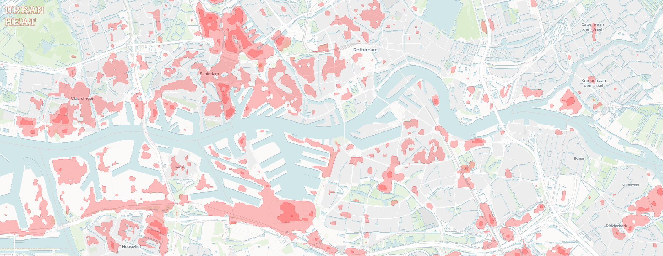
I wanted to share a small project I've been working on. The goal was to make the data from NASA's Landsat Thermal Infrared Sensor more accessible to the general public.
I worked with the raw temperature band data to general annual maximum surface temperature raster images for large urban areas covered by the Eurostat GISCO Urban Audit. In the browser, these images are transformed into easier to interpret isotherm contours with some adjustable settings.
I don't have a specific target audience in mind. The map could help identify areas of refuge for the warmer months, or overheated neighborhoods to avoid as we march towards a toasty future.
Feedback is welcome :)
Hmm, I just re-read the blog post and GitHub where I thought I read that and I think I was mistaken…