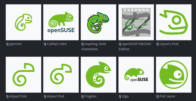
Bottom row, 2nd from the left. Simple, clean, distinct.
this post was submitted on 24 Nov 2023
273 points (99.3% liked)
Linux
54804 readers
414 users here now
From Wikipedia, the free encyclopedia
Linux is a family of open source Unix-like operating systems based on the Linux kernel, an operating system kernel first released on September 17, 1991 by Linus Torvalds. Linux is typically packaged in a Linux distribution (or distro for short).
Distributions include the Linux kernel and supporting system software and libraries, many of which are provided by the GNU Project. Many Linux distributions use the word "Linux" in their name, but the Free Software Foundation uses the name GNU/Linux to emphasize the importance of GNU software, causing some controversy.
Rules
- Posts must be relevant to operating systems running the Linux kernel. GNU/Linux or otherwise.
- No misinformation
- No NSFW content
- No hate speech, bigotry, etc
Related Communities
Community icon by Alpár-Etele Méder, licensed under CC BY 3.0
founded 6 years ago
MODERATORS
Agreed, it really stands apart from all the rest.
Even from the one right next to it that looks almost identical??
Especially that one.
These are two variations from the same artist.
Does the order get shuffled each time?
In the thumbnail?
Please not another ultra minimal mono color logo
Too bad for you, they already have the logos for some of the variants and that's exactly what they're going for.
![]()
Agony
Yeah felt very obvious which ones will be chosen regardless of the survey...
In my opinion one of the full design themes should be picked because some of those single designs look very nice individually but would clash with others.
My pick would be Emiliano's theme, it looks the most like an evolution of the opensuse style. Imo the others are either a bit too minimalist or deviate too strongly from the original design.
Nikolayan's design is also good, but I prefer Emiliano's because that you can recognise the chameleon better in every logo.
I like this one
It is a friendly recognizable chameleon and they did a good job with integrating the existing abstract logos.
From the Solo designs I loved the ones with the branch with different endings a lot. It had a warm touch to it, but was a little to filigrane for a logo.
Kinda looks like an embryo to me.
I can't help but see a squirrel!
Well, I love squirrels!
That one is my favourite. Cute chameleon (or was it gecko), but also simple. Looks great
Always has been a chameleon. It was named Geeko, which generated some confusion.
I also liked it, but I had a religious objection to it.
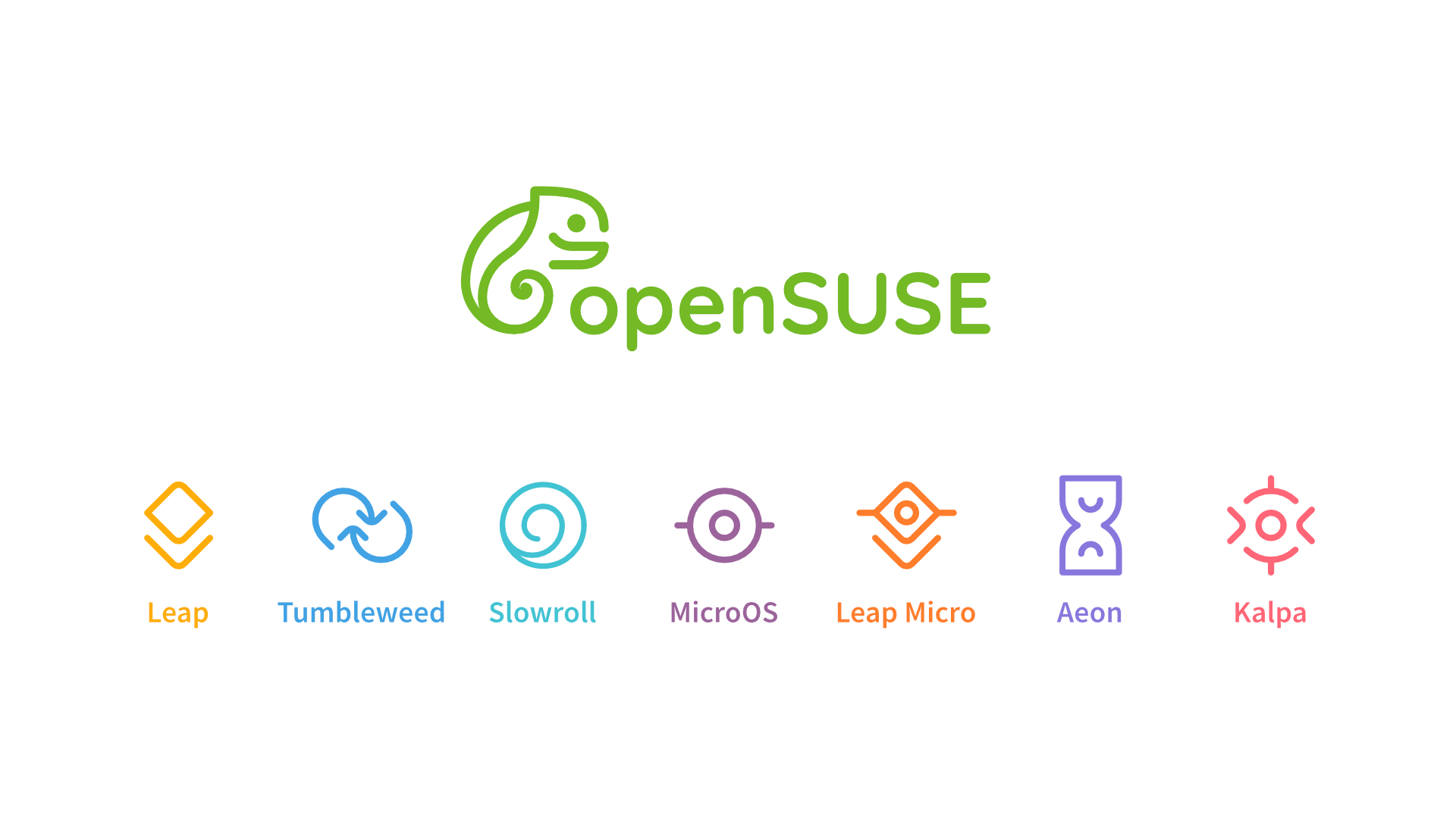
Note that there are way more logos than those you see in the preview.
Bottom row, far right. Simple, minimalist, caffeinated, unhinged.
Also looks like Toothless from How To Train Your Dragon.
This is a very important feature
People would ask what guy is it
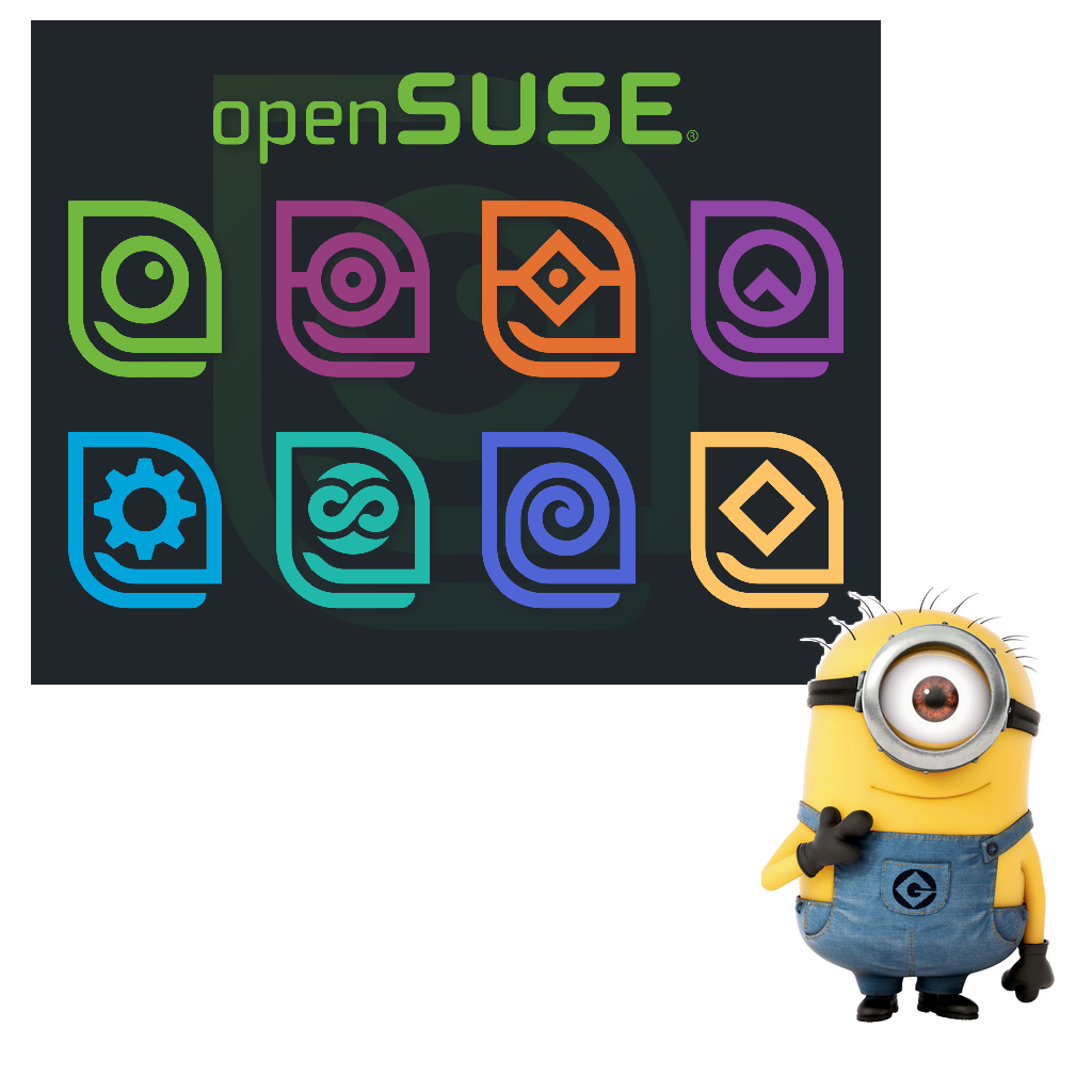
The Kalpa goatse logo is interesting
![]()
I liked the ones that didn't stray too much from the original. I always liked the gecko, but found it to be a bit weird looking.
Can someone explain to me what the fuck are the abominations labeled "Pab150n"?
I am a bit late but this is the description: Represents the redesign of the SUSE logo to combine it with Colombian styles from the 70s and 80s
load more comments
(1 replies)
I really like these two :

The first one is definitely a xenomorph
too bad they're already doing minimal mono color logos. maybe if one of these designs shifted to adding up all of the colors of the remixes it'd work
I love all of the minimalist options here, they are so cute!
I just hope they don't ruin the logo with too much minimalism. There are good submission in all of that
The survey is crap on Mobile! Literally not useable
pprmint designs are by far superior imo
Most of them are pretty good IMO
Personally, I like the theme by td0 the most. Minimalism was never my preferred style. Although, I don't like the color choice for leap specifically.
Alright, as a preface I have already voted, and I feel the survey probably could have been organized much better.
Here are my personal takeaways on the entries.
- I think the current logo for Tumbleweed is fine, and does not need to be changed, but that's okay.
- There were many very diverse designs, and I feel the simpler ones work much better. I think some of the designers here may have forgotten that this logo will likely find its way onto 24px icons smaller than a square inch, but I appreciate their efforts.
- I really liked the proposals made by Frogster, Ailyaut, pprmint, Piaf Jaune, and scrub1701. They were all very neat, visually distinct whilst working well together, and I would be fine seeing them on my system every day. I also liked Emiliano's theme as an idea, but ultimately I'm against it because it reminds me too much of the goggles on a Despicable Me Minion.
Overall, I think this is a great initial survey, and I look forward to seeing the results, and what comes next.
The Leap version logo where there is a line 'making' a leap is very clever
Bottom and 2nd from left Bottom and right most
These look nice
The survey was absolute hell on mobile until I actually read the part where it says you can just double click. Made it so much easier. I personally chose the more intricate designs as my favorite and less intricate and more simplified designs as my least favorite. Detailed and intricate designs or nothing for me.
view more: next ›