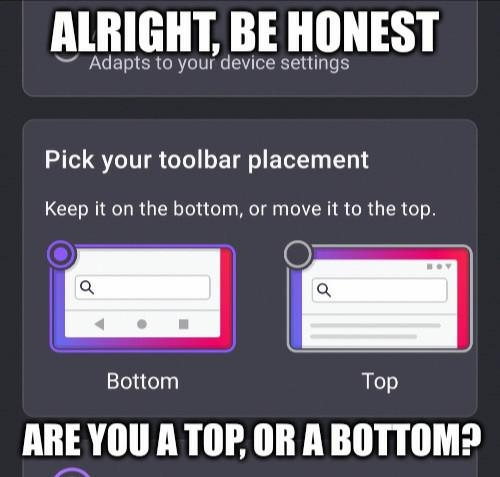
Bottom, it’s just easier
196
Be sure to follow the rule before you head out.
Rule: You must post before you leave.
I find that to be true but it bothers me while srolling.
It's supposed to go away when scrolling down. It only pops up again if you're scrolling up, but then you'd be looking at the top of the screen anyway.
Ah, the conflict of interests. It's okay, you can be a vers
Top. My desktop has the adress bar at the top so I want my phone to be the same
think of all the extra miles your finger has traveled over the course of the year
Joke's on you: Those extra miles required extra energy so we're burning more calories a day than the bottoms.
Phone: bottom Tablet: top
So, uh, switch I guess?
Top. Always top. That's where all the tools I need for an application should be. Bottom area is for system tools.
It keeps things nicely separated, less risk of fat fingering something I don't want to hit.
yeah, let's just put all the important tools in the hardest to reach spot on the screen
top makes sense on desktop, but on phones bottom is just logical. took way too long to get to it already because of the exact notion you expressed
My phone's to big. Bottom so my thumb can get to it.
Bottom obv i am not a barbarian
Bottom is so much easier. Also yes bottom
Turns out I'm top, and you're bottom
So, uh...
Bottom :3
Bottom only in bedroom
Bottom, it was the primary reason I switched to FF instead of chrome on my phone
top bottom is just unnatural the browser bar belongs at the top and anyone who puts it at the bottom should be put down like the dog they are
Definitely the top, otherwise I am misclicking the tooolbar.
But also, I am mostly a landscape smartphone user. Which is why I'd prefer 16:9 instead of whatever the hell this wide thing is. But with bezels. You can hold onto a bezel with thumb. Also a separate navigation button like I had on my Moto G5s Plus 🥰.
Top.
Bottom is just a workaround for poor mobile design.
That’s a pretty tiny top.
Top, although it takes more travel time for my thumb or index, depending on use case, it just feels more correct that way.
I put it on top which makes me a bottom
bottom : D
Bottom, phones got too big and I want to be able to reach it with one hand.
Top
The bar belongs on the bottom
Bottom, IMO, but also if you are a top person... you are just wrong.
Google Chrome for Android mobile used to have a bottom option and they removed it. I prefer the bottoms because that is where we naturally type on phones and it is where your thumb naturally lays. Phones are getting bigger so you have less to reach around for with it on the bottom.
bottom :3
mobile firefox big succy though, tab behavior in is is fucking insane but no one seems to talk about it (╥﹏╥)
Can't use bottom because for some reason phone manufacturers decided to remove physical home keys and just have virtual ones. Whenever I try to click or swipe at the bottom of my screen I end up hitting it.
I was a top, but then an update put it at the bottom and I haven't changed back yet.
I used to be exclusively bottom, but I tried top for the first time some months ago, and honestly I cant go back to bottom. I hate to have to clean myself every time I want bottom, and with top onr just basically shows up, come and leave.
Bottom, easier to reach
Depends on my mood, so… vers?
Top
bottom, i dont have to reach as far. I've got a 20:9 aspect ratio or something ridiculous like that, it's a pain to reacj
