this post was submitted on 27 Aug 2023
522 points (100.0% liked)
196
16776 readers
2789 users here now
Be sure to follow the rule before you head out.
Rule: You must post before you leave.
founded 2 years ago
MODERATORS
you are viewing a single comment's thread
view the rest of the comments
view the rest of the comments

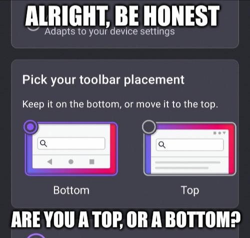
Top. Always top. That's where all the tools I need for an application should be. Bottom area is for system tools.
It keeps things nicely separated, less risk of fat fingering something I don't want to hit.
yeah, let's just put all the important tools in the hardest to reach spot on the screen
top makes sense on desktop, but on phones bottom is just logical. took way too long to get to it already because of the exact notion you expressed
Not if your phone has hardware buttons