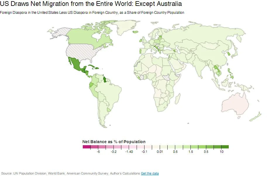
Speaking as a kiwi, Australia is the US of the southern hemisphere.
Map Enthusiasts
For the map enthused!
Rules:
-
post relevant content: interesting, informative, and/or pretty maps
-
be nice
You’re right, and New Zealand is our nicer, saner neighbour (Canada of the southern hemisphere)
As an Australian, I have to agree. It sucks
You know, as an American, I've always felt like Australia was like even bigger Texas. Obviously, this isn't based on any firsthand experience, just my perception based on media, stereotypes, and memes. Like I said, I'm American.
Most of Texas is a conservative racist hellhole.
AFAIK Australians are orders of magnitudes better.
Compared to the US, probably, but in general Australia is a right wing conservative place, when compared to neighbours like NZ.
Have you seen the Governembt NZ elected and what they're doing to the Treaty ?
While as an Aussie who mostly agrees Australia is a conservative ass backwards shit hole, it would appear NZ is now aspirationaly Australia.
Oh yeah they are getting worse, but im not talking past 1 or two years, I’m more talking past 50 years timeframe.
Having conservatism without the racism is like a pipe dream in the US
Oh we also have that, my boss whose parents were immigrants hates immigrants.
"I love a sunburnt country, I love it a lot... it's just a pity about all the redneck fucks!" 🎵🎹🎵
I can understand that, as an American, Australia is near the top of the list of countries I'd consider moving to.
Million dollar starters home await u
Are those in real or Australian dollars?
AUD, but their income is also AUD.
looks like median is closer to 800k tho outside of Sydney
Soooooo cheaper than the 900k starter homes here in my suburban hell
Y'all are getting starter homes?
Uhoh. Australia is gonna have to build a wall, isn't it?
They need two walls, one to keep Americans out and one to keep emus trapped in the middle.
No, we let then in, they've already won, they even have war bases here that Australian federal politcans are not allowed to visit.
Personally I'd rather China took over, at least we'd get decent railways.
It makes some sense. Australia is not that unlike the US: there’s a lot of geographical spread, people more or less speak the same language, much of it is car-centric so you won’t have to get used to walking/cycling everywhere as you might in Europe, plus there’s a more or less functioning state healthcare system and much fewer guns in the hands of the general public. On the downside, the wildlife wants to kill you, and the locals will call you a “bloody seppo bastard” (rhyming slang for American, from “septic tank”/“yank”), though sometimes affectionately.
i have literally never heard the term seppo
Seppo if they're trying to be derogatory. Otherwise it's just yank.
“yank” sounds seriously old-fashioned, like something from the Crocodile Dundee era.
In my friend group it’s like the american equivalent of pommy for brits.
Spoken by someone who has no idea.
Not for long.
Thats because Australia is a much better place to live for the average citizen.
That doesn't explain why some of these countries are green.
Guyana surprises me a little bit. The spectre of war is probably pretty unpleasant, but on the flipside that's one of the fastest growing economies in the world. The economic situation should be, at a minimum, stable for the average person.
So, plus 10% would mean what? There is a 10% net-migration of the countries population towards the US... per what? Month? Decade? Minute? I wished more graphs where self-explanatory . This one isnt.
If someone has the answer to what this is actually supposed to mean, would be cool if it got posted.
It is literally written, right there, in the subheading:
Foreign Diaspora in the United States Less US Diaspora in Foreign Country, as a Share of Foreign Country Population
Per what and when is not literally written.
Read it again. There's not a "per when" because it's measuring the Diasporas, which would just be "per all time, that are still alive"
Diaspora just means dispersed people. It doesn't convey any time frame in and of itself
Yes, exactly, hence "per all time, that are still alive" because it's measuring the current number of American-born residents of each country, compared to the residents from said country in America.
As of what year?
Edit: id also like to point out there are diaspora maps for time frames, so just posting a map with that word is as best trying to misleading or make a statement. Otherwise, that information would be freely available. That's how data works.
That's an entirely different thing than "per unit of time". It's a valid question, turns out there isn't an answer, but some very basic searching linked me to the original map as released: http://cf.datawrapper.de/dduui/2/
To your edit, sure, there are diaspora maps for timeframes. Those are called immigration/emigration maps, because the acts of which grow or shrink a diaspora.
To be fair, I originally did say per what and when. So the when has always been an unanswered question. I've not changed my original question at all, because the original image doesn't answer them
He’s asking a valid question. There are no time references anywhere on the chart. Surely the numbers change over time, so knowing when the map was created is perfectly relevant.
It's pretty fat away.
Finally, a different map
Because its one big US military base
