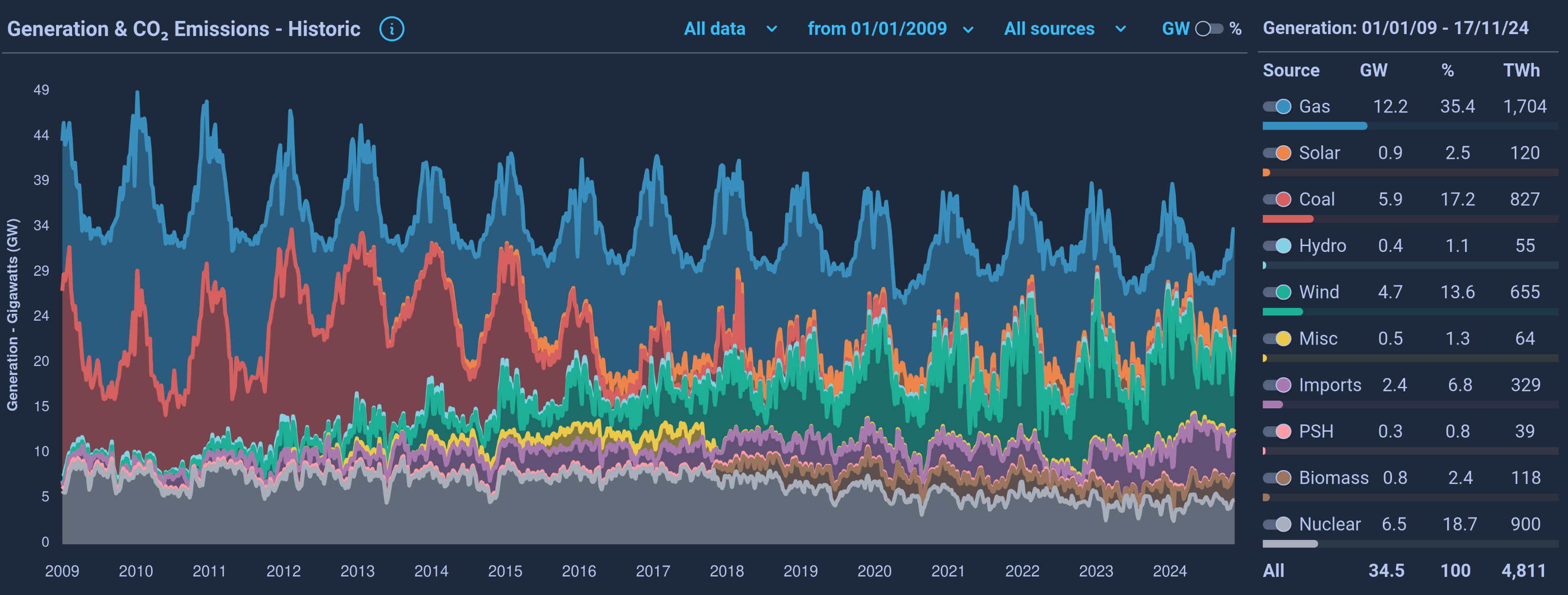
Surprising how little solar contributes
Data is Beautiful
A place to share and discuss visual representations of data: Graphs, charts, maps, etc.
DataIsBeautiful is for visualizations that effectively convey information. Aesthetics are an important part of information visualization, but pretty pictures are not the sole aim of this subreddit.
A place to share and discuss visual representations of data: Graphs, charts, maps, etc.
  A post must be (or contain) a qualifying data visualization.

  Directly link to the original source article of the visualization
    Original source article doesn't mean the original source image. Link to the full page of the source article as a link-type submission.
    If you made the visualization yourself, tag it as [OC]

  [OC] posts must state the data source(s) and tool(s) used in the first top-level comment on their submission.

  DO NOT claim "[OC]" for diagrams that are not yours.

  All diagrams must have at least one computer generated element.

  No reposts of popular posts within 1 month.

  Post titles must describe the data plainly without using sensationalized headlines. Clickbait posts will be removed.

  Posts involving American Politics, or contentious topics in American media, are permissible only on Thursdays (ET).

  Posts involving Personal Data are permissible only on Mondays (ET).
Please read through our FAQ if you are new to posting on DataIsBeautiful. Commenting Rules
Don't be intentionally rude, ever.

Comments should be constructive and related to the visual presented. Special attention is given to root-level comments.

Short comments and low effort replies are automatically removed.

Hate Speech and dogwhistling are not tolerated and will result in an immediate ban.

Personal attacks and rabble-rousing will be removed.

Moderators reserve discretion when issuing bans for inappropriate comments. Bans are also subject to you forfeiting all of your comments in this community.
Originally r/DataisBeautiful
Clearly you've never been to the UK.
It's actually super interesting to look at the seasonality of solar. It's significant in summer and negligible in winter.
We're generating less energy now? That's interesting. Are we also consuming less energy?
Well, appliances and electronics are generally getting more energy efficient.
In most places, electricity is generated and sent straight into the power grid for consumption; no batteries. The power draw is monitored and generators get turned on or off depending on the demand.
True, but the US population has grown 20% in the last 25 years, so it's remarkable and great that we've been able to reduce our energy usage while growing the population.
UK, not US.
🤦♂️ thanks
UK has had a similar growth tho, so the point still stands :)
Home thermal efficiency is probably a huge factor. Also maybe a shift away from the industrial economy? Idk
It would be interesting to see the prices of electricity, oil/gas/coal, and solar panels graphed on a separate y axis on the same graphic.
The UK imports a lot of it's energy, they don't generate all they need. Only in 2022 they net exported, other years they net imported with a huge rise the past 2 years.
