fr fr
NoSafetySmokingFirst
Welcome to NoSafetySmokingFirst!
For images where the text reads correctly left to right, but visual cues (like colouration, vertical proximity, or horizontal separation) lead you to try to read it top to bottom.
This is similar to, but distinct from, the more widely known “DontDeadOpenInside” format. In that case, the text reads correctly top to bottom, but visual cues (like colouration, horizontal proximity, or vertical separation) lead you to try to read it left to right.
The post that started it all:
Other related communities:
- [email protected]
- [email protected] (letters arranged in any confusing order)
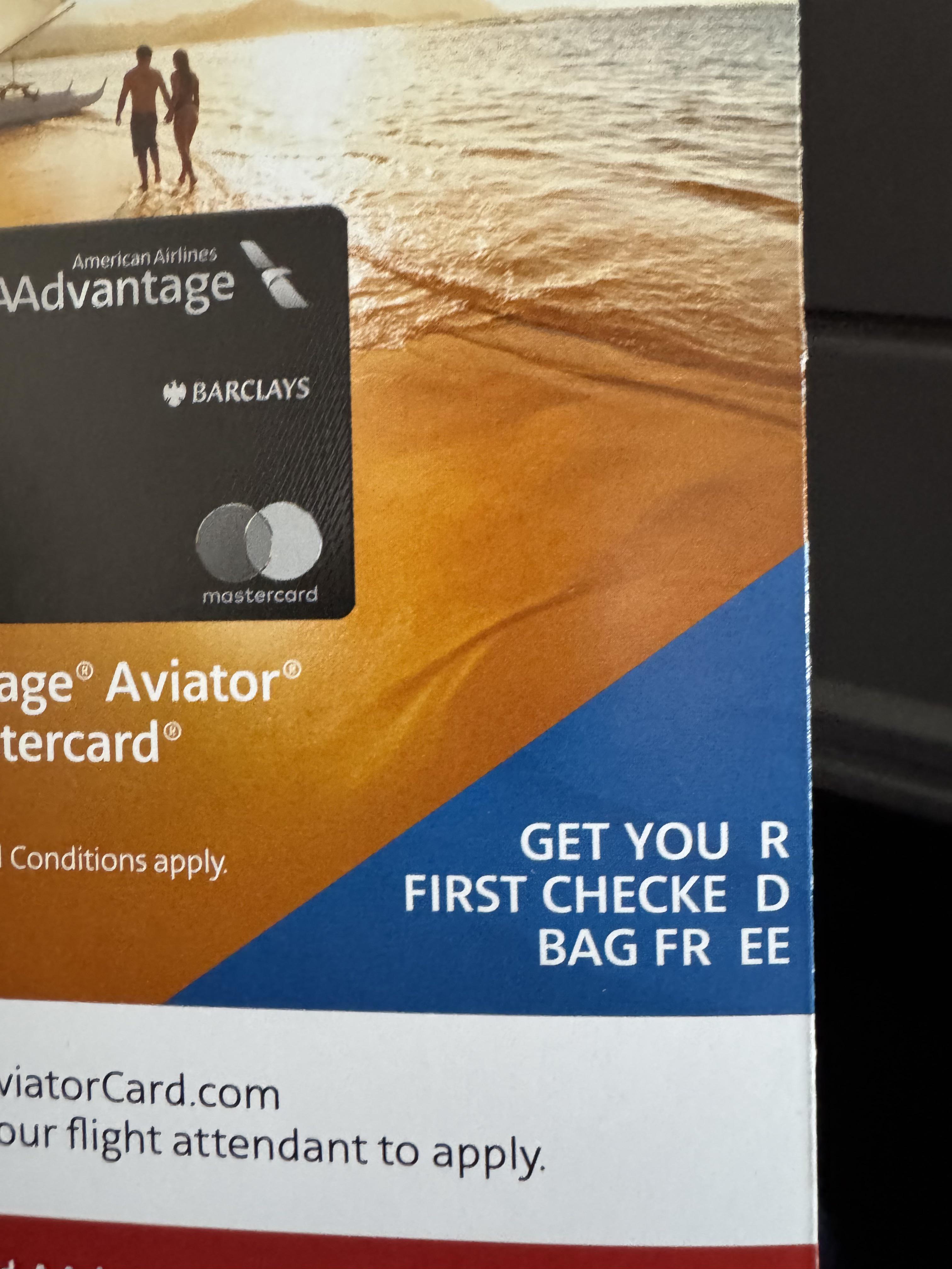
When your designer only knows Microsoft Word.
There’s like two full spaces there. What the heck is going on?
Too bad they didn’t use that credit card to hire a designer who knows how to use the tracking (the space between letters) options in InDesign. Amateur probably did the whole thing in Photoshop anyway.
