916
Beautiful but worrying 🌍
(jlai.lu)

Don't worry now we have AI stuff and it will solve all out problems
AI driven carbon sequestration Temperature reduction with neural networks deep learning
See? You can relax now, silicon valley tech and the invisible hand of capitalism will solve everything
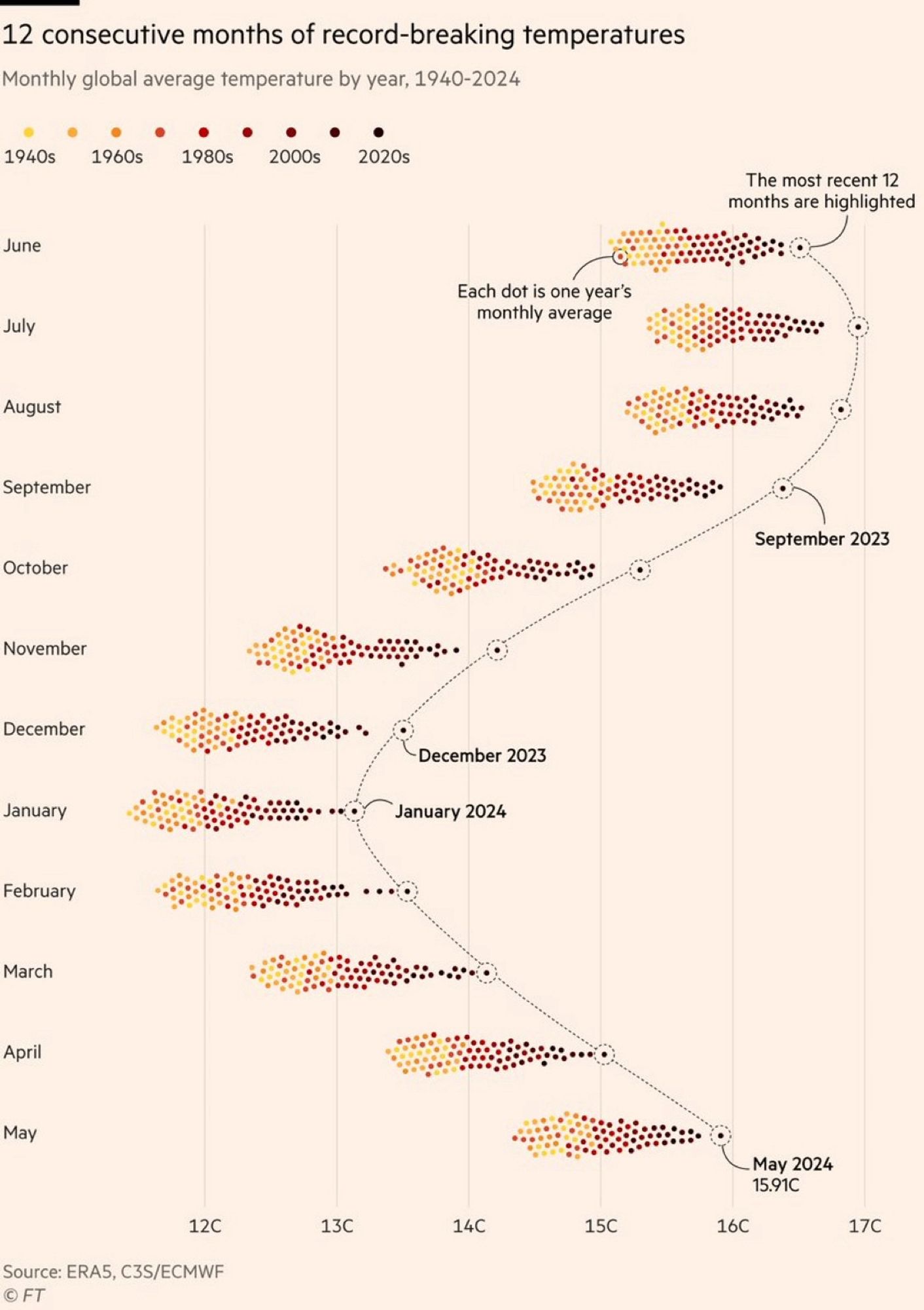
This is a really interesting visualization. I love the density of the data and the way it captures the year over year variability by month while allowing the annual variability to plainly stand out. This is really good.
The color grading of the years is really bad. The last 20/30 years are all very low in contrast compared to each other, while 1940s and 60s are easy to tell apart, where it is least important. There are so many more colors than yellow/orange/brown, we can use them to get more information density.
Making data beautiful is what this community is about. But compromising readability for a color scheme is just annoying. Present data first, worry about it being extra pretty second.
We're already looking at time being encoded differently than the usual horizontal axis, don't make it harder.
On the other hand, if the purpose of the graph isn't to present individual data points, but to present the monthly trends, then maybe it would have been OK, if the last 3 decades could have started over with a higher luminance set of colors. IDK but I think I would have used colors with more contrast and dropped the warm earthy theme.
Quite the contrary. I have a red-green deficiency (and so do about 6% of men). Viridis Color scale is pretty nice but two much colors are hard to read for a lot of people
We need to invent an image format that let's chart colorw be tweaked after the fact lol
In a deep red area here. Talked to locals and they say our temperatures have always fluctuated and that this is just a cycle. I explained that the CO2 in the atmosphere has been climbing steadily and it is at the point it was 100,000 years ago, (actually it was 33 MILLION years) - their eyes glaze over.
this doesn't add up, Jesus made the world 4,000 years ago
If it’s a cycle, ask them when the dinosaurs will come back. When they say “not like that,” ask if the continents will come back together. When they say that won’t happen, ask them to confirm that everything is changing, except the climate.
I like this graph a lot. It's different, beautiful and gives a good overview. The colors could have been slightly better though.
This graph alone conclusively proven global warming.
I'm just hoping that this past year's jump is due to El Nino and/or higher solar activity and that we have a decade or more before those temps are normal (or low since it'll keep trending upwards for at least 30 years after we stop releasing carbon).
Hoping but not holding my breath.
If it was possible I would put quite some money on that geo engineering (like stratospheric aerosol injection) will be seriously discussed on a UN level within ten years. Climate change seems only to speed up and co2 emissions are still rising. At one point there is simply no alternative.
Greta Thunberg talks about it in her book - if the bathtub is overflowing in your house and water is spilling across the floor everywhere, step 1 for most people is to turn off the water. Yes sure it is fine to look for towels and buckets to try to contain the damage (and I don’t even disagree with you that it’ll be needed), but that also assumes that they’ll work and there will be political support to deploy them at scale, instead of mustering up the political support to turn the fucking taps down since at this point that’s clearly needed and is relatively speaking much much easier.
Exactly. The problem is that too many of the world's leaders don't want to upset the capital holders by limiting greenhouse gases.
These people are literally the people that Alfred told Bruce Wayne about: some men just want to see the world burn.
But at least we created some great shareholder value.
It’s honestly most akin to an AI model over optimizing for the trained outcome even when it turns out it was misaligned from the good outcome we wanted.
They certainly don’t want their grandchildren to inhabit a barely-livable hellscape instead of the paradise world they were born into, but they’ve been optimizing for money for so long that it’s baked in now, and it’s so so easy to just say, well it’s probably not a big deal, or I don’t think the science is really all that dire in its predictions, or oh well someone else will probably figure it out. And so, every year, we keep setting records for “production”.
What frustrates the hell out of me is that if they would just allow everyone who can work from home do so, it helps cut down emissions. It won't solve the whole thing, of course. But it's a super easy way to make a difference.
But control freak bosses are all "Good news, everyone! You must return to working in the office. Because it is so much better. It makes me feel important, you see. If I don't see your butts in chairs in front of monitors, I don't think you're actually doing anything."
Minor stuff like that makes me think that we're really doomed here. Late stage capitalism won't even do the easiest of easy things about climate change.
I was more stating what I think will happen rather than wat we should be doing.
In terms of pure physics it is ofc easier to turn off the metaphorical tap, but in terms of power and politics we seem unable to transition to renewables. And I’m afraid once we switch on the geo-engineering button we still won’t transition. Only once oil is priced out of the market completely, be it fusion or abundant solar and wind (with energy storage), will we make the transition. But again I might be too pessimistic.
I also think that this is what will happen (not only discussed) but unless we master fusion it's practically just fixing a symptom and we'd have to do that for quite a while and the oceans will probably become too acidic.
Fusion would solve a lot, but even if we invent room-temperature superconductors today, it would still take so much time to roll fusion out on a big scale and replace oil infrastructure with electric infrastructure.
I tend to be very pessimistic about climate change, but I hope I’m wrong.
There already is no alternative. The amount of CO2 released is going to stay high for a long time (centuries?). People are dying from the current weather.
For the expected response: We need to also stop making things worse. Humanity can do two things at once.
Wouldn't aerosols reduce solar irradiance globally, hence reducing the rate of photosynthesis globally...which further reduces natural CO2 capture? How would that help?
No. It can be localized (for large scales of localized).
Also, we are finding through putting solar farms on crop fields, sun light is not the limiter on photosynthesis for many plants. Many plants get too hot, loose moisture, and photosynthesis less.
Took me more than a minute to realize that only 4 months of this year hold the record. Well, let's wait for 2030
Edit: nope. Last 12 months indeed beat the records consequently . We'll all soon die. The only good thing I can see from this graph is that the shift is even, meaning the seasons are still predictable.
What month of 2024 dosen't hold the record?
Probably the ones that haven't happened yet.
~~April, March and Feb~~
Haha we're doomed
Dumb libruls think global warming is real, when 6 months out of 2024 are not ~~yet~~ breaking temperature records! Half the year is not even hotter!
The most recent months are the records, are they not? Yeah December 2024 doesn't hold the record yet but it hasn't happened yet. The most recent 12 months were the hottest
We will probably be underwater in 2030.
I think that I should become a captain in a supertanker...
It's not going to get that deep, or do so that fast.
I am thinking about buying some beachfront property near the Fall Line for my descendants to inherit, though.
We're cooked or gonna be. Given we're still full swing energy craving, reversing the inertia of this massive shift isn't gonna happen in a lifetime
This is graph of economy doing better than ever.
Ladies and gentlemen, we're royally fucked.
Why does it seem like this is only the northern hemisphere and not truly "global"? Shouldn't it be warm in the southern hemisphere when it's cold in the north? So shouldn't these groupings generally hover around an average between northern and southern hemisphere temps?
Because the northern hemisphere is mostly land mass and the southern hemisphere is mostly ocean. Land heats faster and cools faster than ocean, thus the seasonal effects are more pronounced in the data.
Same with CO2 patterns which gives a similar yearly 'breathing effect'
What's your source that there's not warming in the southern hemisphere?
The temperature readings would look different because winter and summer are flipped, but they absolutely should be attributing a similar effect.
The way earth rotate around the sun is not a perfect circle, but more like an ellipse, that plus the earth rotational axis makes the summers and winters of the global north and south don't correspond exactly. This is why there's a difference of ~4 Celsius between average January vs average July.
A place to share and discuss data visualizations. #dataviz
(under new moderation as of 2024-01, please let me know if there are any changes you want to see!)


