305
True continent sizes
(slrpnk.net)

Contenents are generally bigger than countries yes.
Here's an actual continent size comparison

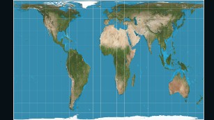
Except, that your picture shows the continents in the usual Mercator projection distorted way. This type of projection makes countries nearer to the poles look way larger than they actually are.
Antarctica is definitely not Mercator there!
And finding a good projection for the entirety of Asia would be difficult.
Now, using Mercator Russia in the OP image with Africa.... But I've already complained about that in two other crossposts ;-)
I'll give you the point on Antarctica, but using multiple different projections is somehow even worse imho
here's a replica i just made using the equal earth projection

and here's one using the authagraph projection

i wanted to make one using the mollweide projection, but i couldn't find a good blank map with borders to use
they're both poor work, but i don't want to put in the effort to fix them, and it's pretty funny imagining icelanders getting mad that i put them in north america
both used blank world map images ripped from wikipedia plus getpaint.net
I don't know what projection that map uses. The vertically squished Greenland makes it seem like it's closer to a equal area projection. But I couldn't find a similar comparison image that I could make sure was using an equal area projection. If you have one, I'd love to see it.
The order is correct at least https://en.m.wikipedia.org/wiki/Continent

Why does this image use the numbers for the entire US but only shows the continental US?
Came to the comments section to say this too. The contiguous States should also look visually smaller than China next to them, so I think they've blown them up to represent the full 9.8m km^2^.
Because if they were consistent or honest, they'd have to admit that the US is actuslly smaller than China (or Canada, which they chose to exclude).
I'd really love to see what Africa would look like without randomly created colonial superstates. I know Atlas Pro did a video about that, but not sure how accurate that is.
Also what Europe if every people group with a unintelligible dialect had a nation. Like Catalan, Occitan, Romansh, Bavarian etc.. Where I live the people in the next village over officially speak the same language, but it's completely unintelligible. So not a different language for political reasons only really.
Also what Europe if every people group with a unintelligible dialect had a nation.
Papua New Guinea/Indonesia and Africa have like a thousand to a two thousand languages each, I think it'd be funnier doing that with them
Same for India, if the British never came what countries would exist in that region? All the states pretty much have different languages, cultures, food, politics, etc so it's more like an EU with a common military
In that case India would be a ton of tiny nations as well.
Interactive tool: thetruesize.com.
It's fun to see how the shapes and areas change while moved around and being reprojected.
"excluding Russia"
includes Russia
I'm confused.
Or was there a text saying something like "all can fit in together, except Russia?"
Update. Didn't see the asterisk near the word Europe, was confused.
It is obviously talking about "the continent Europe, excluding Russia". What is there to be confused about?
Ahhh, I didn't notice the other asterisk near "Europe".
Honestly I missed the asterisk too, but I assumed instead something was cut from the screenshot.
What is there to be confused about?
Well for starters, Russia is in Asia.
The star is meant to point you at the compariosn to Europe which in this case does not include the european part of Russia.
Ah, struggled to find the asterisk near Europe word.
Thank you!
It's basically to make it clear and avoid confusion which can arise, e.g. by including only the European part of russia, as the Europe-Asia border is not uniquely defined.
Thanks! Didn't see the asterisk there
I'm also interested in the true size comparison without the skewed size that occurs further and further from the equator when you make a flat, rectangular map from a sphere.
I'm not sure, but I assume they've used some equal-area projection for the representation, so its angles are skewed, not the size.
Or just scaled the country images to match land area?
On thetruesize.com they seem to use some equal-angle projection and the countries are reprojected while being moved. There, e.g. russia doesn't seem to be that narrow when placed on top of Africa.
URL doesn't work for me
Thx. I've corrected it.
I think those are the unskewed versions.
Area comparison accurate world map

LOL. Africa would be a tiny crumb in AUSTRALIA!
For the map enthused!
Rules:
post relevant content: interesting, informative, and/or pretty maps
be nice