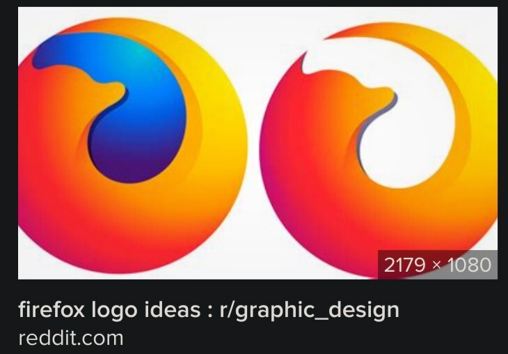
Modern (minimalist) Firefox logo idea:

Be sure to follow the rule before you head out.
Rule: You must post before you leave.
Modern (minimalist) Firefox logo idea:
too complex. remove that dreaded hole in the centre
yet another corporation removing hole. SMH
When did graphic design stop being graphic design? 10 years ago?
Pretty much.
I still won't forgive Apple for releasing iOS 7, and ultimately starting what I like to call "the flattening". And only then did all the supporters of skeuomorphism (or "graphic design" as you call it) fall off like dominoes.
2013 really was the worst year of all time.
Windows Phone 7 was 2010 and Windows 8 was 2012. iOS 7 was 2013, with macOS 10.10 Yosemite in 2014, and Material Design coming a few months later.
I know it’s fashionable to hate on Apple here on Lemmy but those of us with memories know that Apple was chided on being late to the party, and iOS 6 & Mountain Lion were mocked as being behind the times and overly skeuomorphic.
I remember the felt tables in Game Centre, the tape deck in Podcasts and the linen background in the multitasking switcher and Notification Centre being frequently cited as dated and over-the-top.
You could argue that their influence or trendsetting may have helped to lock in the flat design trend for the next decade, but they under no circumstances “started” it. That’s blatant rewriting of history.
To the contrary they were actually one of the biggest pushers of skeuomorphic interfaces up until Forstall was ousted and Ive took the reins of Software UX. A change that was made because people were mocking the dated skeuomorphic iOS UI and the lack of consistent design language through the OS.
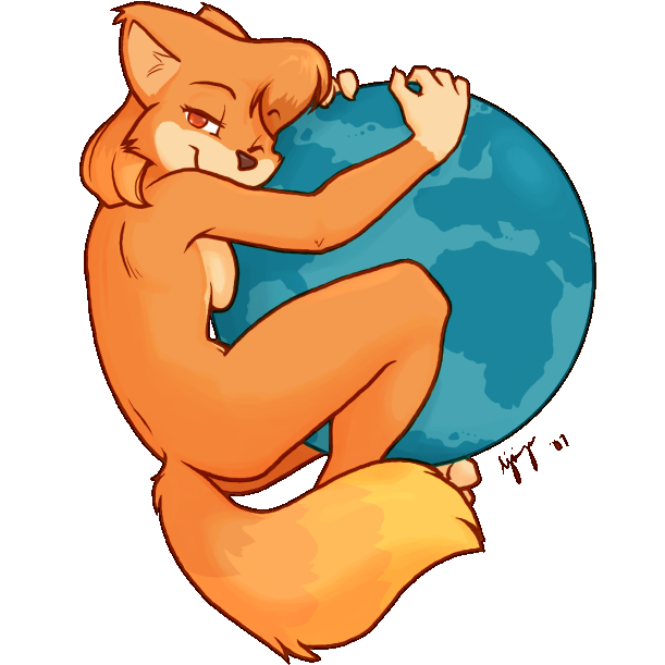
RETURN THE FOX
They should have hired a furry to do the design. I want it to be provocatively fox-like.
Lol, this is great
YES ... HA HA HA ... YES!

PLEASE MAKE THIS THE LOGO IMMEDIATELY
Suits the brand just right given how many edges they've sanded off the software
Just wait until you see modern chrome
Oooh, I see, it's a cock and balls
Such vision and insight, we'll keep an eye on this one
Seems soo familiar
They just used the fill tool there's still a blue glow lmao
That's a drop shadow
A blue drop shadow