this post was submitted on 22 Dec 2023
44 points (95.8% liked)

McMansionHell

1222 readers
1 users here now

(Banner from McMansionHell.com )

(Please set language to English when posting AND commenting!)

A Community about large, cheaply built, suburban homes with design flaws and a lack of architectural integrity also known as “McMansions.” On Thursdays we celebrate the opposite: good suburban architectural design.

Based off the famous subreddit r/mcmansionhell, we will essentially do all the same here, as is over there. Please do your best and crosspost if you need too!

We need mods!! Please please help!

A Short Guide

Friends at c/badrealestate!

Here are the rules:

  1. Posts can be about ugly houses in general
  2. Post appropriately and with correct tags WITHIN the title so it is easy to search. -->Tags: "Thursday Design Appreciation" or "HouseTDA", "Just Ugly", "Shitpost", "Certified McMansion™", "Discussion/Debate", and "Interior" are available.
  3. All post subjects must be single family homes -->Only post suburban, single family homes. No apartments or duplexes, etc. The community is focused on specifically traditional suburban architecture.
  4. Don't post addresses or other easily identifiable information unless it is publicly listed. -->Keep the information about the property you are posting basic and general. However, if the home is listed on a public website you are permitted to post a link to the public listing.
  5. Direct Images Only, no links please. -->Post correctly cropped, direct images and not links to websites. Image hosting links, such as Imgur, are an exception, but we still prefer a direct image. Zillow house page, for example, is ok if it directly links to the photos and such.
  6. No Spam -->No posting an excessive amount in a row on the same day or posting the same comment on several posts at once. We have seen it, we just didn't react to it. Please understand that.
  7. No Screenshots -->Crop your photos correctly.
  8. Thursday is special. To celebrate that, you can post nice houses you appreciate.

Helpful links:

Kate Wagner's Guide to McMansions

Architectural Guides

founded 2 years ago
MODERATORS
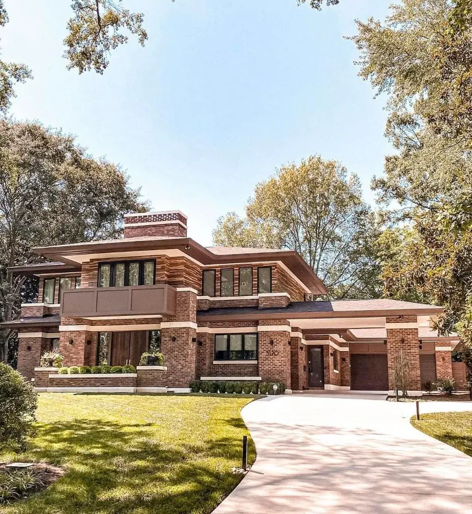
 

I love the way this house looks. The designer has some hits and misses, but this one is definitely a smash hit for me!

Instagram post

top 8 comments
sorted by: hot top controversial new old
[–] [email protected] 9 points 1 year ago* (last edited 1 year ago) (1 children)

Really dislike almost everything about this house. Clearly FLW inspired but so many problems with materials, massing, proportions, etc.

Just to pick a few things as examples:

  1. The port cochere entry thing makes no sense and the roof structure is too wimpy for the massive column supporting it.

  2. The front door/porch could’ve been strong, defined and welcoming. They chose to wall it off instead. If there are sidewalks coming from the sides, they’re invisible in this shot. This says stay away.

  3. That balcony above the front entry is awful. It’s a solid wall that detracts aesthetically and functionally defeats the purpose of swinging those doors open for fresh air, light, and views.

[–] [email protected] 4 points 1 year ago (1 children)

The massive column is suppose to have consistency with the rest of the structure. It mirrors the corners of the house and garage.

I agree with you on all points, but the column sort of makes sense from an aesthetic viewpoint. They should have made all of that like 25% smaller if they wanted that consistency.

[–] [email protected] 3 points 1 year ago* (last edited 1 year ago) (1 children)

No, you’re correct, it’s continuing the rhythm across the facade. I guess what I’m saying is a) the little hip roof looks incredibly weak with that column and nothing else around it and more importantly b) the entire structure is superfluous and as far as I can tell, only serves the purpose of making the house appear larger than it is.

Edit: I can’t tell from this shot, but perhaps there is enough depth to it that it actually does function as a port cochere. If so, I still feel the same way, it looks bad.

Spouse can drop spouse off on a rainy night before parking in the garage. He/she can then enter that weird door (that should’ve been on the side) which seems better than trying to figure out how to get in the barricaded main entry.

[–] [email protected] 1 points 1 year ago* (last edited 1 year ago)

More photos and floorplan here.

It is big enough to fit a car under 21Wx13D. They maintained the same roof pitch on both elevations for consistency and to not obstruct the view from the MB closet(lol). What doesn't make an sense is the side entry door is not covered under the same roof, so you need walk into rain to get inside or you need to go all the way into the garage. The windows in the kitchen flanking the sink are between the port and the side door, so you'd have to kill off the windows or extend the port to bring the door under cover.

Also the balcony isn't even for the MB.

Such strange decisions.

The house address is 3520 Selwyn Av Charlotte, NC 28209. So they only get like 4in of snow a year, but they do get like 42in of rain...

[–] [email protected] 6 points 1 year ago

Kinda reminds me of Doc Brown's house from Back to the Future.

[–] [email protected] 5 points 1 year ago* (last edited 1 year ago)

That's a variation of the Prairie Modern style created by Frank Lloyd Wright, down to the materials and textures.

[–] Mouselemming 3 points 1 year ago

The shape is cool but I don't understand why they suddenly have the one middle layer with the horizontal -stripe texture. And the balcony paint is too flat, just a generic grayish brown that doesn't go with the bricks. The shapes of the house work well though.

[–] captain_aggravated 1 points 1 year ago

When a doctor's office architect tries his hand at residential design.