this post was submitted on 08 Jul 2023
401 points (96.3% liked)
Fediverse
28223 readers
578 users here now
A community to talk about the Fediverse and all it's related services using ActivityPub (Mastodon, Lemmy, KBin, etc).
If you wanted to get help with moderating your own community then head over to [email protected]!
Rules
- Posts must be on topic.
- Be respectful of others.
- Cite the sources used for graphs and other statistics.
- Follow the general Lemmy.world rules.
Learn more at these websites: Join The Fediverse Wiki, Fediverse.info, Wikipedia Page, The Federation Info (Stats), FediDB (Stats), Sub Rehab (Reddit Migration), Search Lemmy
founded 1 year ago
MODERATORS
you are viewing a single comment's thread
view the rest of the comments
view the rest of the comments

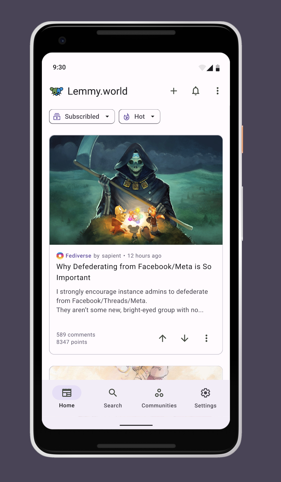
I think it looks fine on android, but it probably doesn't integrate with iOS nicely. I also think light themes are bad by default so I can't judge your photo accurately lol.
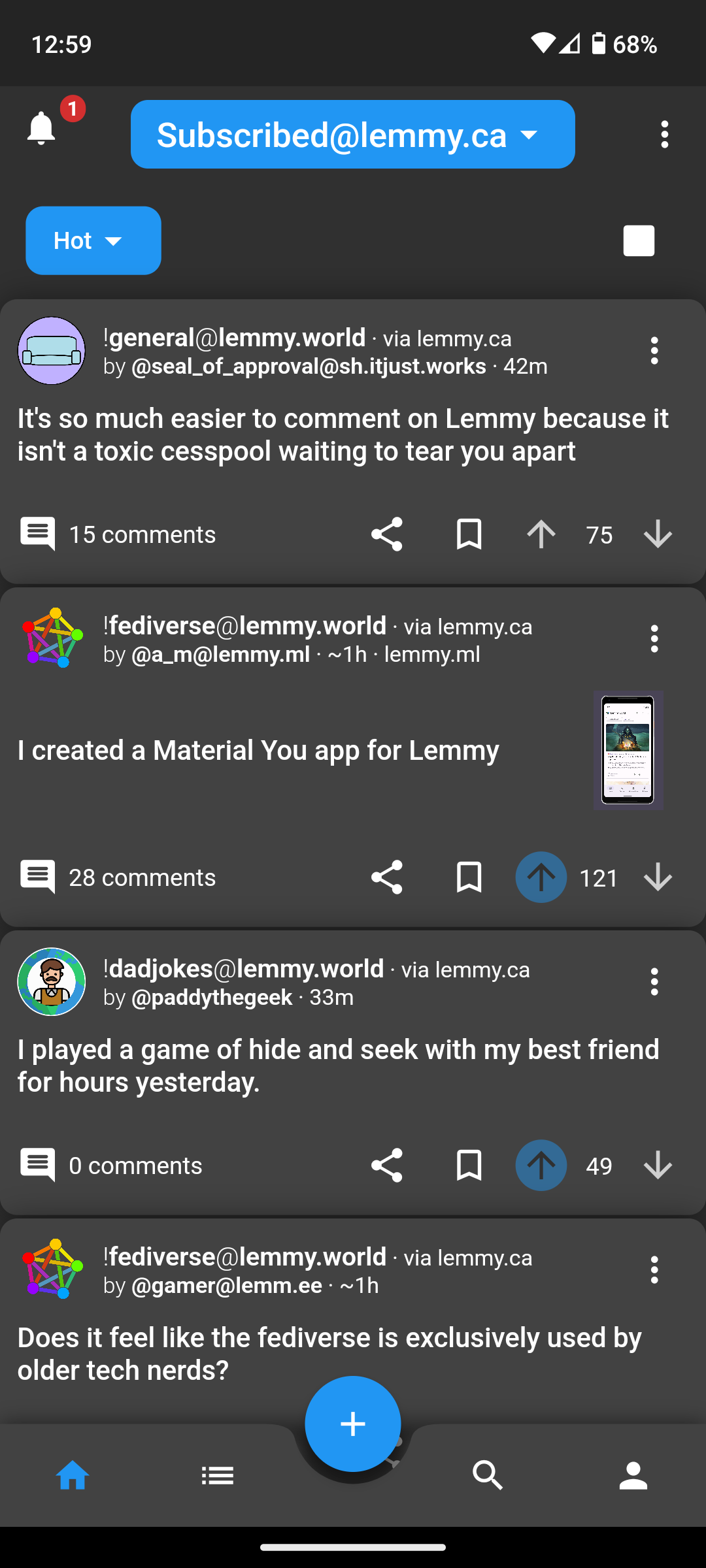
Here is iOS dark / compact
IMHO, the shadows, padding around cards, corner radiuses, drop down stylings, etc. are all pretty rough. It doesn’t feel as refined as Material You or iOS’s design system.
After driving in Memmy, Mlem, and Wefwef (now Voyager), Liftoff feels kind of janky to me.
Just my 2¢
If you go into settings and turn off card shadows and rounded corners it gets a bit better IMO
Oh god, that’s way better. That stuff should be off by default. That said, I still feel like they need a UI person to contribute, and OP should hit them up.
As someone who does UI for a living, it feels rough to me. I wish I had the time to help out, but I’ve already got a couple other nasty side projects on my plate.
Just popping in to mention the UI got a pretty big update recently. You might want to take another look, I think its a lot better now.