this post was submitted on 02 Dec 2023
24 points (96.2% liked)
Melbourne
1966 readers
88 users here now
This community is a place created for the people of Melbourne and Victoria. We are a positive, welcoming and inclusive community. We might not agree about everything, but we always strive to stay civil and respectful.
The focus of our discussions is based around things that affect Victoria, but we are also free to discuss our local perspective on wider issues. Or head to the regular Daily Random Discussion thread to talk about anything.
Ongoing discussions, FAQs & Resources (still under construction)
Adoption Certificate for Nellie, the Daily Thread numbat (with thanks to @Catfish)
founded 2 years ago
MODERATORS
you are viewing a single comment's thread
view the rest of the comments
view the rest of the comments

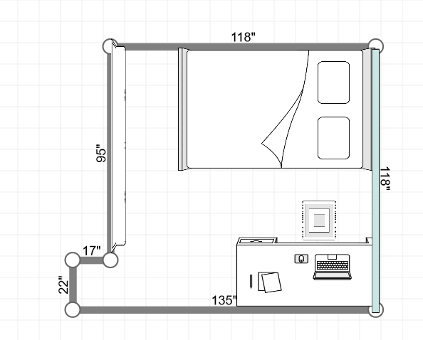
edit (this was supposed to be my option B, i done goofed up)
Measurements (in cms, roughly):
Room is 290x290 (118 x 118 in)
Table is 160x80 (and a bit for the chair, used a rug in place of chair in the image) (62 x 31 in)
Bed is 228x141 (88 x 55 in)
I need some help w arranging furniture in my room. I believe my room is 290cm x 290cm (and a bit for the door entrance). Room has mirror BIRs on one side and windows on the other side.
Option A would mean very little room to walk but option B is pushing one side of the bed towards the wall. Note that the bed has drawers on both sides so that also means no access to drawers on one side (i can potentially live with that). Does option B make more sense for me? Also gives me a lot more room to play with.
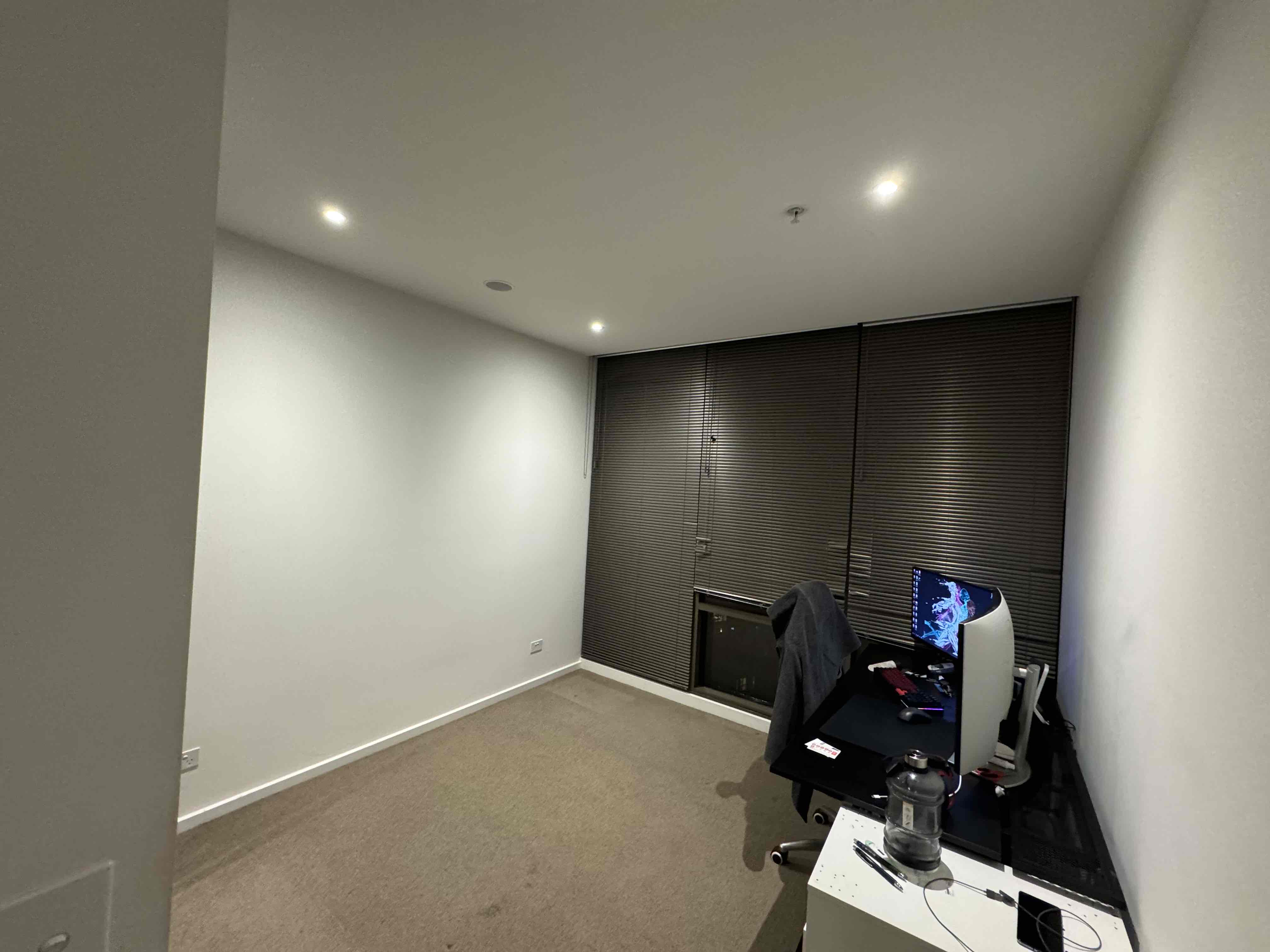
Edit 3: gone with option B. This is the room without the bed (arriving tomorrow). Excuse my busy table. Might shift out the IKEA Alex drawer in the future.
I'd go with option B as being more liveable - but you are going to get annoyed every time you have to climb on the bed to reach the blind cord, and changing the sheets is going to be a pain with the bed against the wall. But you'll do those much less often than you will sit at your desk, so I'd prioritise that space.
B makes way more sense on so many levels, losing bed drawer access is minor compared to how cramped it would be getting to bed in A + weird wasted corner. Just see how you'd feel with the desk being so close to the bedhead in B though, in terms of height difference and how likely you might bang your head against it (but also whether maybe you could use it as a bedside table)
i done goofed up. this was meant to be my option B. looks much better i reckon! i also have an ikea alex drawer that i need to fit.
Better. Can you put some art on that wall? Would make it a bit less bed focused if you need to be on camera for work etc.
I usually have my background blurred / company background so should be fine but I do need help with decorating my room. So far all I've got is a couple of posters. Need more life. Maybe some plants?
Well a few numbat would be adorable if highly impractical 😜
Option B would be my preference. Nice planning, what ap did you use to draw it?
Cheers mate. I used this site: http://www.planyourroom.com/
Its very basic, limited functionalities but does the job :)
Not much room for a reading chair either way. B is a bit less cluttered, but very much a one person layout. Don’t know if I could sleep facing a mirror.
Just updated option B. It is a one person layout! Also good points on sleeping facing the mirrors, hadn't thought of that. I might just leave one side of the mirrors open so as to see less of myself, but i reckon B (or the updated B now) is less noisy
Assuming the windows are on the wall to the left of the door on entry, I would give some thought to flipping the bed through 180 degrees as per revised option B so it faces away from the window. Depending on how much you like lying in bed staring out the window or at the mirror robes. Then the Alex drawer can be put next to the head end and be your bedside table but will still be accessible to the desk. It will help screen your bed from the doorway too. Moving the bed from being jammed up against a wall/window at the head/foot end could make quite a difference to usability. It'll simplify changing sheets quite a lot if you can easily access both head and foot of the bed. Even if the access is only 30 cm or so. Opens up access to the full width of the mirror robe too.
On the left side of the door are the BIRs and the windows are opposite (see last photo) but point noted!