this post was submitted on 27 Nov 2024
143 points (99.3% liked)
NoSafetySmokingFirst
625 readers
44 users here now
Welcome to NoSafetySmokingFirst!
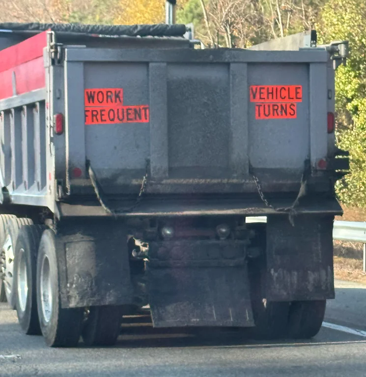
For images where the text reads correctly left to right, but visual cues (like colouration, vertical proximity, or horizontal separation) lead you to try to read it top to bottom.
This is similar to, but distinct from, the more widely known “DontDeadOpenInside” format. In that case, the text reads correctly top to bottom, but visual cues (like colouration, horizontal proximity, or vertical separation) lead you to try to read it left to right.
The post that started it all:
Other related communities:
- [email protected]
- [email protected] (letters arranged in any confusing order)
founded 6 months ago
MODERATORS
you are viewing a single comment's thread
view the rest of the comments
view the rest of the comments

Looking at the image, whoever put those signs didn't had the slightest clue on what they were doing.
You need the information concentrated in an easy to read and perceive cluster; best placement here would be at the center panel. Visual signs of danger should have been placed on the sides, as visual information is processed faster.
And where are the standard warning signs?