this post was submitted on 29 Jun 2024
-98 points (24.5% liked)
Linux
54535 readers
776 users here now
From Wikipedia, the free encyclopedia
Linux is a family of open source Unix-like operating systems based on the Linux kernel, an operating system kernel first released on September 17, 1991 by Linus Torvalds. Linux is typically packaged in a Linux distribution (or distro for short).
Distributions include the Linux kernel and supporting system software and libraries, many of which are provided by the GNU Project. Many Linux distributions use the word "Linux" in their name, but the Free Software Foundation uses the name GNU/Linux to emphasize the importance of GNU software, causing some controversy.
Rules
- Posts must be relevant to operating systems running the Linux kernel. GNU/Linux or otherwise.
- No misinformation
- No NSFW content
- No hate speech, bigotry, etc
Related Communities
Community icon by Alpár-Etele Méder, licensed under CC BY 3.0
founded 6 years ago
MODERATORS
you are viewing a single comment's thread
view the rest of the comments
view the rest of the comments


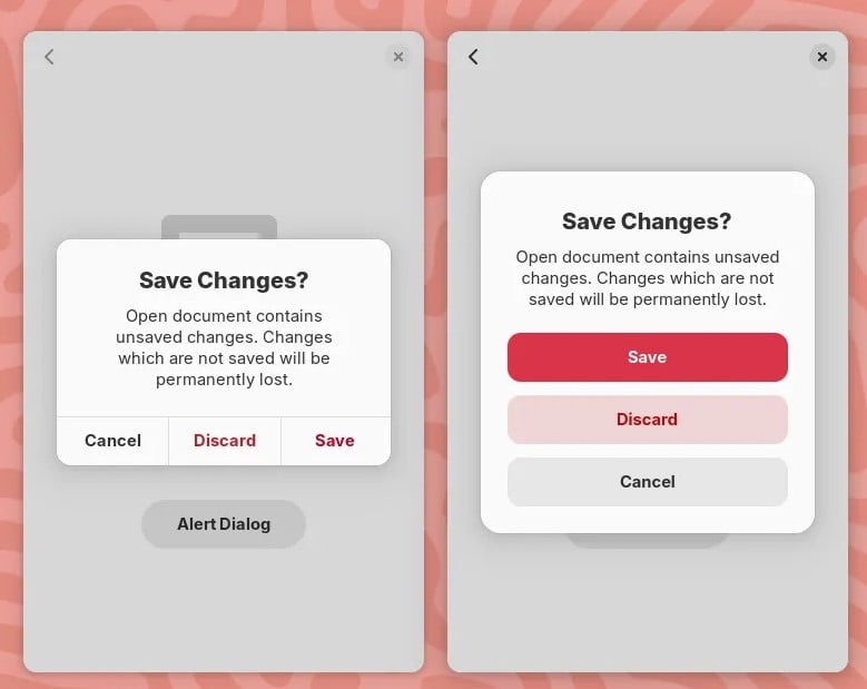
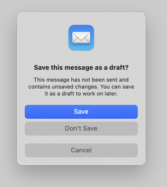
My only problem with both designs in your images is the colors. It’s a pretty standard part of UI design (in real life and on computers) that “red means cancel” and “green means continue.” Apple using blue is no big deal and I’m 90% sure they just use a user chosen “highlight color.” (Maybe Gnome as well?) But cancel or delete or similar things should probably be red or another color that signals “Stop.”
I’ve always thought Bootstrap, the web design library, has a good set of base colors. Red means danger. Light blue means info. Green means yes or success. Yellow means warning. Other buttons are a darker blue — basically the highlight color. (Not saying they chose the best version of those colors. Just that the general idea is consistency and what users most naturally expect.)
The “Save” button uses the accent color which is blue by default. With configurable accent colors coming to GNOME 47 and GTK/Libadwaita, you can choose a red accent color.
See the original description of the screenshot:
It's just an accent colour and can be changed.
Where can i change easily accent colors in Gnome without using extensions?
Accent colors are coming with GNOME 47.
Yup, i know, its just not possible atm. But thank you anyway :)
Yes it does. Those guys did a really good job.