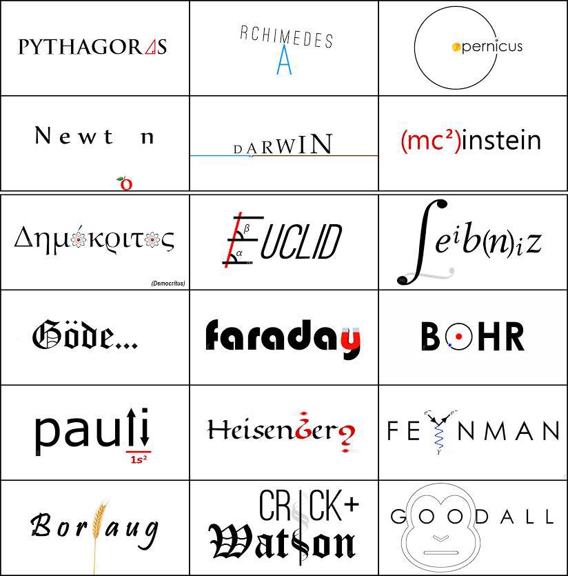
I’m no designer but some of these really fail on readability which I’m pretty sure is important for a logo.
tsoptihs - shitpost - stopthis
To shitpost or not to shitpost is never the question.
I presume the one with atoms in it is in greak so I guess that might get a pass until we get someone who can read achient greak here
You mean the one where the translation of him name is in small print at the bottom of the rectangle?
Ah didn't notice the translation on Democritus
Newton furiously writing a C&D to Leibniz cos he totally had an idea for a logo like that years ago and just didn't tell anyone
Wish more people knew these names rather than Kardashian-this and Cardi-B-that.
Letters have evolved a lot through history. A proper letter evolution would have been nice for darwin
I like how everybody ha slogos that are related to their fields or something and Godel is just chilling with his Dark Souls Gothic
I think the ellipses is a reference to the incompleteness theorem
TIL among notable scientists Einstein doesn't even crack the top 15
His logo is up there. Last on the second row. The super clever (mc²)instein
That one took me a second, so I presume most lemmings will totally fail to get it
Mcinstein lol
Mc^2 = what?
Obviously, but really reads like shit. No way any branding expert would agree that this is good
