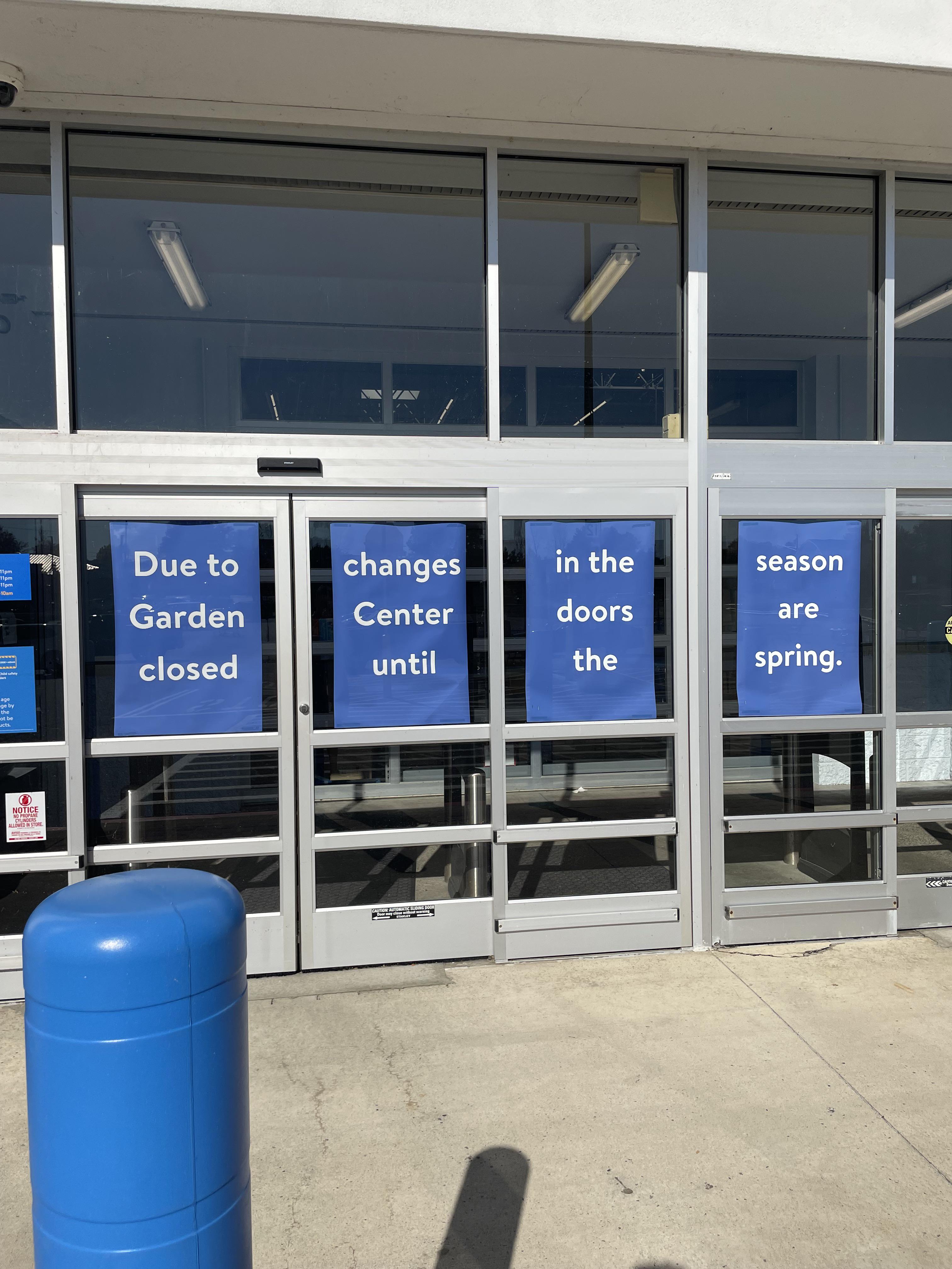
It's beautiful, reads like a poem
this post was submitted on 01 Nov 2024
155 points (99.4% liked)
NoSafetySmokingFirst
759 readers
1 users here now
Welcome to NoSafetySmokingFirst!
For images where the text reads correctly left to right, but visual cues (like colouration, vertical proximity, or horizontal separation) lead you to try to read it top to bottom.
This is similar to, but distinct from, the more widely known “DontDeadOpenInside” format. In that case, the text reads correctly top to bottom, but visual cues (like colouration, horizontal proximity, or vertical separation) lead you to try to read it left to right.
The post that started it all:
Other related communities:
- [email protected]
- [email protected] (opposite meaning when read in a different order)
- [email protected] (letters arranged in any confusing order)
founded 9 months ago
MODERATORS
That's almost kind of right.
Wow. It really took some effort to make this disaster.
