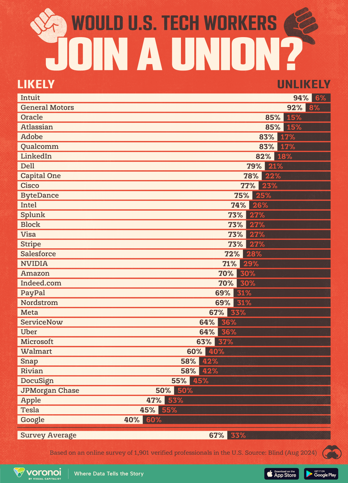
This graphic is nice enough to state that it is only based on 1901 respondents to an online survey. How many of those respondents could possibly be speaking for Nordstrom employees? Certainly not many. Also, how much does selection bias play a role in this survey?
I like the message, but the statistics likely make this info useless...
Adding more to this. If we assume that the 1901 responses were evenly distributed across the 34 companies mentioned in the graphic, we get about 56 responses per company. That would give a margin of error of +/- 13.1% for the numbers. So, even without any kind of bias, most of these numbers are junk...
