Just installed and poked around a bit. So far so good! I like the new look and feel.
Mlem for Lemmy
Official community for Mlem, a free and open-source iOS Lemmy client.
Rules
- Keep it civil.
- This is a forum for discussion about Mlem. We welcome a degree of general chatter, but anything not related to Mlem may be removed at moderator discretion. This is not a forum for iPhone/Android debate. Posts and comments saying nothing but "iOS bad/I use Android" will be removed as off-topic.
- We welcome constructive criticism, but ask that it be both precise and polite.
FAQ
- When will insert feature here be implemented?
- Check our issue board--if there isn't an issue open for the feature you want, feel free to open an issue or make post! Just remember that devs are people too--we're doing this for free in our spare time, and building a quality app takes a lot of patient work.
- Is Mlem available for Android?
- No. Mlem is written using SwiftUI, which is not currently supported on Android. If such support becomes available, we will look into bringing Mlem to our Android friends.
- How do I join the beta?
- We are currently testing our new 2.0 codebase on TestFlight. We have two beta groups: a weekly group that receives the current state of our development branch every week, and a stable group that receives a curated pre-release build at the end of each development cycle.
- Join the weekly beta
- Join the stable beta
- How do I join the dev team?
- Head over to our recruitment channel, or go straight to our GitHub and read CONTRIBUTING.md to get started.
Search by post works great 🫡🫶💪
Now we just need search by comment. The only reason why I still have Voyager.
New comment counts are back! Thanks.
I also submitted a bug report on GitHub, Mlem is marking posts read on scroll even when that option is unchecked in settings.
~~As I am typing this it appears the unearthly loud sounds are fixed too. Again, thank you.~~ I spoke too soon about the sound.
Thanks for the bug report! We've already merged the mark read on scroll fix. The sound issue has proven a lot harder to track down, but we're working on it.
I used to be a TestFlight tester but I got removed and all I can see now when clicking the join link is that I was removed from the program ):
Never mind, it fixed itself just now, thanks for the great app!
Hmm, that's strange. Have you tried manually opting out of testing ("Stop Testing" in the TestFlight app) and clicking the link again?
Please add more breathing room/padding to posts — it’s stressful how close posts are to each other (could mostly be solved with just a few more pixels of negative space under the interaction bar before the divider). Also, some text feels like it’s cropped by the edges of my iPhone. There is more than enough room to spare on the iPhone Pro Max for that additional comfort.
The interaction bar customization doesn’t allow me to customize it the way I want because it doesn’t consider that I have more space for actions if I remove some readouts. Also, I’d like to reorganize readouts.
Almost all settings should be specific to the account they were changed under, like settings of users on a pc. Currently, a change under one account is made to the other accounts.
Upon returning to my list of subscriptions (from my All feed for example), my subscribed feed may be highlighted, even though that’s not the page I’m on, coming from, or have selected.
Thanks for the feedback!
Please add more breathing room/padding to posts — it’s stressful how close posts are to each other (could mostly be solved with just a few more pixels of negative space under the interaction bar before the divider).
Yeah, I'm not happy with the padding there either and we're experimenting with some ways to improve this.
Also, some text feels like it’s cropped by the edges of my iPhone. There is more than enough room to spare on the iPhone Pro Max for that additional comfort.
I'm not sure what you mean by this. Would you mind providing a screenshot?
The interaction bar customization doesn’t allow me to customize it the way I want because it doesn’t consider that I have more space for actions if I remove some readouts. Also, I’d like to reorganize readouts.
I'll look into allowing more space for actions if readouts are disabled. Reorganising readouts is planned in the future, though it may not be in v2.
Almost all settings should be specific to the account they were changed under, like settings of users on a pc. Currently, a change under one account is made to the other accounts.
We're considering applying this to certain settings, such as the "Blur NSFW" setting. We're hesitant to apply this for all settings, because we don't want the settings system to become too complicated for the user. Users might find it annoying if they have to go through all of their accounts to apply a setting change that they want to make globally.
Upon returning to my list of subscriptions (from my All feed for example), my subscribed feed may be highlighted, even though that’s not the page I’m on, coming from, or have selected.
We're looking into it 👍
I agree about the padding between posts, and if the diving line could be enlarged (or the size set by the user) that would help too.
Also if more room could be added after the bottom response in a thread. Currently the up/down vote and reply buttons are so close to the nav bar at the bottom I click the nav bar by mistake sometimes.

Also if more room could be added after the bottom response in a thread. Currently the up/down vote and reply buttons are so close to the nav bar at the bottom I click the nav bar by mistake sometimes.
Sure 👍 Mlem v1 had this; we'll be adding it back in
Finally Mlem has link support!
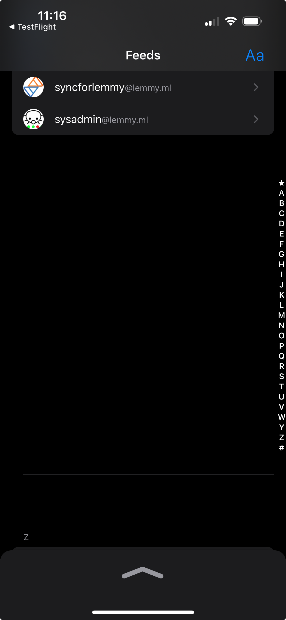
Loving the new look so far! One thing I immediately noticed though is while scrolling through my subscriptions via the letters on the right, the view starts breaking with a ton of random space.

Changing the sorting back and forth seems to fix the view, but rapidly scrolling back and forth will break it again.
Thanks for the bug report! We'll look into it.
Viewing cross posts is probably my favourite feature for 2.0 so far. It’s been a little over a week, and I can’t believe I used Lemmy without it!
We're glad you like it 😄
It’s great to read up on more conversations!
The latest beta update is great!
Uploading a photo to any community fails with Error. Anyone getting this issue too?
As Eric said, if you tap on the error it'll give you more info. Have you tried a different image? Some instances impose a maximum file size on the images you can upload. If that happens, it'll show the "error" toast. We'd like to make that error case show a more obvious warning in future.
It was exactly it! Image too large, it says. Fingers crossed Mlem make this process easier in the future🤞
Thanks for the bug report! If you tap the error message at the top of the screen it will give you a more detailed error message—would you mind sharing that message so we can debug further?
Thanks. I tapped the error message and turned out it was image too large. So not a bug:D
Will this version include support for Apple’s translation API? I’d love to be able to read some of the posts that aren’t in my language.
We do plan to integrate the translation API, but it might come after we release 2.0 to the App Store—our primary focus right now is reaching feature parity with the v1 app so we can ship 2.0. That being said, we may build it into 2.0 before then as an excuse to play around with the new API.
The block options in feed do not work on ipad. You have to go to the community or user to perform the block.
This is so smooth, awesome.
Will you bring back the "compact comments" setting in the future?
Yep, it'll be back :)
Feature request: label users on the app.
Please and thank you!
Feature Request: View comments section like posts on the Lemmy website to watch the new comments in a community.

This is planned 👍 It may or may not be in 2.0; we'll see.
It says I've been removed from the test program. How do I get back in?
Possible to close the feed drawer without refreshing the feed? I keep opening the feed drawer on accident, but the only way I find to get back to my feed is to click on a feed (all/subscribed/local/saved) and then Mlem loses my place and it refreshes the feed.
ETA: iPhone with iOS 18 Mlem 2.0 (61)
Yeah, we'd love to have this but it's unfortunately very difficult to implement so is unlikely to happen anytime soon. We're tracking the issue here.
The latest padding updates are great, but the addition of a gray background (on dark mode) has made reading unnecessarily more difficult due to the reduced contrast ratio.
Thanks for the feedback! We've received a couple requests for an oled/"blackout" theme--we'll have one out soon.
Can we get a back button on iPad? Right now we have to remember to tap the feed nav item. Also, I tried to get used to the glow around sections in the OLED theme, but it’s just distracting and frankly ugly. I’m requesting an improvement here as well. Thanks for all that you do for Lemmy.
