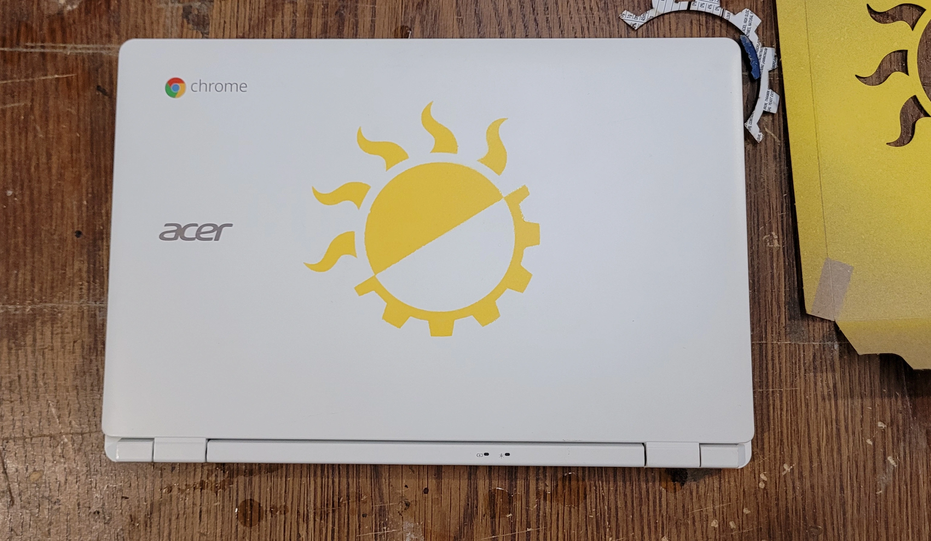
117
submitted 1 month ago by [email protected] to c/[email protected]

cross-posted from: https://slrpnk.net/post/9709038

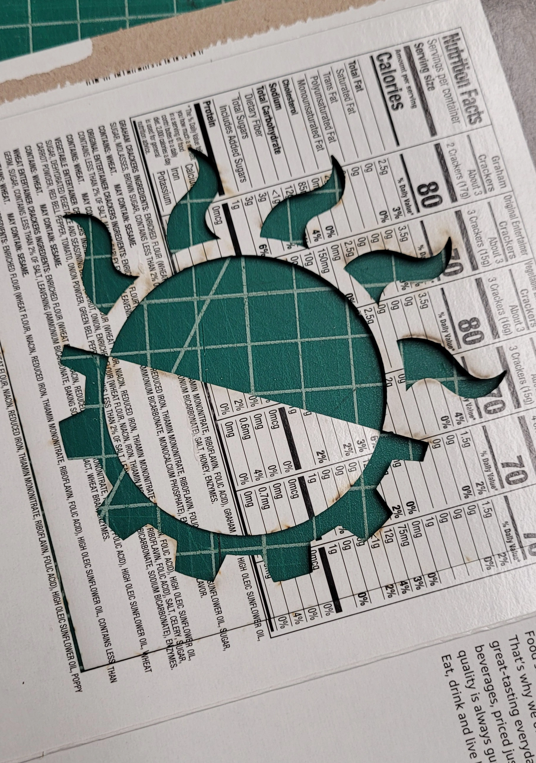
https://cohost.org/roguecache just made a new solarpunk logo; i think it's very well designed and keeps the simplicity while still keeping sun, nature and technology meanings

all 19 comments
sorted by: hot top controversial new old
[-] [email protected] 14 points 1 month ago

No idea what v1 looked like, I kind of think it should be flipped horizontally and maybe tilted, since it’s already making an ‘S’ with those two sets of shapes.

[-] [email protected] 24 points 1 month ago

It was bugging me how that could be an S but wasn't so I fixed it.

[-] [email protected] 7 points 1 month ago

I like this a lot more vertically!

I also think it could have a bit less detail and get the point across, which would let it scale better.

[-] [email protected] 6 points 1 month ago

I kinda like the message of the gear below the plant as well. It's like were using automation and science to uplift nature.

Or like nature based on science.

[-] [email protected] 3 points 1 month ago

Exactly - honestly would be neat to stick on the boxes for the controllers I'm using for sensors in the garden.

May play around a bit with the design (with the help of a few graphic designer folks that I work with and would enjoy this, who can also do in minutes what would probably take me an hour or two)

[-] [email protected] 5 points 1 month ago

At some point that must have been the idea behind this logo. Would be interesting to hear from the original artist why they decided to go in a different direction with it.

[-] [email protected] 4 points 1 month ago

This is much better indeed! 🙌

[-] [email protected] 5 points 1 month ago
[-] [email protected] 5 points 1 month ago

Hmm, I think I like v1 better. It's all good though.

[-] [email protected] 10 points 1 month ago

Once upon a project (now abandoned), a graphic designer gifted me this logo, is a carrot with electronics soldering like PCBs... https://gitlab.com/uploads/-/system/group/avatar/4402577/huertechno3-01.png I absolutely love it!

[-] [email protected] 8 points 1 month ago

I love it! I'll probably trasform this into a sticker and slap it on the back-case of my phone, cheers!

[-] [email protected] 8 points 1 month ago

Is it just me or dose this one looks a bit like the depressed Form of v1 (I love v1 its part of my punk-jacket). The down hanging leafs combined with the darker colors give me a more sad vibe like if the plant needs watering or something.

[-] [email protected] 6 points 1 month ago

I get more jungle vibes from it :o

[-] [email protected] 6 points 1 month ago

I would love something that you could spraypaint on a wall within seconds, like the anarchy-A

[-] [email protected] 11 points 1 month ago* (last edited 1 month ago)

This would lend itself to stencils pretty well though (one color, no islands), especially with a touch of spray adhesive on the back. I've done the symbol from one of the more common solarpunk flags, and getting the blank spot inside the gear positioned would be a little finicky if doing graffiti.

You'd want to bridge the corners there, to make it all one piece, if you wanted to be able to put it up quickly. I was just painting a laptop so I had plenty of time to fuss with it.

[-] [email protected] 4 points 1 month ago

Honestly stencils are best for that.

[-] [email protected] 6 points 1 month ago

Looks nice but probably too many details to work at smaller sizes. A single large leaf instead of the whole leafy stem would convey the same visual concept.

[-] [email protected] 3 points 1 month ago
this post was submitted on 20 May 2024
117 points (96.1% liked)

Solarpunk

5113 readers
57 users here now

The space to discuss Solarpunk itself and Solarpunk related stuff that doesn't fit elsewhere.

What is Solarpunk?

Join our chat: Movim or XMPP client.

founded 2 years ago
MODERATORS