this post was submitted on 03 Dec 2023
693 points (95.2% liked)
linuxmemes
20686 readers
1287 users here now
I use Arch btw
Sister communities:
- LemmyMemes: Memes
- LemmyShitpost: Anything and everything goes.
- RISA: Star Trek memes and shitposts
Community rules
- Follow the site-wide rules and code of conduct
- Be civil
- Post Linux-related content
- No recent reposts
Please report posts and comments that break these rules!
founded 1 year ago
MODERATORS
you are viewing a single comment's thread
view the rest of the comments
view the rest of the comments
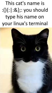
What that garble of symbols does, is that it defines and calls a function named
:, which calls itself twice.The syntax for defining a function is different in Fish, so no, this particular garble will not work:

But it is, of course, possible to write a (much more readable) version that will work in Fish.
you can write a more readable version in any shell, it's intentionally unreadable
Yeah, I meant, as an attacker, you couldn't come up with a similarly unreadable version.
At least, as far as I can tell, defining a function requires spelling out
functionand seems to require being defined on multiple lines, too.Oh, I see. That's very nice then
Unfortunately it works in zsh. I just had to kill my laptop after curiosity got the better of me.
the gentleman hacker
The ampersand looks very weird in that font. It would bug me.
It hails back to the early days of the ampersand, from when it was basically still just Latin "et": https://commons.wikimedia.org/wiki/File:Trebuchet_MS_ampersand.svg
Personally, I do like this font (Fira Mono+Sans), because it still looks professional, without being so boring that I get depression from looking at it.
But yeah, that ampersand is pushing it a bit, as I'm not sure everyone else knows that's an ampersand...