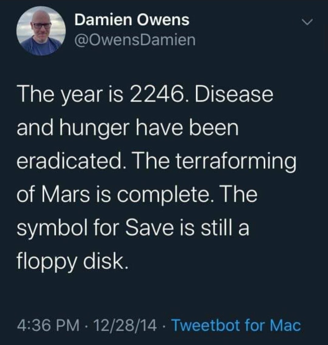
this post was submitted on 30 Jan 2025
276 points (96.0% liked)
People Twitter
5802 readers
899 users here now
People tweeting stuff. We allow tweets from anyone.
RULES:
- Mark NSFW content.
- No doxxing people.
- Must be a pic of the tweet or similar. No direct links to the tweet.
- No bullying or international politcs
- Be excellent to each other.
- Provide an archived link to the tweet (or similar) being shown if it's a major figure or a politician.
founded 2 years ago
MODERATORS
you are viewing a single comment's thread
view the rest of the comments
view the rest of the comments

What should we use tho? I'm wrackin my brain and i can think of nothin'
LibreOffice has used an arrow pointing to a hard drive for a while, but that's also outdated.
The trend has been to move away from saving as a distinct action in favour of constant auto saving, so I don't know if canonicalising a wholly new icon is in the future.
The download icon might not be an awful choice in some contexts.
Maybe a chronograph or piechart and calling it Snapshot?
Loading would be rewinding, going back in time, so with a counterclockwise arrow?
How about this?
If download can be represented as a horizontal line with a downward arrow above it, something similar to this seems the most suitable.
A box with CTRL-S printed on it
(CMD-S for Mac users)
Symbolic icons should never use words to convey their meaning. Some of us are dyslexic, some of us don't speak the language, some of us are blind as shit, etc.
Tbf those aren't words, they're the labels of 2 keyboard keys
Labels composed of letters to form otherwise meaningful words, it's still not a great option in terms of user accessibility. If even a couple of icons used similar words/ letters as their iconography, then suddenly it becomes an irritating nightmare just trying to identify which is which without breaking the flow of what your doing. If anything, a simple S would be acceptable, but that brings its own problems
I was joking anyway. People who need the icon more often than not probably don't know the keyboard shortcut