this post was submitted on 18 Dec 2024
846 points (98.5% liked)
Comic Strips
14193 readers
2752 users here now
Comic Strips is a community for those who love comic stories.
The rules are simple:
- The post can be a single image, an image gallery, or a link to a specific comic hosted on another site (the author's website, for instance).
- The comic must be a complete story.
- If it is an external link, it must be to a specific story, not to the root of the site.
- You may post comics from others or your own.
- If you are posting a comic of your own, a maximum of one per week is allowed (I know, your comics are great, but this rule helps avoid spam).
- The comic can be in any language, but if it's not in English, OP must include an English translation in the post's 'body' field (note: you don't need to select a specific language when posting a comic).
- Politeness.
- Adult content is not allowed. This community aims to be fun for people of all ages.
Web of links
- [email protected]: "I use Arch btw"
- [email protected]: memes (you don't say!)
founded 2 years ago
MODERATORS
you are viewing a single comment's thread
view the rest of the comments
view the rest of the comments

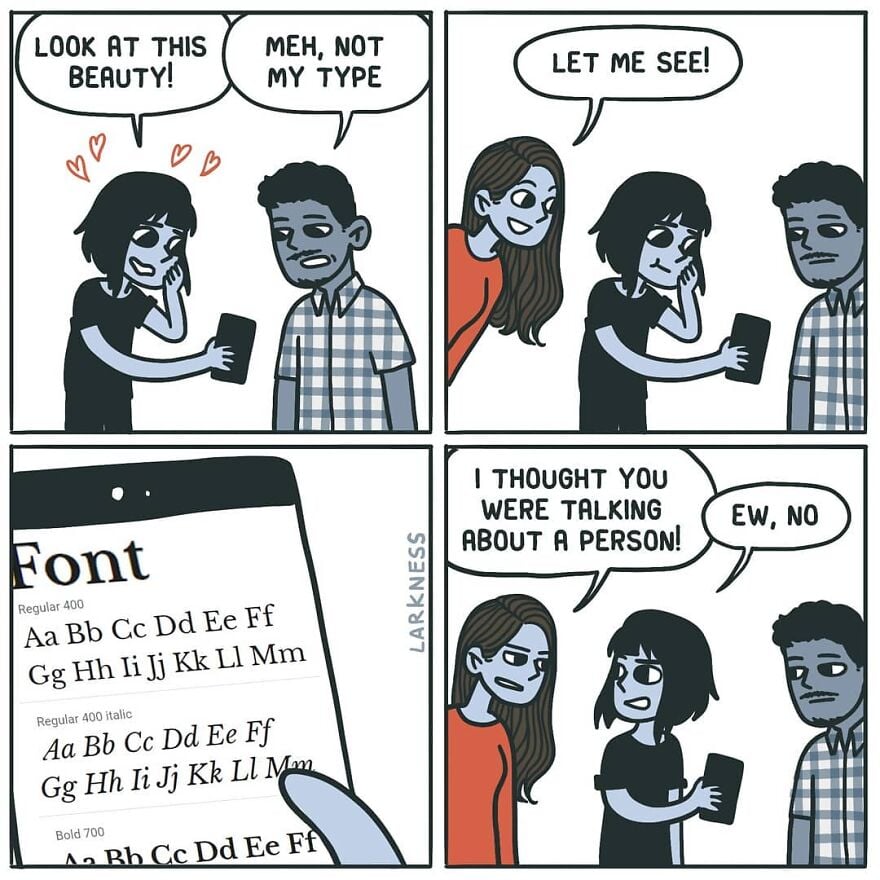
Fira Sans ♥️
Text looks good, but man the Number hight looks cursed and kinda random.
they're called lowercase numbers and they're designed to look good in paragraph text. for example if you're reading this comment, mentioning the year 1997 suddenly puts four full height characters as if I typed one word in all caps, while in lowercase numbers it would look more like if I typed the word iggy (1 is x height while 9 and 7 have descenders like g and y).
they're not designed to be used in math or for longer number sequences. for that you have the full height (uppercase) numbers that most typeface should still have.
0123456789 in lowercase have the same heights as oizgjpbyfq - just as random as that word's letter heights are. which is not random at all, you're just not supposed to use it like that.
Oh that makes sense, thanks for the information. Still would not want to use something thats not universal.
idk what you mean by universal; this is a typographical choice. the only reason you see more uppercase numbers everywhere is because of typewriters and by extension computers. I don't think people make a point of lining numbers up with cap height in handwriting.
But we are speaking about a Computer Font right now, idk what that has to do with handwriting and who cares about handwriting in 2024. With universal i mean that any kind of number should look god, no matter if its a Telefon Number, a Price or a Street Number.
we're not speaking about a computer font, we're speaking about typography in general. the reason I mentioned them is because the ubiquity was forced by restrictions. we used to type non-english letters without diacritics before different languages got support online. now we don't have those restrictions either. what you said is not universal; there are different kinds for different uses. just like uppercase and lowercase letters.
Their shape is beautiful (from 3 to 9) but why were they not written on the same line?
lowercase numbers, check my comment above if you're interested
Pure elistism. 0 1 and 2 were the original high digits created by imperialist powers that reigned supreme for thousands of years.
After the first number wars, 3-9 started to demand equal rights at the bargaining table.
In order to keep the hierarchy in place, 6 and 8 were empowered as class traitor pawns to subjugate the other lower digits. Hence their perceived elevated status.
Why did 6 hate 7? Because 6 and 8 86'd anyone who didn't fall in line. No one even knows about digit [redacted] anymore.
It appears that the middle line crosses the centre of mass.