this post was submitted on 10 Dec 2024
313 points (97.3% liked)
Map Enthusiasts
4179 readers
2 users here now
For the map enthused!
Rules:
-
post relevant content: interesting, informative, and/or pretty maps
-
be nice
founded 2 years ago
MODERATORS
you are viewing a single comment's thread
view the rest of the comments
view the rest of the comments

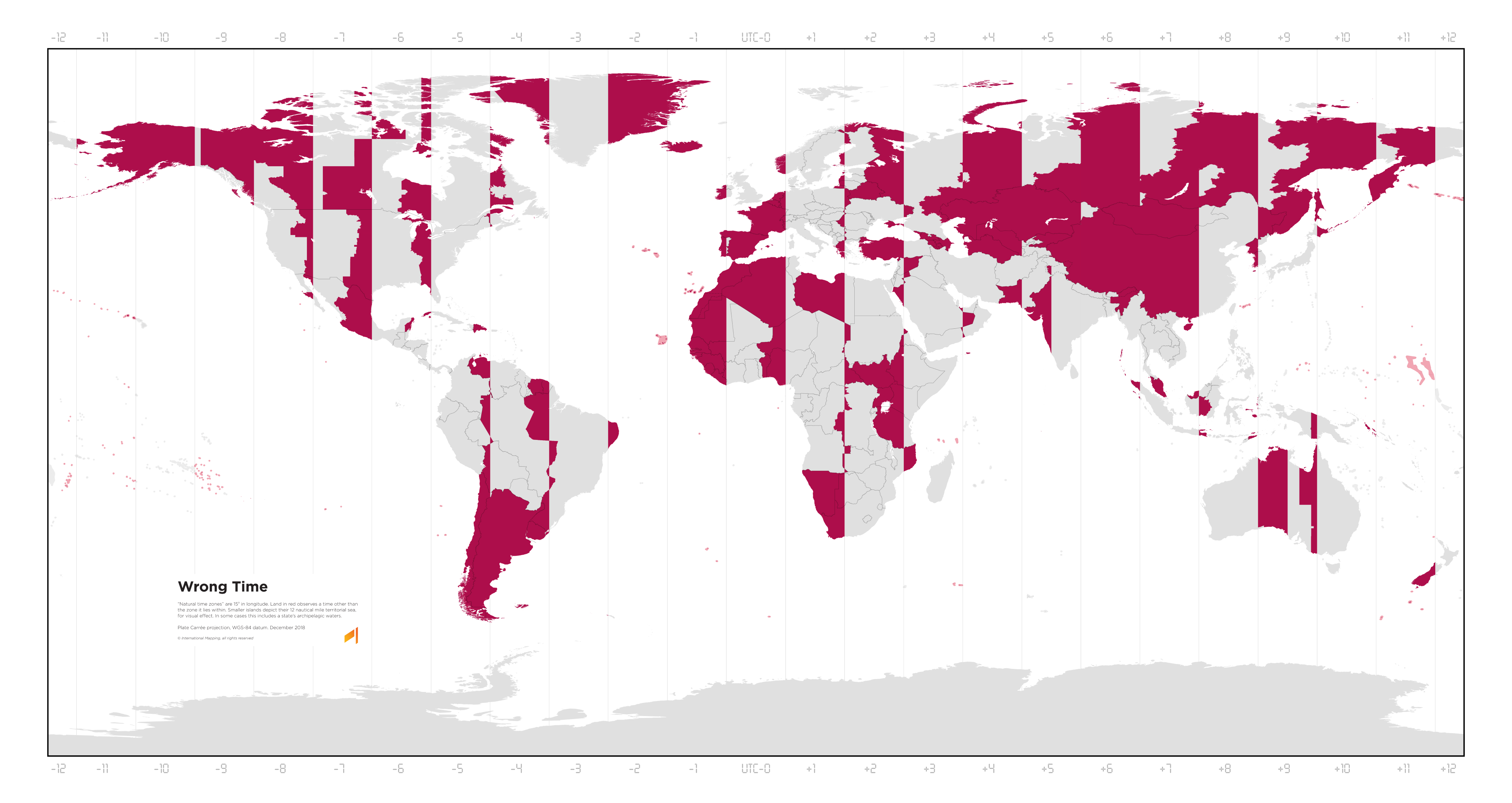
You should make one that shows how much the official time is wrong with respect to the local time.
That would require way more effort than "find picture from elsewhere on the Internet, scale it down to a size my Lemmy instance will let me upload, and then upload it."
But anyway, you can basically get that from this chart, for the most part. The rightmost edge of each red section is 30 minutes ahead, or the leftmost is 30 minutes behind of where it should be, when those edges are caused by the time zone itself (rather than national or regional boundaries like state lines), growing by an hour per vertical line.
So, the westernmost parts of Spain are about 1 hour 30 ahead, while the easternmost parts of Poland are 30 minutes behind. The westernmost tip of China is about 3 and a half hours ahead.
Yes, I know about China and Spain, that's why it would be interesting to plot it.