this post was submitted on 30 Oct 2024
547 points (92.9% liked)
Technology
69804 readers
5029 users here now
This is a most excellent place for technology news and articles.
Our Rules
- Follow the lemmy.world rules.
- Only tech related news or articles.
- Be excellent to each other!
- Mod approved content bots can post up to 10 articles per day.
- Threads asking for personal tech support may be deleted.
- Politics threads may be removed.
- No memes allowed as posts, OK to post as comments.
- Only approved bots from the list below, this includes using AI responses and summaries. To ask if your bot can be added please contact a mod.
- Check for duplicates before posting, duplicates may be removed
- Accounts 7 days and younger will have their posts automatically removed.
Approved Bots
founded 2 years ago
MODERATORS
you are viewing a single comment's thread
view the rest of the comments
view the rest of the comments

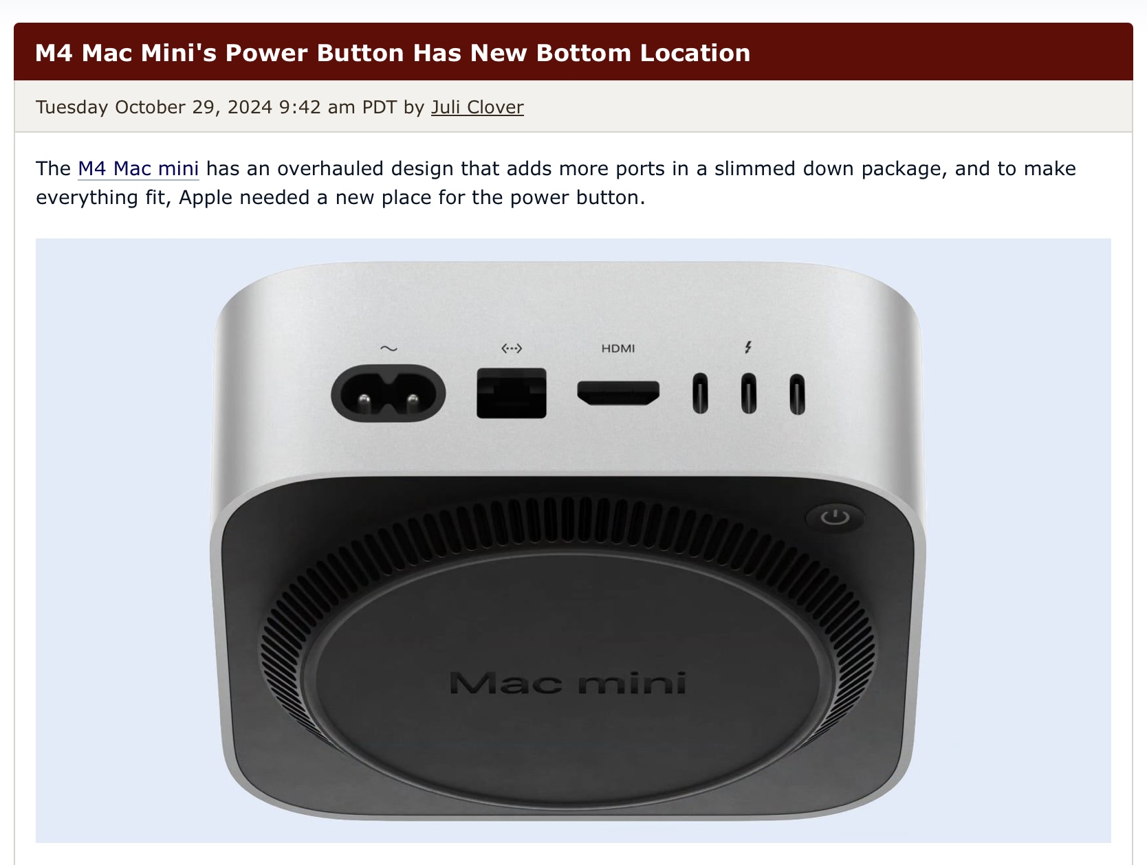
On the one hand, I agree. Apple has positioned their power buttons with the assumption that the devices wouldn’t be turned off very often for quite a while now. It was on the backside of the previous mac mini design and also on the backside of the 2013 trashcan mac pro, for example.
That still doesn’t make it less annoying though. We use a lot of macs for work, including aforementioned mac minis and mac pros and we do turn them off regularly because there’s no need for them to use power 24/7. Having to turn them around to find the power button is just stupid. That’s form over function in its finest. But if you’re the type of person who never turns off their computer, obviously it doesn’t really matter.
That’s not to say, that the new mac minis aren’t remarkable machines. The redesign was necessary and is very good in general. It’s a tiny powerhouse. They could’ve just chosen less of afterthought of a power button location.