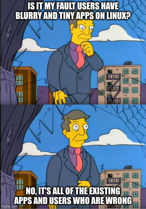
Wuuttup. I'm here complaining again about Framework's Linux unfriendly display. The new one this time.
https://frame.work/products/display-kit?v=FRANJF0001
Old display, 2256 x 1504 (3:2)
GNOME
100% scale
- Nothing looks blurry
- Everything is tiny
- Unusable
100% scale + large text accessibility
- Nothing looks blurry
- Most apps scale appropriately
- Some apps don’t respect GNOME’s large text setting (Alacritty)
125% scale
- Most apps look blurry (Picard, Firefox, Spotify, Alacritty)
200% scale
- Everything is way too big
- Unusable
Plasma
100% scale
- Nothing looks blurry
- Everything is tiny
- Unusable
125% scale + Apply scaling themselves
- Nothing looks blurry
- Most apps scale appropriate
- Some apps can’t scale themselves and look tiny (Picard)
125% scale + Scaled by system
- Most apps look blurry (Picard, Firefox, Spotify, Alacritty)
200% scale
- Everything is way too big
- Unusable
New display, 2880 x 1920 (3:2)
GNOME
100% scale
- Nothing looks blurry
- Everything is tiny
- Unusable
100% scale + large text accessibility
- Nothing looks blurry
- Most apps scale appropriately
- Some apps don’t respect GNOME’s large text setting (Alacritty)
- Everything is tiny
150% scale
- Most apps look blurry (Picard, Firefox, Spotify, Alacritty)
200% scale
- Everything is way too big
- Unusable
Plasma
100% scale
- Nothing looks blurry
- Everything is tiny
- Unusable
150% scale + Apply scaling themselves
- Nothing looks blurry
- Some apps can’t scale themselves, but look a little better here? (Picard)
150% scale + Scaled by system
- Most apps look blurry (Picard, Firefox, Spotify, Alacritty)
200% scale
- Everything is way too big
- Unusable
tl;dr
In the old display, GNOME at 100% + large text was the best compromise. In the new display, Plasma at 150% + Apply scaling themselves is the best compromise.
Interestingly, Picard scaling itself looks super tiny in the old display, but in the new display it looks... better. It's still not correctly scaled like native Wayland apps, but it's better.
Warning
If you can't stomach moving from GNOME to Plasma, then 🚨 DO NOT BUY THE NEW DISPLAY 🚨. The new display is worse for GNOME.
Once again
I am once again begging Framework to just give us a damn regular DPI display that works! Without workarounds. Without forcing users on specific DEs. Without forcing users to stop using their favorite apps. This new display has basically all of the flaws as the previous one.

macOS seems to handle this pretty well, honestly. About the only issue I have is XQuartz and even it’s pretty good.
What’s the issue you’re seeing?
Scaling, MacOS has no actual scaling it will only lower the resolution, and using Retina on anything that isn’t sold in an Apple store (and even then) just simply does not work. It essentially has no HiDPI support past using native resolution with slightly larger text that is not adhered to by most of the operating system itself. I am at a loss at why you think this is well handled, what criteria are you using?
Am I crazy or are you just completely wrong?
https://github.com/waydabber/BetterDisplay/wiki/MacOS-scaling,-HiDPI,-LoDPI-explanation
What the hell are you talking about? You are completely wrong on this. macOS has had high DPI support since 2012, when the first Retina display Macbook Pro came out. Applications bundle 1x and 2x sized assets, and fractional scaling is achieved by shrinking the 2x upscale back down to match the selected fractional scale.
I'm surprised to be learning this, but I've never tried to use a non-Apple HiDPI display with my Macs. Weird that it works so well on the HiDPI built-in displays and their external displays, but won't bother to make it work right with non-Apple displays.