this post was submitted on 02 Aug 2024
111 points (100.0% liked)
Climate - truthful information about climate, related activism and politics.
5558 readers
642 users here now
Discussion of climate, how it is changing, activism around that, the politics, and the energy systems change we need in order to stabilize things.
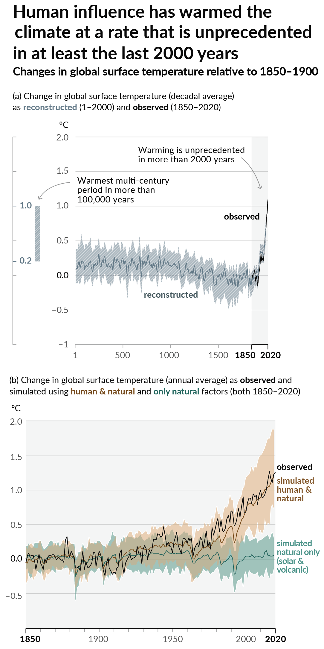
As a starting point, the burning of fossil fuels, and to a lesser extent deforestation and release of methane are responsible for the warming in recent decades:

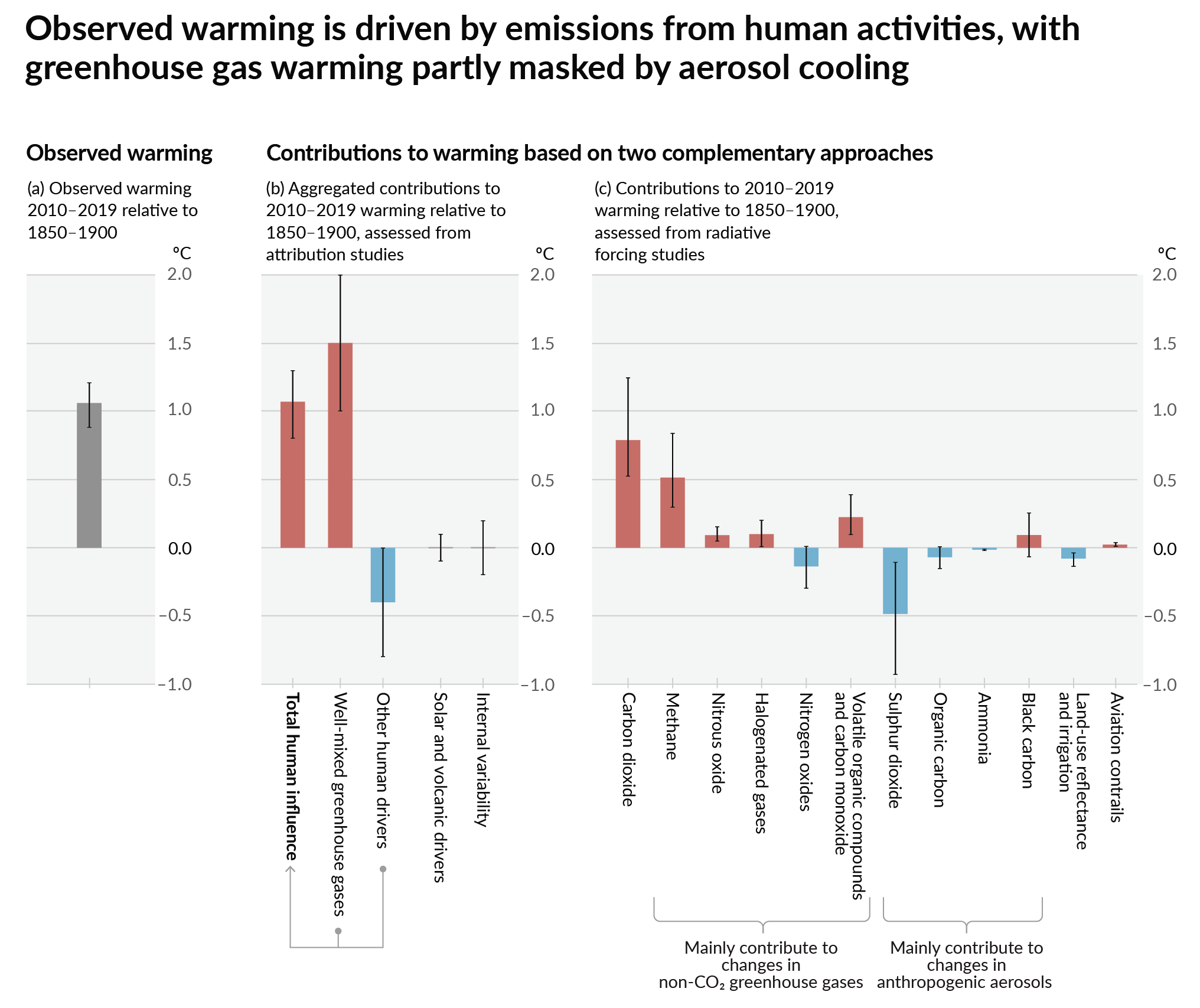
How much each change to the atmosphere has warmed the world:

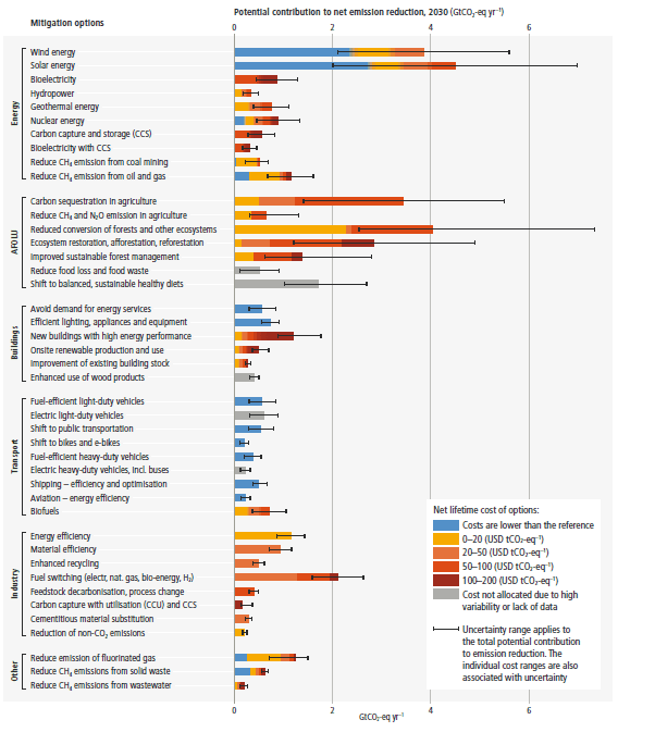
Recommended actions to cut greenhouse gas emissions in the near future:

Anti-science, inactivism, and unsupported conspiracy theories are not ok here.
founded 2 years ago
MODERATORS
you are viewing a single comment's thread
view the rest of the comments
view the rest of the comments
I read your comment before clicking on the article, and I thought "how bad could they be?"
These have me in tears.... Lol
They are ugly, but they also tell an important story, which is the decline of coal, and (in some areas) rise of wind and solar.
Love the "gas" label in your second picture. There was no need at all to tilt letters, but I guess it would not keep the theme of "thrown together" if it was straight text.
Also what is with all that background white in between the graphs? Is it electricity demand that didn't get meet by any means? Asking jokingly.
You’d think that 100% height graphs (or whatever they’re called) didn’t exist
I honestly can't believe those are real graphs. Looks like Ms paint and that Amiga 500 program had a baby that was dropped on his head