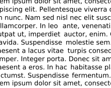
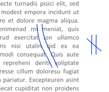
In typography, rivers (or rivers of white) are gaps in typesetting which appear to run through a paragraph of text due to a coincidental alignment of spaces. Rivers can occur regardless of the spacing settings, but are most noticeable with wide inter-word spaces caused by full text justification or monospaced fonts. Rivers are less noticeable with proportional fonts, due to narrow spacing. Another cause of rivers is the close repetition of a long word or similar words at regular intervals, such as "maximization" with "minimization" or "optimization".
Typographers/Designers pay attention to all sorts of minor text details that the average person just cannot be bothered to care about. Like, a reader might have a sense that something feels “off” on the page, but they probably won’t quite know what it is. Or, if they do notice it, they’ll just go, “Huh, that’s funny,” and move on. With everything going digital now though, and having variable page sizes and such, there’s a bit less control for things like that for web & mobile stuff. It’s only print people that probably have to worry about that now.
The copywriters in my company stare at a landing page for hours and fix little word flow details.
I remember having to explain responsive design, since words can break on screen size. The old editors who worked on magazines were kind of annoyed. But fortunately, we have better css tools like clamp, and word break to control word flow. But honestly its easier to teach the copywriter how tech works.
Rivers caused by justified text are bad for those with dyslexia and present a website accessibility issue. Good developers avoid allowing users the option.
The thing that normal people don't worry about is "readability." Bad type is harder to read, for example rivers are distracting. Turning black marks on paper into concept, metaphor, irony, narrative, setting should be as painless of a process as possible so that the most people possible have access to reading and information. Little details like letter and word spacing, font, typeface add up to something that is either easy or difficult to read.