break a lot of backwards compatibility or radically change the current way of doing things
Plan 9. We can still have textual interfaces without emulating the ancient use of teletypewriters.
break a lot of backwards compatibility or radically change the current way of doing things
Plan 9. We can still have textual interfaces without emulating the ancient use of teletypewriters.
The things I've read (admittedly mostly from the OpenBSD camp) from BSD devs, they seem to not worry about corporations building from their source that much, instead they actively try to get rid of GPL code because it isn't permissive enough for their standards.
Theo wrote "GPL fans said the great problem we would face is that companies would take our BSD code, modify it, and not give back. Nope—the great problem we face is that people would wrap the GPL around our code, and lock us out in the same way that these supposed companies would lock us out. Just like the Linux community, we have many companies giving us code back, all the time.
But once the code is GPL'd, we cannot get it back."
People use ed because they want an editor. They don't want an emacsitor or vimitor. Those aren't even words.
If you are planning on adding things, my humble suggestion would be how to write a really good bug report, maybe going through how to research what went wrong to narrow down the problem, looking for already filed bug reports, using diff and patch if you have a proposed solution, using reportbug, etc.
The option to not set a root password and instead let the regular user use sudo seems to be mentioned in the installer for the first time around 2007, so it's been there for a while.
Also OpenBSD use different versions, I'm guessing their vi is the original since it can't handle utf-8. And iirc ex(1) is also a vim variant on Linux. I've never met anyone who actually uses ex though. ed(1) I think is just GNU ed. I am not certain about these versions though.
The original vi has not been maintained for many years. Most distributions, including Debian, Fedora, etc, use a version of Vim which (mostly) is similar to how Vi was.
From Fedoras wiki:
"On Fedora, Vim (specifically the vim-minimal package) is also used to provide /bin/vi. This vi command provides no syntax highlighting for opened files, by default, just like the original vi editor. The vim-minimal package comes pre-installed on Fedora."
From the vim-tiny package description on Debian:
"This package contains a minimal version of Vim compiled with no GUI and a small subset of features. This package's sole purpose is to provide the vi binary for base installations."
It is, they have the same text.
Nowadays vi is just a symlink to vim.tiny, so you're actually running vim (in vi mode).
https://www.maketecheasier.com/assets/uploads/2020/08/debian-install-set-password.png.webp
Third paragraph. I'm not trying to be a smart-ass, I also installed Debian a few times without seeing it.
The installer says this when it asks you to type a root password. I don't know why, but for some reason the information is both right there and easy to miss.
So, I recently got this C64 for free, and I've been wanting to test it. However, figuring out how to connect a monitor has led me to various forums with home-made adapters that require soldering, a 5-pin DIN to 4xRCA to...? My monitor has VGA and HDMI, etc, the usual modern inputs. Someone claimed that the voltages are different which will lead to artifacts and to put a resistor somewhere. I found some box thing from China that looks promising but it's around 150 usd.
What would you recommend for this? Is the expensive box my best bet?
I have no TV or anything that can input RF, just a computer monitor.

Trying to see if I can post from Lemmy.
Got a pen for my birthday. Have been practicing my foundational butts since then. I can not get it to flow right, maybe that will magically fix itself in the future.

There's this guy called Stephan V. Bechtolsheim who wrote a series of books on TeX called "TeX in Practice". He's really good at the finer details of, well, everything.
In one of the books, he makes a macro to visualize boxes. It's built up over many pages and chapters with lots of small macros as building blocks. Because he's reusing these macros in different places, it makes a lot of sense.
However, when I wanted to use the box visualizing macro, I found that I had to look up and copy a lot of code to make it work. This was no fun, so I re-wrote it in a "flatter" way where it's just regular plain old macros.
I ended up with this:
\newdimen\linethickness \linethickness=0.4pt

\def\boxlines #1{%
    \hbox{%
        % Save original (argument) box
        \setbox0 = #1%
        % Place bullet at baseline and vertical align of the box
        \setbox1 = \hbox{\hskip -2.5pt \lower 2.5pt \hbox{$\circ$}}%
        \ht1=0pt \dp1=0pt \wd1=0pt
        \box1
        % Place a dashed line at baseline
        \setbox2 = \hbox to \wd0{%
            \xleaders\hbox to 4pt{%
                \hskip 1pt
                \vrule depth 0.5\linethickness
                	   height 0.5\linethickness
                	   width 2pt
                \hfil
            }%
            \hfil
        }%
        \ht2=0pt \dp2=0pt \wd2=0pt
        \box2
        % Place frame
        \setbox 3 = \hbox{%
            \hskip -0.5\linethickness
            \vrule width \linethickness height \ht0 depth \dp0%
            \hskip \wd0%
            \hskip -\linethickness
            \vrule width \linethickness height \ht0 depth \dp0%
            \hskip -\wd0%
            \hskip -\linethickness
            \dimen0 = \wd0%
            \advance\dimen0 by \linethickness
            \dimen2 = \ht0%
            \advance\dimen2 by 0.5\linethickness
            \dimen4 = \ht0%
            \advance\dimen4 by -0.5\linethickness
            \dimen4 = -\dimen4
            \vrule width \dimen0 height \dimen2 depth \dimen4
            \hskip -\dimen0
            \dimen2 = \dp0%
            \advance\dimen2 by -0.5\linethickness
            \dimen2 = -\dimen2
            \dimen4 = \dp0%
            \advance\dimen4 by 0.5\linethickness
            \vrule width \dimen0 height \dimen2 depth \dimen4
        }%
        \ht3=0pt \dp3=0pt \wd3=0pt
        \box3
        % Place original argument box
        \box0
    }%
}
The macro takes a box as an argument, for example
\boxlines{\box0}
It puts lines around the box, and marks out the baseline and the horizontal alignment. The neat thing is that the lines are made so that they don't interfere with the typesetting at all. Everything is placed as it would be without the lines.
If you have something that looks misaligned or strange, like these words:
it can help to visualize the boxes:

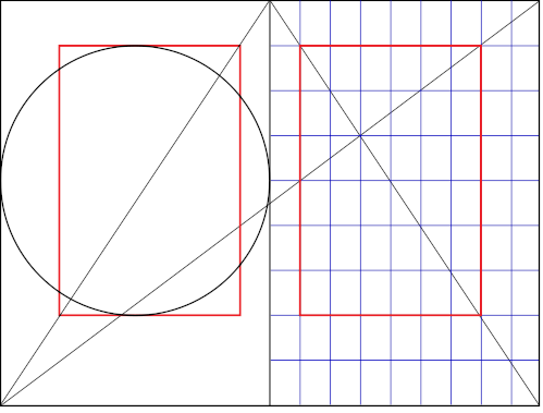
Jan Tschichold and Raul Rosariva independently researched the layout of medieval books, and each came up with a method of construction. Rosarivas version (to the right) lends itself very well to a programmatic approach. We could implement it (in luaTeX) in a few lines like this:
% Page size (proportions 2:3)
\pagewidth=150mm
\pageheight=225mm

% Undo 1 inch origin (personal preference)
\pdfvariable horigin 0pt
\pdfvariable vorigin 0pt

% Inner margin
\hoffset=\pagewidth
\divide\hoffset by9

% Top margin
\voffset=\pageheight
\divide\voffset by9

% Type area width
\hsize=\pagewidth
\divide\hsize by9
\multiply\hsize by6

% Type area height
\vsize=\pageheight
\divide\vsize by9
\multiply\vsize by6
This is all well and good if we have vertically stretchable material on every page. But... if we want to do grid typesetting, we will quickly run into "Underfull \vbox (badness 10000)".
Let's say we've set \parskip=0pt.
\topskip=10pt and \baselineskip=12pt
\showthe\vsize produced "426.79129pt" in the log.
Right now we have 35 lines: \topskip + 34 \baselineskips, which is 10pt+(34*12pt) = 418pt, i.e. less than \vsize, but there's no room for adding another line.
Something has got to give.
One way is to define \vsize as a set number of lines, and then adjust \baselineskip to be slightly bigger to make \vsize be in accordance with the golden canon.
Either we stay with 35 lines and increase \baselineskip slightly, or we decrease \baselineskip to fit one more line. This is where you have to make a call based on what would make it better as a whole. In this case, I think it wouldn't hurt with a little extra leading, so I'll stick with 1+34 lines and go back and change \vsize:
\vsize=\topskip
\advance\vsize by 34\baselineskip
Now all that is left is to figure out how much to increase \baselineskip. We can leave \topskip as it is, at 10pt, so we're left with 426.79129pt - 10pt = 416.79129pt.
Divide that with 34 lines:
416.79129pt / 34 is approximately 12.2586pt, so we go back and set \baselineskip to that.
\baselineskip=12.2586pt
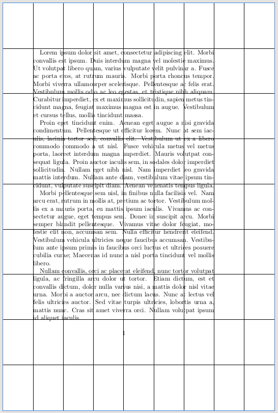
Now we have something like this (with added guidelines):
Finally, if our goal here is to make a type area rectangle of a certain proportion, it could be argued that the first line should have its x-height touch the upper border of the rectangle. The bulk of a line contributing to color is made up of the lower case letters. In that case we could adjust \voffset:
\advance\voffset by-\topskip
\advance\voffset by 1ex
but then we would also have to compensate the total \vsize and figure out a new \baselineskip.
Disclaimer: I haven't tested the above code, so there could be spelling errors etc, but it's more about the reasoning.
Yes, or one of the forks.