this post was submitted on 29 Jul 2024
41 points (97.7% liked)

KDE

5548 readers
36 users here now

KDE is an international technology team creating user-friendly free and open source software for desktop and portable computing. KDE’s software runs on GNU/Linux, BSD and other operating systems, including Windows.

Plasma 6 Bugs

If you encounter a bug, proceed to https://bugs.kde.org, check whether it has been reported.

If it hasn't, report it yourself.

PLEASE THINK CAREFULLY BEFORE POSTING HERE.

Developers do not look for reports on social media, so they will not see it and all it does is clutter up the feed.

founded 2 years ago
MODERATORS
41
submitted 5 months ago* (last edited 5 months ago) by [email protected] to c/[email protected]
 

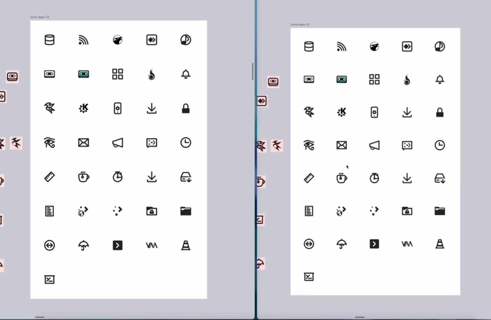
screenshot

Removing the color-coding of mimetypes, for accessibility for "color blind" people. (Like me!)

(this is not my work, just posting here)

top 3 comments
sorted by: hot top controversial new old
[–] [email protected] 9 points 5 months ago (1 children)

It's great that since 5.x they're giving attention to the tiny action icons. Pinheiro did an amazing work on apps, places and other icons with the Oxygen set in the KDE 4.x era, but its mini action icons were kind of lost and had too much detail. Though with 5.x they did some great improvement about consistency, the 1px thickess just didn't help too much into readability.

I do icons and have done icons for KDE in the past so I can tell that indeed the work they have done is huge and the result is outstanding.
[–] [email protected] 1 points 5 months ago

Interesting! Yes I think the Breeze icons are pretty good but look bad anyways. The sharp edges, and 1px are an issue when fractional scaling.

[–] concrete_baby 3 points 5 months ago

I'm so glad they decided to make the lines thicker. I always thought the Breeze icons were ugly because of their 1px outline style. It's hard to see and lacks weight. Liking the improvement here.