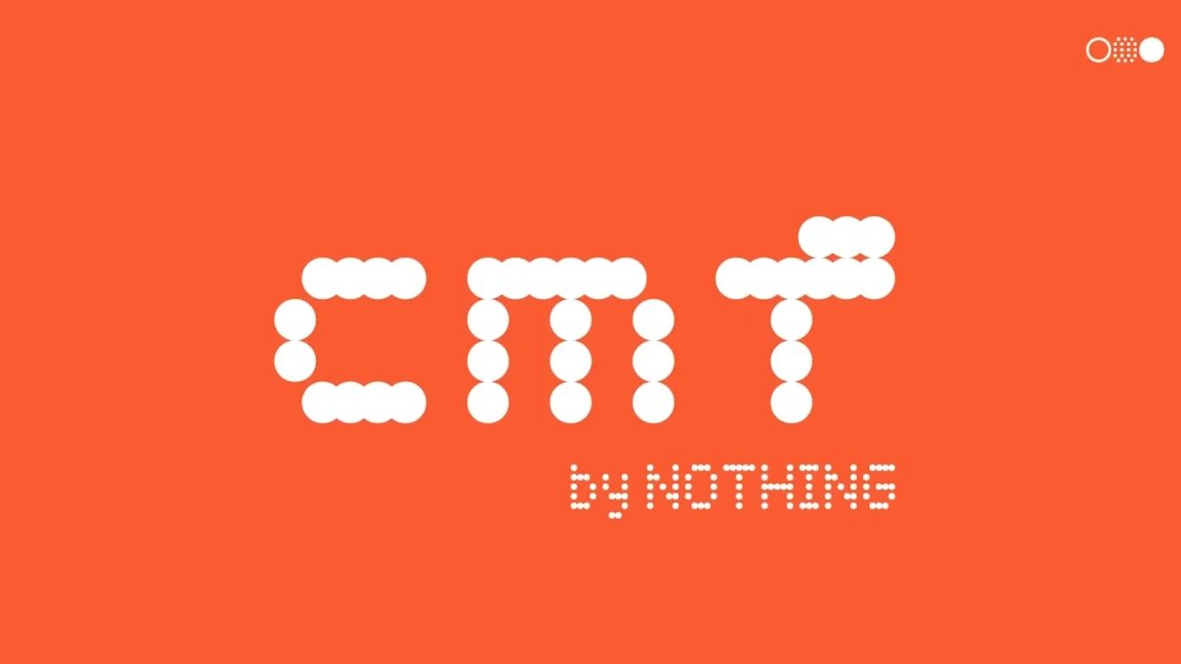
How does a logo like this ever get to the point where someone other than its designer even sees it?
this post was submitted on 04 Aug 2023
20 points (100.0% liked)
Crappy Design
517 readers
1 users here now
Poor designs resulting from incompetence. This covers unintentional artifacts. (Intentionally malicious/anomalious designs belong in c/assholedesign)
founded 4 years ago
MODERATORS
It does say "cmf" in lowercase, though it could be more clear.
Not gonna lie, on first glance it looked like it said cunt
The sad thing is, they had enough vertical "pixels" to make a proper "F". 🤦♂️ If they were worried it didn't look lowercase enough, just remove the top-left "pixel".
Of course what they really need is for someone to shake them and yell "IT'S 2023, ENOUGH WITH THE FAKE DOT-MATRIX DISPLAY BULLSHIT", but what can you do.