11
submitted 1 week ago by [email protected] to c/[email protected]

Last week I received some constructive criticism on the project's Matrix room by @[email protected] — BTW if you guys are not on Matrix yet, you are all invited — and there was an interesting point about the bottom navigation bar, which I converted to an issue to better keep track of it.

The original idea was to alter the order of the items in the navigation bar, and I was also suggesting to make it entirely configurable as for which items to include and in what order. But the whole question is more complex than that, e. g. because some people don't expect to find "Settings" in the bottom navigation at all and would like it to be in the navigation drawer on the left.

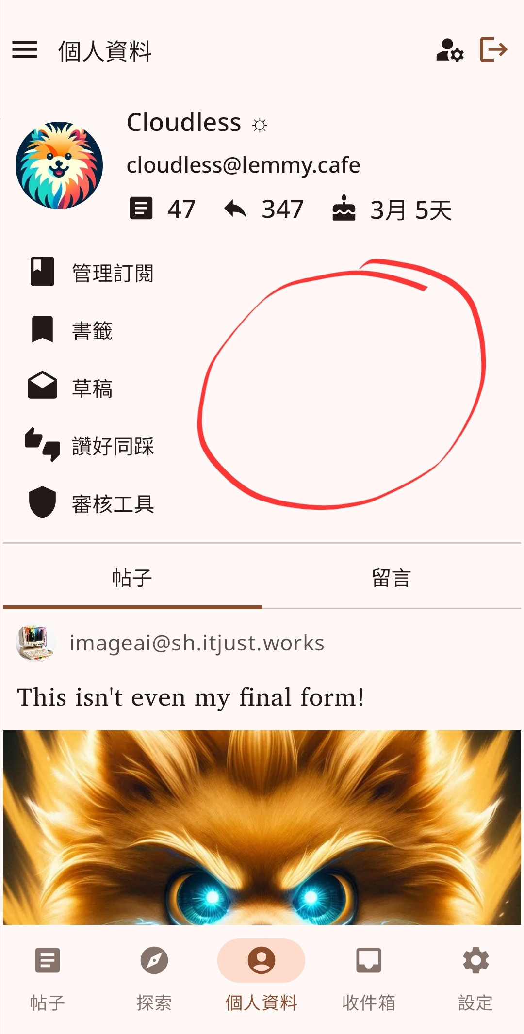
Personally, I would also like to have bookmarks in the bottom navigation bar instead of settings and would like to swap things that are displayed there and shortcuts that appear in the profile screen (e.g. bookmarks, upvotes/downvoted, drafts, etc.) even if this implies some rework on global navigation and the UI.

Additionally, you know that I am not a big fan of shortcuts in the profile either, but I would prefer to have a panel on the right (like community info or user info) containing all these shortcuts and the logout action instead of placing it in the top bar.

I am therefore creating this post to foster discussion about this topic and gather ideas, so feel free to leave your opinion no matter how much rework it implies.

top 4 comments
sorted by: hot top controversial new old
[-] [email protected] 4 points 6 days ago

In my opinion, the bottom toolbar should be reserved for most frequently used navigation.

Settings shouldn't be something that is prominent. Once the user have configured the app to their liking, they should only occasionally visit the settings page.

I agree that settings should go to the navigation pane on the left, just like in Eternity.

As for the profile page, I think it is good as is, and not sure about the benefits of adding a panel on the right. My suggestion is to make use of the empty space (see circled) and move the logout/manage account buttons there. Add labels to the buttons as they are not entirely intuitive.

[-] [email protected] 3 points 1 week ago

I feel like your ideas are on point. Please continue.

[-] [email protected] 3 points 1 week ago

Personally, I don't mind settings being in the bottom bar. But at the same time, I think what you have in mind would be fine too. I do like the idea of bookmarks in the bottom bar, as honestly, this wasn't something I was aware existed until I read your post and found bookmarks in the profile menu. Of course, it seems obvious now with the common bookmark button next to the upvote/downvote... I noticed I had some items bookmarked, likely accidental presses as a result the button's proximity to the up/downvote.

I came from eternity, which had that the profile and settings in the left bar, which I also thought was fine.

The one thing I do find inconsistent with the UI is how the app treats Subscribed, All, and Local versus individual communities. Clicking on Subscribed, All, or Local gives you the default UI with the navigation bar at the bottom, and then you can swipe to quickly go to another. However, clicking on a community in the left bar does not give you the bottom navigation bar and while you can click on another community to go to it, you cannot click on Subscribed, Local, or All to go to those aggregate feeds. You instead have to click the back button in the upper left on each individual community you navigated to.

[-] [email protected] 1 points 1 week ago

That was by design: a community detail with all its posts and a generic feed (like All/Subscribed/Local) are conceptually different in Raccoon although they may use the same data source except when searching within a community (because even the data source is different then).

But I understand the bug you are reporting: if in the community detail I open the navigation drawer and select one feed (e.g. Subscribed or All) nothing happens and no post list is opened.

this post was submitted on 28 Jun 2024
11 points (100.0% liked)

raccoonforlemmy

166 readers
17 users here now

The purpose of this community is to discuss and collect feedback about the development of the Raccoon For Lemmy mobile app.

Feel free to use this space to share your

Suggestions as well as criticism is well accepted (better if constructive but who cares after all: Lemmy is beautiful because there's freedom).

Have a look at the GitHub repository for more information.

Chat with us on Matrix!

NB: Notes collected here will eventually become issues on GitHub to better track their evolution.

founded 9 months ago
MODERATORS