18
Fixing Photon's navigation
(lemdro.id)
This is my current layout idea for the navigation bar, let me know if it should be changed:
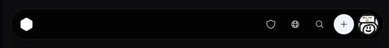
Edit: I'll also add an option to change the position of the navigation based on screen size, which will be the default.
I think the new layout is fine for mobile but should be reverted completely for desktop.
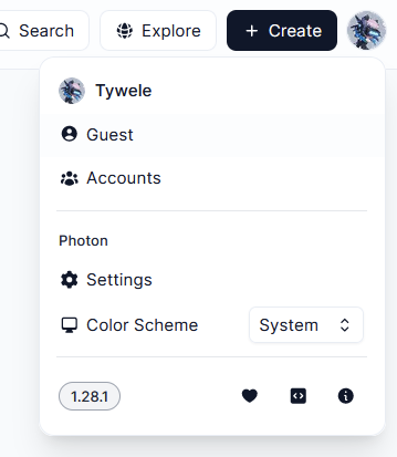
From there (v1.28.1 basically) I suggest the following changes:
These changes would put all the functionality that is used more often closer together and reduce the amount of mouse travel.
A & B I think. In general, desktop should be the primary target, as mobile is well covered by other apps.
Also personally I would like there to be more emphasis on it being an actual landing page for an instance. Photon is the closest to being a full replacement for lemmy-ui, but the recent changes like moving the main instance logo away from the standard top left position makes it less suitable for this.
There are a couple things.
Might be that I'm still used to old photon, but point A has been bothering me. I keep looking at the wrong side first.
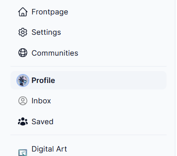
The other thing has been that Home was moved away from the sidebar, where all the other "browse x" buttons are. Actually, now that I'm thinking about it, all/subscribed might deserve their own buttons there.
The new layout as-is seems like an improvement for mobile, though I haven't spent much time to properly try it on my phone.
Oh, and, now that I'm here, thanks for all the effort. Photon is just excellent.
I've taken in some of this feedback, let me know what you think of Photon v1.29.4
I noticed it right after writing the comment, now deployed. This immediately feels like it gets most of it right. I'll see if I have more thoughts later.
pin comments test
How can I see all my subscriptions in the WebApp?
Under iOS I can’t find any button to show my subscription. Can somebody help me?
Communities > Location > Subscribed. I'll add easier access on mobile soon.
I would be in favour of A or D personally. However some of the new chances might be liked by some so having that as an option in the settings instead of legacy navigation might be in favour of some?
Keep up the great work 🙌
An alternative UI for Lemmy with more features, a more intuitive UX, and modern design.
Share your themes, ask questions, report bugs, or check on the latest updates here!