10
Inclusive Sans, by Olivia King (a font for accessibility that also looks good)
(www.oliviaking.com)
Planet Dyne is a weekly(ish) newsletter compiling everything going down in the Dyne community.
Links to funky tech, mad hacks, tasty art, activism, memes, tales and mythologies are probed here to see how they fly through the votes of dynes like you!
Why did "Pp" not make it in the preview?
Too vulgar, this is a family Lemmy
yes, exactly. it was totally not to farm interactions!
edit: typo
I always find it difficult to pick a font for accessibility, because for example, some people absolutely gush over OpenDyslexic and then others say that it's actively bad for them. Given that humans are different, this does make sense, but doesn't make the task easier.
I do like the look of this font, though, so that makes it easier to pick. I've been looking for a font for one of my side-projects and this might genuinely fit it quite well.
Also, side-note, this is the first time I opened Google Fonts and holy crime-against-humanity batman:
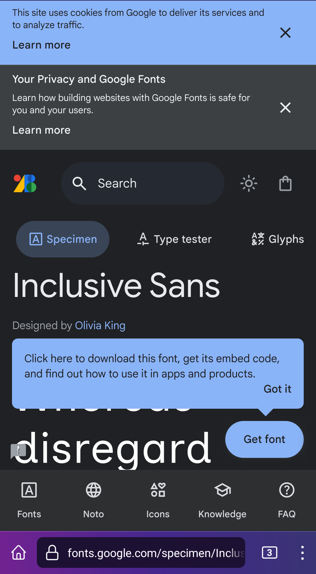
Almost makes me wish, I could install some browser toolbars, so I could see even less of the content.
gogole has become such a joke... here's an alternative access. ethicaly it isn't that much better, but the UI isn't screaming at ya: https://github.com/google/fonts
you made me realise i didn't look up the license of this font .. thanks!