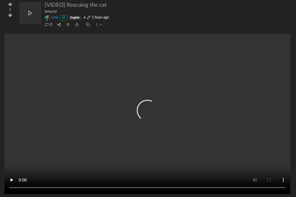
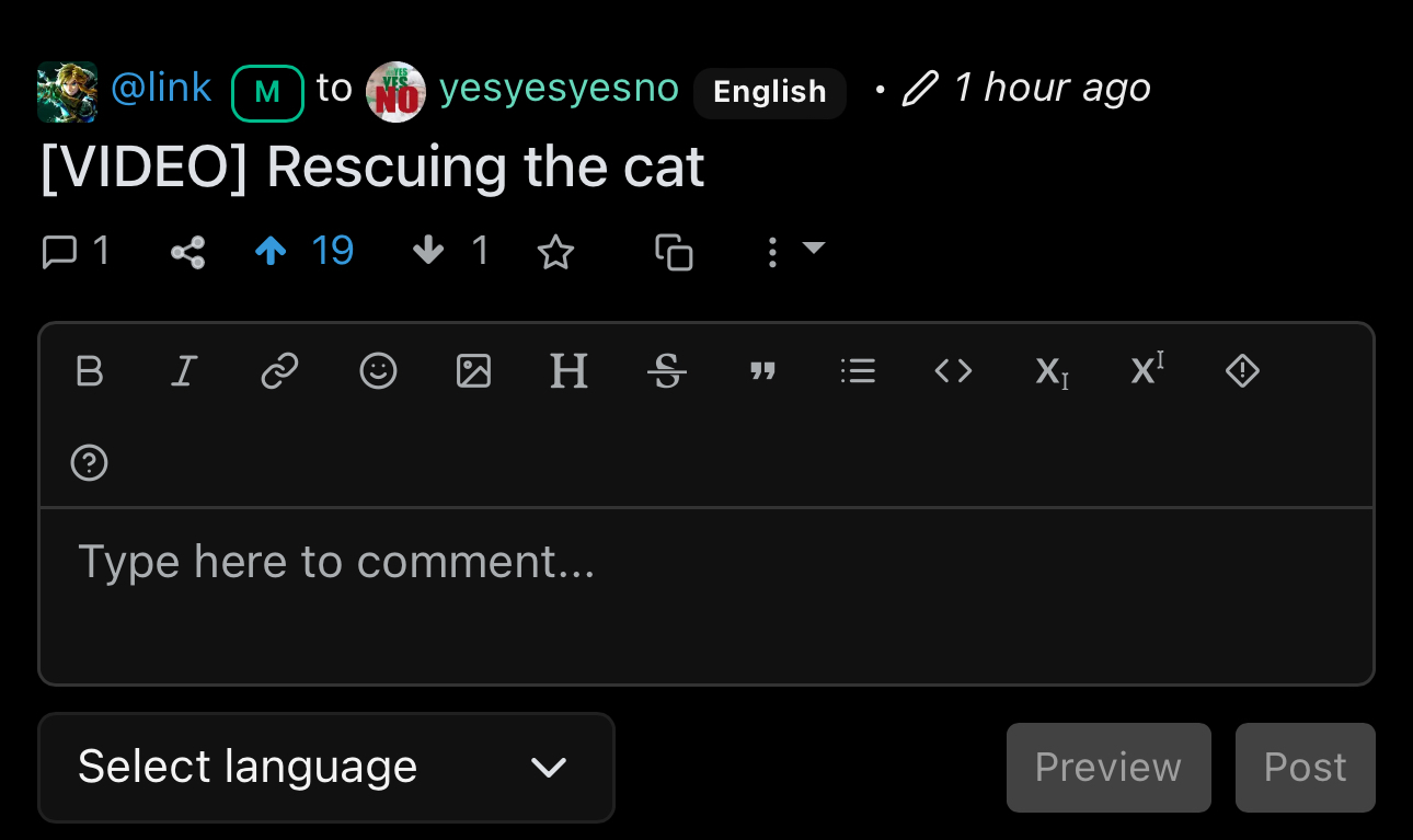
I don't think your description of the problem is quite right, but I do believe that there is a problem. Here's what I see on lemmy-ui:

It shows no thumbnail, but the standard "play" icon, centred.
That's different from any other kind of post. Text posts:

Have no thumbnail, and a "text bubble" icon, centred.
Link posts:

Sometimes do, sometimes don't have a thumbnail. If no thumbnail, they have an "external link" icon, centred. If there is a thumbnail, that same external link icon appears in the upper-right corner.
And finally, image posts:

Have a thumbnail of the image with an "image" icon in the top right.
In the case of image and video posts, clicking on the thumbnail/icon creates an "expando" where you can see the image/watch the video inline.

This is good UX, in my opinion. However, unfortunately, your instance is failing to load the video for me. It's not caused by the expando, because this happens even if I go straight to the video itself in a new tab. So it's probably a problem with the instance, not with Lemmy.
But as I said at the start, there is a problem here.
First and foremost, a complete lack of any thumbnail for the videos. Thumbnails are good! Videos should also get them.
And well-known popular video sites should also be supported by the video expando. From a UX perspective, it would be better to be able to watch YouTube directly inline, rather than being forced to go through to youtube.com.
Also as a second related UX issue, text posts can be viewed from the feed page, but unlike videos and images, it's not done by clicking the thumbnail, but by clicking the little "+" sign next to the title. In my opinion this is inconsistent and not ideal.
